Book Review: 2012 Competitions Annual

2012 Competitions Annual edited by G. Stanley Collyer with Daniel Madryga
The Competition Project, 2013
Paperback, 240 pages


At the start of the 1990s, Competitions magazine began publishing quarterly issues with notices and results on architectural competitions. In 2011 the publication went the way of many magazines and is now online-only, though its print output has segued to an annual book that collects the results of some prominent competitions. The second edition, covering competitions in parts of 2011 and 2012, features the winners and runners up for 16 competitions.

Competitions is based in Kentucky, so it's no surprise that the (now e)magazine tends to focus on the United States, but as the back cover attests: "the majority of competitions for real projects in this volume reflect not only the institutional commitment of foreign nations to this process, but the dire economic straits our governing bodies find themselves in." This quote points to an emphasis on "real" competitions versus "ideas" competitions, while indicating that U.S. competitions in the annual are few; in fact only 5 of the 16 projects are located in the United States, 7 if we broaden the criteria to North America by adding Canada. But of course competitions in any locale are geared to entice as many architects from different countries (often pairing up with local architects) to enter, hopefully leading to more ideas and potentially bigger names. Therefore U.S. participation, as the Annual attests elsewhere in its pages, goes far beyond the locations of competitions.


[OMA: Musée National des Beaux-Arts du Québec. Image: © OMA, rendering by Luxigon]

That said, the U.S. competitions tend to be less flashy and with fewer (or no) big names. This doesn't mean these competitions don't have value, but the mix of international/local and famous/not-so-famous in the book broadens its appeal to a wider spectrum of architects and fans of architecture. An example of the international/famous side of things is the Musée National des Beaux-Arts du Québec competition, won by OMA, with Allied Works, David Chipperfield and others as runners up. On the local/not-so-famous side can be found the Atlanta History Center competition, won by Pfeiffer Partners, with Stanley Beaman & Sears, MSTSD and others as runners up. Given Competitions' focus on results in its annual, we do not learn what really happened to these and other "real" projects. In these cases, OMA's design, officially called the Pierre Lassonde Pavilion, started construction in 2013 and is slated for a 2015 opening, while Pfeiffer Partners' winning design was shelved in favor of an arguably inferior design by Atlanta's MSTSD, but not their runner-up entry they did with Kallman McKinnel & Wood.


[Pfeiffer Partners: Atlanta History Center. Image via waltercrimm.com]

But the big question, the elephant in the room if you will, is the obvious one: What is the value of the Annual in the age of Arch Daily, Bustler, and other websites featuring competitions results with plenty of images and text from the architects? The answer is threefold: The first has already been alluded to, as the book includes competitions that these websites do not feel the need to feature (Arch Daily's coverage of the Atlanta competition is solely a 2011 call for architects announcement, for example). The second is that Competitions includes editorial commentary and jury comments, which these websites don't include and sometimes include, respectively. Third is having the winner and the runners up in one place, which makes it easy for comparison and to have a mental picture of reactions to the competition brief, easier to achieve in a book than on separate web pages online; often websites highlight only the winner and/or only it and a couple runners up. Even if every notable competition isn't covered (an appendix with other competitions, some of them ideas competitions, and their winners is included) the thoroughness of the 2012 Annual should be commended.

Book Review: Three Books about Chicago

AIA Guide to Chicago edited by Alice Sinkevitch and Laurie McGovern Petersen
University of Illinois Press, 2014, Third Edition
Paperback, 568 pages

Building Ideas: An Architectural Guide to the University of Chicago by Jay Pridmore
University of Chicago Press, 2013
Paperback, 160 pages

Chicagoisms: The City as Catalyst for Architectural Speculation edited by Alexander Eisenschmidt with Jonathan Mekinda
Park Books, 2013
Hardcover, 184 pages


Recently I received review copies of three books on Chicago, so it seems appropriate to put them together into one review, discussed in alphabetical order.

Having produced my own guide to architecture in New York City, and therefore having researched many guidebooks, one of my pet peeves with guidebooks (architectural or otherwise) is when they are not designed with their use in mind. By this I mean being carried around, having easy-to-find entries and easy-to-navigate maps, and giving the reader something of interest while seeing the site in person. Although the AIA Guide to Chicago excels in many respects (to be discussed soon), the third edition actually takes a step back from the 2004 edition in one important area: maps. The new edition forgets one thing the previous edition was aware of: books have folds where information gets lost, so don't put anything within about 1/4" or 1/2" of the fold. Unfortunately the maps don't heed this advice, so many streets and buildings in the two-page maps are lost, only to be found by those that break the binding or cut the book apart. This is unfortunate, more a mistake for a first edition than a third, especially when the second edition got it right.

With that out of the way, the positive aspects of the guidebook are many, building upon the previous edition (also edited by Sinkevitch) with better navigation (page-end tabs make the chapters easy to find), thorough histories of the city and neighborhoods, commendable fact-checking (unlike the AIA Guide to New York, as I wrote in my review), and good additions with the many contemporary buildings that are once again making Chicago an exciting place to be an architect and archi-tourist. Things were not so optimistic when the previous edition came out in 2004, timed, like the third edition, to the AIA Convention descending on the city.

I'll admit that in the decade I worked as an architect in Chicago (1997-2006), there was a general malaise with architects in the city, brought on by important projects going to outsiders and bland buildings being erected by locals (Millennium Park was just completed in 2004, so its impact was not yet felt). There were bright spots with Jeanne Gang, John Ronan, Wheeler Kearns, and Brininstool + Lynch, among others, but mediocrity was the norm over the design excellence Chicago is known for, rose-colored glasses or not. But positive momentum has been in swing as Gang, Ronan (below photo) and others have received more commissions and created some of the best architecture in the city, with buildings that are drawing attention to far-flung parts of the globe – Gang's Aqua Tower, the most obvious expression of this, graces the cover for good reason. Of course, there is much more to see than Aqua, and this book (warts and all) is a good companion to exploring the city from what's left of its 19th-century origins to the present.

Poetry Foundation
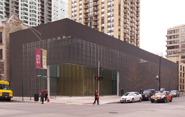
[Poetry Foundation, John Ronan Architects, 2011 | Photo by John Hill]

When a review copy of 
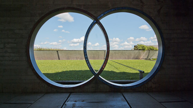
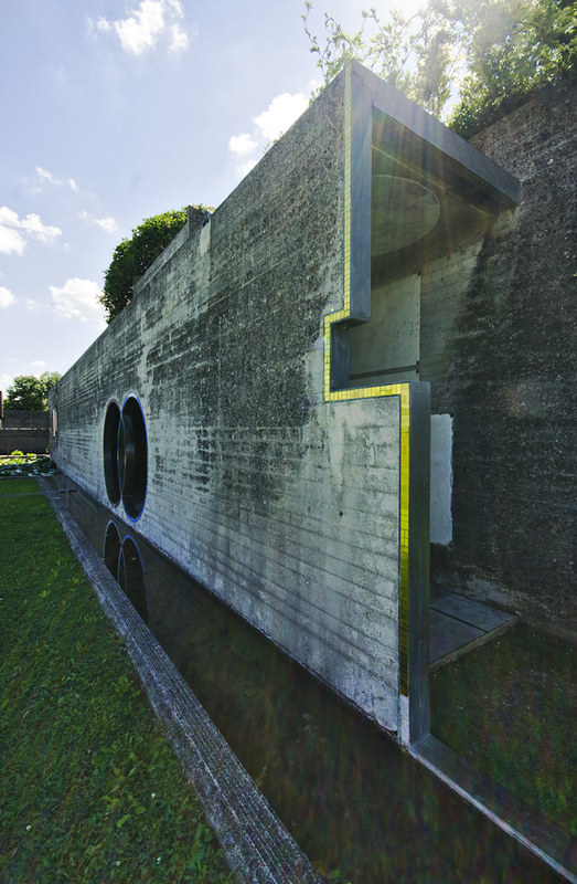
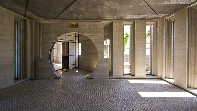
Building Ideas: An Architectural Guide to the University of Chicago landed on my doorstep, the first thing my wife asked was, "what do they say about the Smart Museum?" where we got married in 2006. Turns out the answer was "nothing." I could find the museum labeled #2 on a map near the front of the book, but when I flipped through the book to find the same, thinking it might be arranged in order of the 31 buildings on the map, I couldn't find it. The chapters are chronological/thematic, moving from "The Gothic Campus" to "Building Ideas with Modern Architecture," so projects are out of sync with the numbering on the map. OK. But looking in the index, the only mention of the Smart Museum of Art is for the two-page spread of the map. I checked the 30 other buildings and discovered only one other building (International House) in the same predicament; every other building is discussed at some length in the book.

So what does the inclusion of the Smart Museum in the map but its omission from any description say about the book? First, combined with the somewhat large size of the book (10"x9"), it's not an "architectural guide" in the sense of the AIA Guide to Chicago or any other portable, keyed-and-mapped guidebook. A more accurate subtitle would have been "an architectural history of the University of Chicago," given the way the chapters are arranged, the narrative flow of Pridmore's writing, and the way the reader learns about the planning and evolution of the physical campus. Most people will not notice the omission of the Smart Museum from the text, but if they used it as a guide to the campus, as the subtitle indicates, they most certainly would have noticed. (That said, Pridmore did produce an architectural tour of the campus in 2006 as part of PAPress's campus guide series, a more traditional guide that predates the university's latest building boom.)

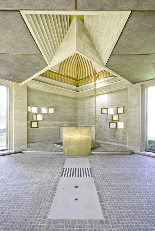
Aside from the quibble of "guide" versus "history," how is the book? While it does a great job in describing the evolution of the campus from its origins, selection of architect/planner, and even selection of style (less obvious and more important in the late 1800s than today) to its modern plans by Eero Saarinen and Edward Larrabee Barnes (he was architect of the Smart Museum, but in the book's one mention of the museum – not by name – it and other Barnes-era buildings "did not meet expectations") and the latest boom with buildings by Helmut Jahn, Tod Williams and Billie Tsien, and Valerio Dewalt Train. But when it comes to the overall tone of the book and descriptions of the individual buildings, the book is more "booster" than either history or guide, as if the book is a promotion for the school rather than a scholarly or independent voice on it. Regardless of the Smart Museum's omission, people like me, with a fondness for the school in their hearts (this goes for alumni, professors and others who have spent time there for whatever reason), will find the book rewarding, but those looking for a proper guide should go with the AIA Guide, which devotes nearly 20 pages to more than 80 buildings on its Hyde Park campus.
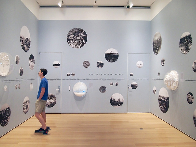
Chicagoisms
[Chicagoisms exhibit at the Art Institute of Chicago | Photo by John Hill]

Chicago is a city whose mythologies are more prevalent to foreigners than other cities. In my travels in Europe in the mid-1990s, just about everybody I met and told I came from Chicago replied with something about Al Capone and the mob ("stick 'em up, bang, bang!), or personalities like Oprah Winfrey and Michael Jordan, or its great architecture being limited to Frank Lloyd Wright and the "birth of the skyscraper." Even today, people tell me that it makes sense I'm an architect/architectural writer, considering I came from the city. People's impressions of Chicago are colored by personalities whose contributions were great but which overshadow the complexities and realities of the city. Many histories repeat these myths and simplifications, but this great book thankfully goes the opposite route, dismantling some of those myths and putting Chicago in an international context that shines a light on its influences.

The dismantling of myths starts right away with the first essay (of eight), Penelope Dean's comparison of two contemporaneous exhibitions in 1976: 100 Years of Architecture in Chicago: Continuity of Structure and Form and Chicago Architects. The first, organized by SOM's Peter Pran and Mies biographer Franz Schulze, was representative of the myth (still strong) that painted Chicago architecture as starting with the Chicago School, moving through Mies, and then culminating (at the time) with corporate modern firms like SOM. The second, on the other hand, argued that such a simple view was misleading, ignorant of the variety in Chicago architecture that was portrayed in the show; Stanley Tigerman and Stuart Cohen, among others, were responsible for the oppositional exhibition. Dean's analysis examines the two exhibitions but also how people in places like New York reacted to the shows and how they viewed architecture in Chicago.

The following essays take further in-depth, scholarly looks at Alvin Boyarsky, the Museum of Modern Art's 1933 exhibition on Chicago, Ludwig Hilberseimer, Burnham's Plan of Chicago, and of course Mies van der Rohe, among other subjects. Each one ties Chicago to another Place (London, New York, Berlin, etc.) as a means of lending alternative viewpoints to the city as, among other things, a testbed for innovations in architecture and urban design. Aiding the essays are 20 short-form pieces (each one a two-page spread on a pink background) that focus on a particular project from an atypical perspective (buildings by Mies, Bertrand Goldberg, and SOM, as well as projects by the likes of Greg Lynn, Sean Lally, and others). All tolled, the book is one of the freshest recent books on architecture in Chicago, one that inspired the Art Institute exhibition of the same name, in which some voices from the book use the essays as frameworks for speculating on Chicago's future evolution. Perhaps a future edition will combined the book and the exhibition to make an even better document of Chicago's realities and potential realities.

Disappointed in Astoria

So, this is what Castle Hill in the Bronx gets for an EMS Station:

[Zerega Avenue EMS Station by Smith-Miller Hawkinson | Photo by Michael Moran/OTTO]

But this is what my neighborhood of Astoria, Queens gets:

[Hoyt Avenue EMS station made from construction trailers | Photo by John Hill]

What's up with that, DDC?

Today's archidose #779

Here are some photos of Brion Cemetery (1972) in San Vito d'Altivole, Italy, by Carlo Scarpa, photographed by Francesco Maria Gabriele Vozza.

Carlo Scarpa - Tomba Brion

Carlo Scarpa - Tomba Brion

Carlo Scarpa - Tomba Brion

Carlo Scarpa - Tomba Brion

Carlo Scarpa - Tomba Brion

Carlo Scarpa - Tomba Brion

Carlo Scarpa - Tomba Brion

To contribute your Flickr images for consideration, just:
:: Join and add photos to the archidose pool
To contribute your Instagram images for consideration, just:
:: Tag your photos #archidose

Book Briefs #19: University of Minnesota Press

"Book Briefs" are an ongoing series of posts with short first-hand descriptions of some of the numerous books that make their way into my library. These briefs are not full-blown reviews, but they are a way to share more books worthy of attention than can find their way into reviews on my daily or weekly pages. In this post are six titles published by the University of Minnesota Press.


1: Architecture since 1400 by Kathleen James-Chakraborty | 2013 | Amazon
Instead of the traditional discussion of style and analysis of space, the author aims "to reconstruct the story of how environments are created that shape experience and communicate identity through the ways in which spaces are formed and surfaces are decorated." The examples in the book, which moves chronologically and geographically from front to back (starting in China in the early 1400s and ending in the same country in present day), are diverse in terms of place (Asia and South America are afforded as much importance as Europe and North America, though Africa is the focus of only one of the thirty chapters) and architect/builder (encompassing more buildings than those designed by well known architects), making it an atypical history of architecture when compared to Sir Banister Fletcher, Trachtenberg and Hyman, and other standard textbook histories. The bite-sized chapters – thirty of them across 488 pages, or an average of 16 illustrated pages per chapter – make the book a handy reference when students and architects want to get a different perspective on buildings in a particular place and time. Further, references at the end of each chapter give the reader good places to go for more depth than what James-Chakraborty's book allows.

2: City Choreographer: Lawrence Halprin in Urban Renewal America by Alison Bick Hirsch | 2014 | Amazon
I've never been a fan of the phrase, "You can't judge a book by it's cover." Sure, you can't pass judgment on a book entirely based on its cover, but there are certain telling things that covers convey, particularly some architecture books. This book's cover has two illustrations: a photo of activity in Cascade Fountain in Seattle's Freeway Park designed by Lawrence Halprin, and a score by Halprin for a performance, most likely for his wife Anna. These two images, as the title of the book hints, have a strong relationship, as the design of Halprin's public spaces, like Freeway Park, were informed by a creative process called the RSVP Cyles (Resources, Score, Valuation, Performance) that Halprin developed in the 1960s. Hirsch, in a book based on her doctoral dissertation at the University of Pennsylvania, analyzes Halprin's methods for designing public spaces with people's actions in mind, an approach that designers should pay attention to today.

3: The Folklore of the Freeway: Race and Revolt in the Modernist City by Eric Avila | 2014 | Amazon
"When the interstate highway program connected America's cities, it also divided them, cutting through and destroying countless communities." So says the back-cover description of this book, which brings to mind the way the Dan Ryan Expressway on Chicago's South Side separated the former Robert Taylor Homes from the neighborhood of Bridgeport, the home of Richard J. Daley, the Mayor of Chicago when both the expressway and public housing were constructed in the 1960s. In this case the expressway didn't destroy Bridgeport (as planned it would have, but it was rerouted eight blocks to the east) but it severed the white and black neighborhoods from each other. This particular example is not part of Avila's book, since the associate professor of history, Chicano studies, and urban planning at UCLA focuses on Los Angeles, New Orleans, New York, and other cities where people have protested the damage wrought by highways.


4: Mechanization Takes Command: A Contribution to Anonymous History by Sigfried Giedeon | 2013 | Amazon
Sigfried Giedion wrote one of the most influential books on architecture last century, Space, Time and Architecture, released in 1941 and now in its fifth edition. If one masterpiece in his lifetime was not enough, Giedion also wrote this masterful volume seven years later on the "anonymous history" of mechanization taking hold of just about every aspect of our lives. Having covered architecture in the earlier book, here he tracks the changes in the food we eat, the chairs we sit on, the rooms we bathe in, and even the locks that secure our homes. As much a product of its time as Space, Time and Architecture, Mechanization Takes Command is, as Stanislaus von Moos states in the postscript to the 2013 printing of the 1948 book, equal parts "factographic" historical account and manifesto. I prefer to read it in the former sense, since the balance of textual and visual evidence paints a clear picture of technology's advance, even as the unbiased nature of Giedion's writing comes through from time to time. It does make me wonder if a similar "anonymous history" could be done on the computer age, on the influence of the digital in similar areas of our life. Perhaps somebody's done that and I'm not aware; if not, Giedion's reprinted book is a wake-up call for somebody to dive in.

5: The Modern Architectural Landscape by Caroline Constant | 2012 | Amazon
In the sphere of modernity, there's an inclination to partition work and expression into disciplines. Buildings are the purview of architects, for example, and the land around a building is taken care of by the landscape architect. Such a distinction is prevalent today, but this book's analysis of nine landscapes designed by architects puts a wrinkle in this partitioning by focusing on the totalizing nature of modernism to create cohesive environments, buildings and landscapes combined. Inside are the Barcelona Pavilion and Lafayette Park, both the product of Mies van der Rohe, the Woodland Cemetery of Asplund and Lewerentz, Jože Plečnik's Prague Castle, Le Corbusier's Chandigarh, and OMA's unbuilt Parc de la Villette submission, among others.

6: Pedestrian Modern: Shopping and American Architecture, 1925–1956 by David Smiley | 2013 | Amazon
Southdale Center, designed by Victor Gruen and known as the first fully enclosed, climate-controlled shopping mall in the United States, opened in Edina, Minnesota, in 1956. Gruen and his influence on the shopping mall and the suburbs after World War II is well documented, but what about the architecture of shopping centers pre-Southdale? Such is the subject of Columbia University professor David Smiley's thorough and thoroughly illustrated book, which tackles the years 1925 to 1956. The history is told in six chapters that are thematic rather than chronological, with "Park and Shop" in chapter three and "The Language of Modern Shopping" in chapter six, for example. The previous ignorance of early 20th-century shopping centers from architectural study is hinted in the title, as "pedestrian" refers not only to shoppers on foot (and the environments architects created for them) but also to the relegation of shopping centers to "secondary, pedestrian status" as the back cover attests. This book shows that the latter is far from the truth, and shopping centers are as much about modern architecture as housing, office buildings, and other traditional building types of interest.

Today's archidose #778

Here are some photos of Råå Day Care Center (2013) in Helsingborg, Sweden, by Dorte Mandrup Arkitekter, photographed by Matthew Gribben.


To contribute your Flickr images for consideration, just:
:: Join and add photos to the archidose pool
To contribute your Instagram images for consideration, just:
:: Tag your photos #archidose

Today's archidose, now with Instagram

Since starting the "Today's archidose" feature in 2006, when I asked readers to contribute photos of contemporary via Flickr for consideration on this blog, I've done 777 posts. Given that Flickr isn't the primary means for people to share photos online, I've decided (somewhat well after the fact) to open the Today's archidose feature to Instagram.

It basically works the same way as the Flickr instructions, but instead of joining a group, just tag your Instagram photos #archidose (I'd link to the tag here, but Instagram only allows clicking on tags that through their app) and I'll dig through them as I consider what to post. It helps that a number of proactive Instagram users have already been using the #archidose tag.

To start, here is one of my photos, of SOM's One World Trade Center as seen from West Street:


To contribute your Flickr images for consideration, just:
:: Join and add photos to the archidose pool
To contribute your Instagram images for consideration, just:

:: Tag your photos #archidose

Book Review: Building as Ornament

Building as Ornament by Michiel van Raaij
nai010 Publishers, 2014
Paperback, 240 pages


Before he took the helm at Dutch website Architectenweb, Michiel van Raaij penned one of my favorite architecture blogs, Eikongraphia (Iconography), which looked at buildings united through their resemblance to other things, things outside architecture. Projects, many not yet built at the time, were given a title that made it clear what sort of building-size iconography was in place: Gherkin, by Foster and Rocks, by Mazzanti, to name just a couple of the built projects. Michiel's comments were always in-depth and insightful, but much of the fun was in seeing the sheer number buildings being designed in such a way.

That was 5 or 7 years ago (the posts stopped in the middle of 2010), and today the prevalence of what Michiel calls "building as ornament" is much more widespread. It's hard to go a week without seeing a just completed building or just unveiled project on Arch Daily that resembles this symbol or that animal or this fruit or whatever the case may be. Michiel actually contends that we are witnessing the second generation of iconographic buildings, which are more nuanced than the attention-getting iconographic buildings of the first generation that he was covering on his blog.

While the trend of building as ornament can be grasped by many people, there is a good deal of disagreement over whether these second-generation icons are good or bad. Michiel sees them as unavoidable, not going away anytime soon. Therefore, he argues, architects should be deliberate and careful with how they design buildings as large-scale communication devices. Enter the interviews, which enable him to discuss the intentions of designing recognizable icons with eight prominent architects and two historians. There's Auke van der Woud, Denise Scott Brown, and Charles Jencks in the "iconographic detail" section; Adriaan Geuze, Michiel Riedijk, Alejandro Zaero-Polo, and Ben van Berkel in the "layered iconography" section; and Steven Holl, Winy Maas, and Bjarke Ingels in the "singular iconography" section. The interviews are bookended by two projects sections with numerous renderings and photographs of designs by other architects, and interspersed with two collage sections, one on "alphabet" buildings and one on "island" projects.

Occasionally in the interviews Michiel is met with resistance by the architects, ones who don't want to be known for designing "buildings that look like X or Y." While the author is able to clarify his intentions and then eke out some insight from his subjects, the end the chapter with Winy Maas's interview is telling of the precariousness of "building as ornament." It shows the reader MVRDV's controversial design for The Clould in Seoul from 2011, when comparisons to the destruction of the Twin Towers spread like crazy through the media, although the architects denied any intention as such (Michiel's interview happened before the design was released, and not surprisingly MVRDV did not return the author's later requests for comment). The design is a lesson in regards to the precariousness of iconography and confusion of messages across cultures; it certainly points to more nuanced design moving forward, along the lines of what Michiel is calling for.

Are we witnessing the end of icons or just a hiccup toward something else? Or to put it another way, is this book a snapshot of a brief period or a polemic for the evolution of icons? We will know in the coming years, as the answer lies with the architects (many in the book) that are fulfilling the wishes of clients around the world for buildings that stand out and get attention.

Today's archidose #777

Here are a couple photos of Emerson College Los Angeles (2014) by Morphosis Architects, photographed by Riley Snelling.

Emerson College

2742

To contribute your Flickr images for consideration, just:
:: Join and add photos to the archidose pool, and/or
:: Tag your photos archidose

Mummers Theatre, RIP

While I haven't paid close attention to the fight to save John M. Johansen's Mummers Theater* in Oklahoma City, I'm disheartened to see this photo taken by Timothy Hursley last week of the one-of-a-kind building's demolition:


[Click image for larger view | Photo: Timothy Hursley]

One year before, Hursley visited the building with his sons:

[Click image for larger view | Photo: Timothy Hursley]

*Those interested, albeit at this admittedly late stage, should visit the Save the Stage Center Facebook page and The Architect's Newspaper's extensive coverage of Mummers and what will replace it.

(Thanks to Tim Hursley for sending along the photos.)

Rebel Architecture - Guerrilla Architect

The first installment in Al Jazeera's six-part "Rebel Architecture" series is on Spanish "self-build legend" Santiago Cirugeda:

Today's archidose #776

Here are some photos of Farmville, under consruction in Paredes, Portugal, by AND-RÉ, photographed by José Carlos Melo Dias.

Paredes, Incubadora de empresas. AND-RÉ

Paredes, Incubadora de empresas. AND-RÉ

Paredes, Incubadora de empresas. AND-RÉ

To contribute your Flickr images for consideration, just:
:: Join and add photos to the archidose pool, and/or
:: Tag your photos archidose

Architecture Misquote #3: Winston Churchill

Book Review: Book Mountain Spijkenisse

Book Mountain Spijkenisse: Biography of a Building by Nicoline Baartman, Winy Maas
MVRDV/nai010 Publishers, 2013
Hardcover, 260 pages


Book-length case studies of buildings are great for giving more space than a monograph or magazine in explaining the history, design, realization, and in some cases post-occupancy of a particular building. But this type of book begs the question: Who writes it and who is it for? The first could be the architect (the most common), or perhaps the client, or even a freelance writer commissioned by one, both, or neither. And in most cases the answer to the second is "other architects." The answer to the first for this "biography" of MVRDV's Book Mountain in Spijkenisse, the Netherlands, is "all of the above"; and for the second it is "everybody."

MVRDV Boekenberg
[Photo: Jonas Klock/Flickr]

The library is part of a district in the admittedly unexceptional town of Spijkenisse near Rotterdam, which also includes residences designed by MVRDV (photo above). The project's evolution from a library into something larger is explained in the book, as is the history of the town, something that the hip-roofed form of the library taps into. What is most interesting about the book is that the story of the library is told in three intertwining ways:

1 - A narrative by journalist Nicoline Baartman,
2 - A photographic essay by Marcel Veldman,
3 - And a pictorial documentation by the architects.

Further, #1 and #3 occupy two sides of the same pages, as MVRDV's contribution is found entirely within gatefolds, in the vein of Diller Scofidio + Renfro's large book on Lincoln Center. Therefore one can read Baartman's text without ever encountering MVRDV's visual essay. Veldman's photos, on the other hand, happen in five spots spaced throughout the book on glossy b/w pages; they are hard to miss.

MVRDV Boekenberg
[Photo: Jonas Klock/Flickr]

The contributions are three ways of telling roughly the same story: painting a picture of the town and its people, describing the building, and speculating on the place's future now that it has this special library. The book therefore is greater than the sum of these parts, at least when readers take the time to read each piece or parts of each piece. Sure, there is some overlap in terms of what is learned, but these areas point to what is important, what it is about the place and the building that the architects and Baartman felt the need to discuss. As can be expected, I found myself focusing on certain parts and skimming others for both; MVRDV's visual history of the place does a great job of explaining Spijkenisse, as do Baartman's interviews with residents, particularly the ones she talked to inside the library.

MVRDV Boekenberg
[Photo: Jonas Klock/Flickr]

This experiment of sorts for telling multiple stories about a building is not the only one for MVRDV; they also created a "biography" of the Glass Farm, a similar forward-thinking/vernacular-formed building in Holland. Like the buildings themselves, the books have a strong public component, in that they strive to make architecture understood by a larger audience (the forms, and in the case of the Glass farm the graphics, make modern architecture easier to digest). I'm all for broadening architectural appreciation, without dumbing things down of course. Book Mountain Spijkenisse is commendable in this regard, and I hope other architects and publishers take note.

MVRDV Boekenberg
[Photo: Jonas Klock/Flickr]

A New Harvard Design Magazine

It seems like it was just yesterday that Harvard Design Magazine (HDM) reinvented itself. Yet taking a look at their back issues makes me realize that the last reinvention took place five years ago. Now starting with its Spring/Summer 2014 issue, HDM has been "reconceived and relaunched with a new editorial and design approach," under the direction of Editor in Chief Jennifer Sigler. 


Sigler says in her editorial intro (spread below) to the issue, which was handed out at the vernissage for the 2014 Venice Architecture Biennale (where I snagged a copy), that the magazine's new direction "invites 'reading' across disciplinary boundaries, and stakes out an expanded arena for architecture and design dialogue." These are boastful words that might ring hollow in today's saturated digital/print marketplace for architectural writing, except I must admit that I really like the new direction.


The issue's theme is "Do You Read Me?", a play on the phrase in radio communications "do you hear me?", and it's certainly a good question to ask. At its most basic, it asks the reader if he or she actually delves into the words or if they just look at the pictures. Furthermore, if they do read an essay, are readers getting the intended meaning? Or are they misreading the articles, yet still gaining something useful out of them, such as new ways of thinking about or looking at things?


In terms of what the issue makes me want to actually read, a combination of factors come into play: the length of the article (they range from one page to 14 pages); the size of the font (many of the pieces are in large fonts, much like many websites are rendered in the same for mobile devices, making them appear quite large on laptops and other computers); the page design (beyond the layout of images and text, the issue incorporates special, small-size, glossy inserts for four pieces, as seen in the bottom spread); and of course subject (more on that below).


Subject-wise, there's a lot of interesting things to be found in essays and interviews that expand upon what the editorial theme might actually mean: an interview with Peter Galison about "the architecture of air"; Jeffrey T. Schnapp's essay (spread above) on libraries as "warehouses of thoughts and things"; a long piece by Sanford Kwinter (I'm planning to read that on the train ride home this evening); Daniel Rauchwerger and Noam Dvir's piece on comparative analysis of "national libraries as knowledge icons"; K. Michael Hays and Peggy Kamuf's rereading of Jacques Derrida's "Point de folie – maintenant l'architecture," a 1986 essay on Bernard Tschumi's Parc de la Villette; and many more, as these are just a few among many. Yes, this is Harvard GSD, so the texts are scholarly, but nevertheless there is an effort to make things more accessible given the various contributors, lengths of article, design and so forth. Oh, and there's even a crossword puzzle on the last page.


Building a Dream, Eden-Style

The other day I was wondering what Sean Eden, former guitarist with Luna, was up to. Turns out he splits his time between a number of bands (including Elk City, another band I like), sound design for video games, voice-overs, and music composition for films and other moving pictures. In regards to the last, it was interesting to discover that he scored part of Building a Dream, a half-hour film directed by Ultan Guilfoyle on the Guggenheim Museum in Bilbao.

Per Eden on his website:
Ultan hired me to do some of the music for the project when the film was already deep into the editing phase and nearing its completion deadline. We recorded and mixed several guitar-based atmospheric tracks in one marathon session, and this particular one was used for the opening sequence, which features some breathtaking shots of the building and its surroundings, and a voice-over by Frank Gehry himself, telling the story of how he came to decide on where exactly to build it.
Here is the 2-minute clip with some of Eden's bendy and reverb-y guitar playing:


Today's archidose #775

Instead of particular buildings, here are some urban vistas grabbed from the archidose Flickr pool.

Barcode project (Oslo), photographed by Wojtek Gurak:
Barcode Project

La Défense (Paris), photographed by Arno Dumont:
La Défense - Hauts de Seine

Emilli Plater Street (Warsaw), photographed by Krzewi:
Emilli Plater street

Financial District (Dubai), photographed by Andrew A. Shenouda:
Touch the sky

Potsdamer Platz (Berlin), photographed by Gonzalo Mauleón:
POTSDAMER PLATZ

Chicago (seen from Lincoln Park), photographed by clarkmaxwell:
chicago skyline.

Hong Kong, photographed by Fernando Herrera:
Bank of China and Others

Danzig, photographed by krzewi:
Tkacka / Długa street in Danzig

To contribute your Flickr images for consideration, just:
:: Join and add photos to the archidose pool, and/or
:: Tag your photos archidose

NOMO's Golf Course Screenprints

In my review of Leftunder Rightunder I mention the book's designer, Jerome Daksiewicz, and visiting his site, NOMO, I came across his series of Golf Course Screenprints that include some of my favorite courses I've never had the chance of playing:

Augusta National:


Pebble Beach:


Pine Valley:


Having wanted to be a golf course designer myself back in the days before college (I got so far as designing a course on paper, but not one for a real place), these and other courses are the ones I studied and continue to appreciate from a distance. It's always great to come across other designers with similar interests.

NOMO has the above and more courses as posters for sale in their online shop.