It was back in 2000 when I learned about Kowloon Walled City (via MVRDV's FARMAX), and my interest in the vertical slum, as it's been called, was great enough that I wrote a piece about it for a friend's website that summer. Most of the photographs I used were pilfered from Greg Girard and Ian Lambot's definitive account of the late KWC, City of Darkness. In the meantime I've discovered a number of books on KWC (most Japanese, for some reason), but none of them come close to the duo's book in terms of capturing the impressive physical form of the place but also the lives of the people that called the place home (a focus on the former over the latter is the source of much criticism over KWC's ongoing popularity with architects).
I'm delighted to learn that Girard and Lambot are updating their "book of record" on KWC. Per their Kickstarter page, where they are trying to raise £50,000 toward the update, "City of Darkness Revisited, an all-new edition that will combine the best of the original book with several new sections that will fill in some of the gaps and bring the story up to date." In addition to the Kickstarter page, much more information on City of Darkness Revisited can be found on their website.
And for a film history of KWC, check out this 10-minute study created by students at the University of Waterloo, found via the Kickstarter page:
Today's archidose #744
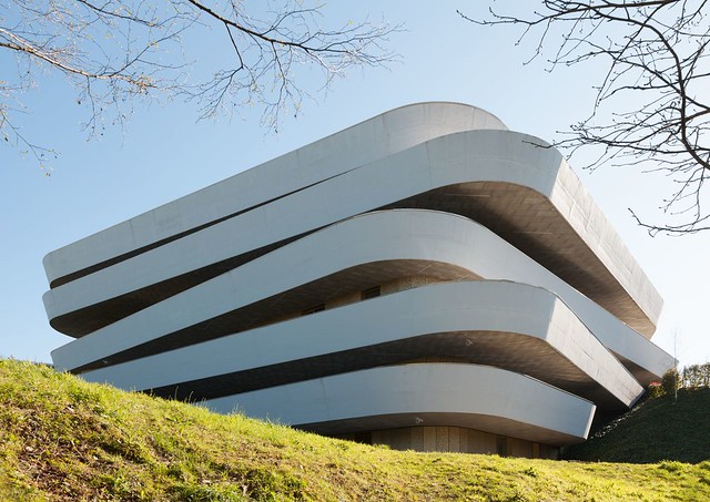
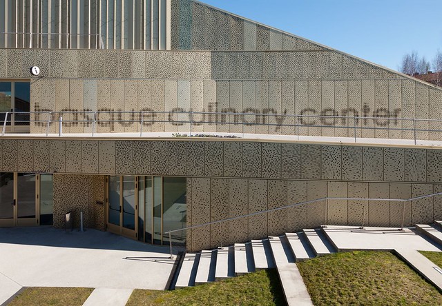
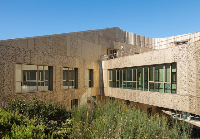
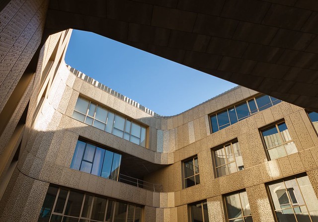
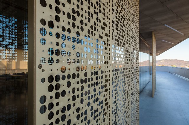
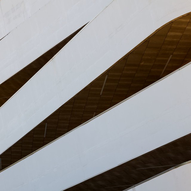
Here are some photos of the Basque Culinary Center in San Sebastián, Spain, by VAUMM (2011), photographed by Ximo Michavila. Back in 2012 I featured photos of the building's exterior and balconies, so the below photos focus on the interior.
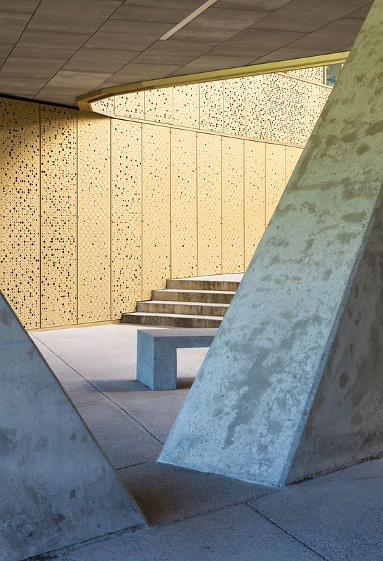

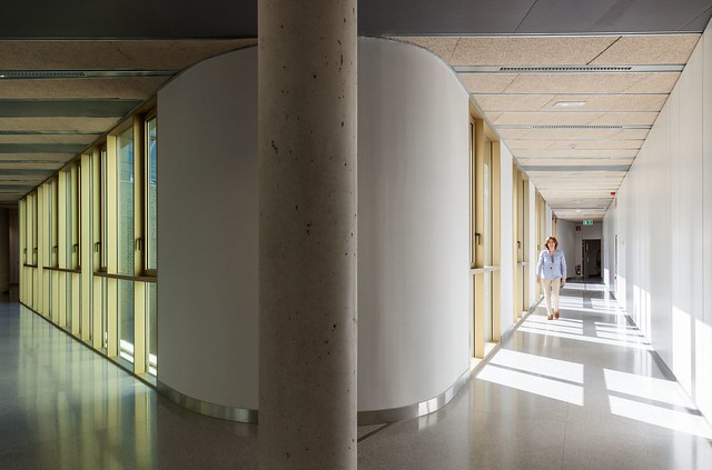
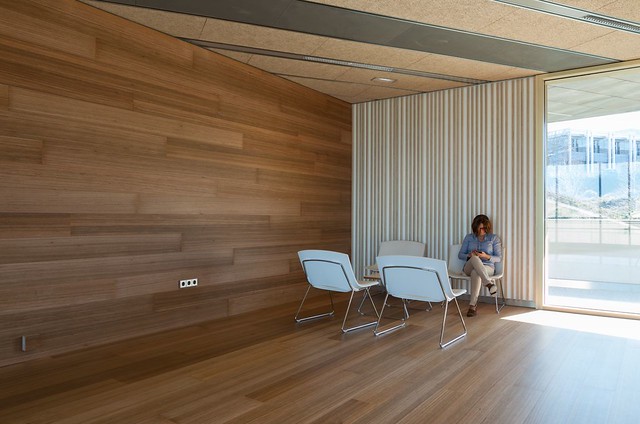
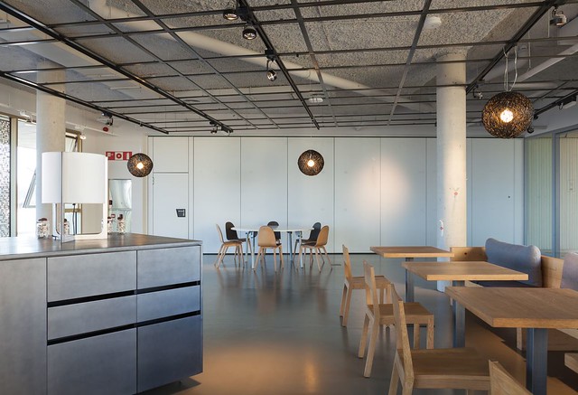
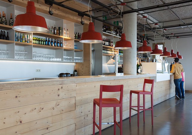
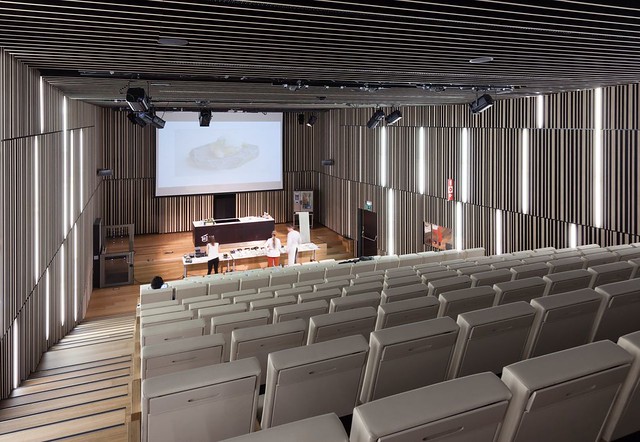
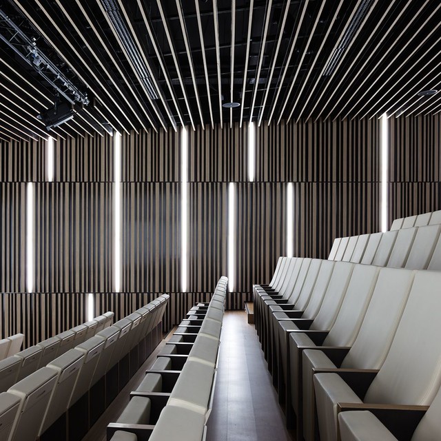
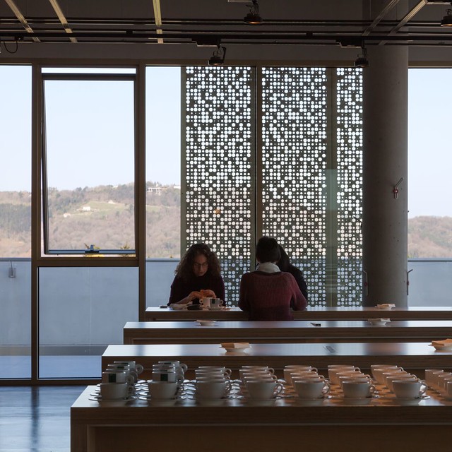
To contribute your Flickr images for consideration, just:


To contribute your Flickr images for consideration, just:
:: Join and add photos to the archidose pool, and/or
:: Tag your photos archidose
Mies Worship
Today would be Mies van der Rohe's 128th birthday. This year Google did not opt to "celebrate" it with a doodle, but they did so two years ago:

I probably wouldn't have taken notice of this anniversary either, except for two recent projects – one built, one a competition – that both reference Mies in different ways.
First is the Allianz Headquarters designed by Wiel Arets and just completed in Zürich:

Per the website of the architect who happens to now head the Mies's Illinois Institute of Technology: "This new district’s master plan mandated that all building façades be composed of natural stone, yet it was chosen to frit this building’s full glass façade with an abstracted pattern of Onyx marble–from Mies van der Rohe’s Barcelona Pavilion." (my emphasis)

The second project is OMA's winning design for the Axel Springer media center in Berlin. Announced on the firm's website today, the design that bested former OMA employees Bjarke Ingels and Ole Scheeren includes a photo of the model next to a drawing of Mies van der Rohe's famous Friedrichstrasse office building proposed for Berlin in 1922:

OMA's model appears to use the thick and wavy vertical lines of the all-glass triangular skyscraper as an image on its façade, much like Arets printed the Barcelona Pavilion's marble on the glass in Zürich. For decades, Mies influenced the forms of buildings, but if these projects are any indication, that influence has segued into graphics covering more complex (if still glass box) forms. These make me wonder if there is more "Mies worship" to come.
I probably wouldn't have taken notice of this anniversary either, except for two recent projects – one built, one a competition – that both reference Mies in different ways.
First is the Allianz Headquarters designed by Wiel Arets and just completed in Zürich:

Per the website of the architect who happens to now head the Mies's Illinois Institute of Technology: "This new district’s master plan mandated that all building façades be composed of natural stone, yet it was chosen to frit this building’s full glass façade with an abstracted pattern of Onyx marble–from Mies van der Rohe’s Barcelona Pavilion." (my emphasis)

The second project is OMA's winning design for the Axel Springer media center in Berlin. Announced on the firm's website today, the design that bested former OMA employees Bjarke Ingels and Ole Scheeren includes a photo of the model next to a drawing of Mies van der Rohe's famous Friedrichstrasse office building proposed for Berlin in 1922:

OMA's model appears to use the thick and wavy vertical lines of the all-glass triangular skyscraper as an image on its façade, much like Arets printed the Barcelona Pavilion's marble on the glass in Zürich. For decades, Mies influenced the forms of buildings, but if these projects are any indication, that influence has segued into graphics covering more complex (if still glass box) forms. These make me wonder if there is more "Mies worship" to come.
Book of the Moment: War of Streets and Houses
Not many graphic novels treat buildings and cities as an integral part of their stories, so I'm intrigued by War of Streets and Houses, a new graphic memoir from cartoonist and author Sophie Yanow.

[All images via Uncivilized Books]
Text from the publisher:


(via Atlantic Cities)
Available at

[All images via Uncivilized Books]
Text from the publisher:
The War of Streets and Houses is named after General Thomas Bugeaud's 19th century essay; the first manual for the preparation and conduct of urban warfare. The text greatly influenced Baron Haussmann’s famous re-development of Paris, and the planning of modern cities. In 2012 the author participated in the massive Montreal student strikes. In the midst of protesting crowds and police kettles, the military origins of urban planning suddenly became an undeniable reality. Sophie Yanow’s most ambitious work to date deftly melds the history of urban planning, theories of control with personal experiences of political activism.


(via Atlantic Cities)
Available at
Facades+ Performance
A couple years ago I attended the 2012 Facades Conference in New York City, what turned out to be a jam-packed day of design, technology and engineering focused on, naturally, facades. The 2014 conference, Facades+ Performance, takes place April 24 and 25 – the symposium on the 24th takes place in the CUNY Graduate Center's Proshansky Auditorium, and the workshops on the 25th are held at the Pratt Manhattan Campus. Click the image below for more information and to register for the event.


Today's archidose #743
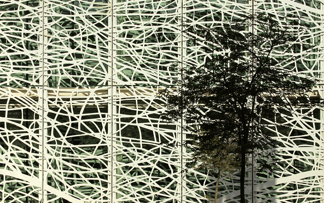
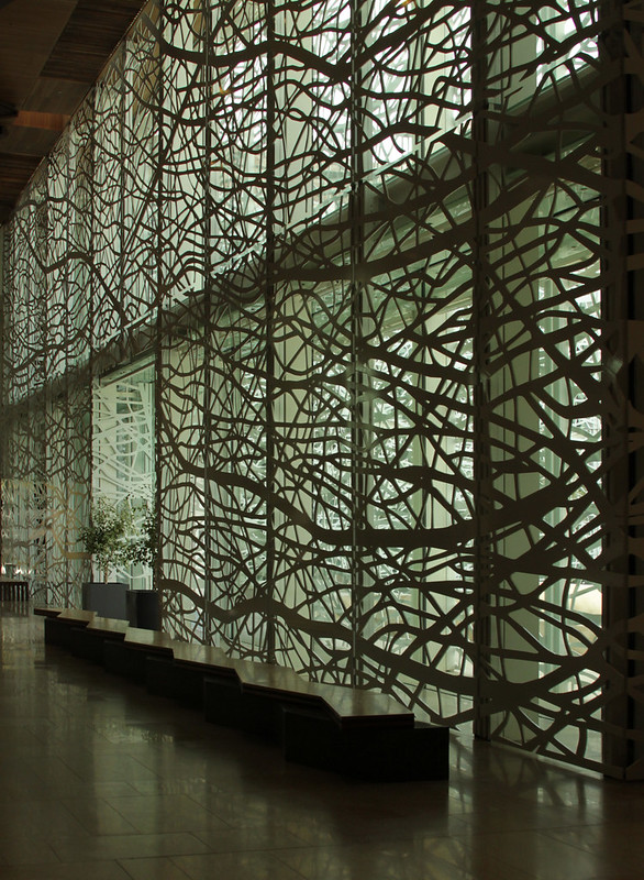
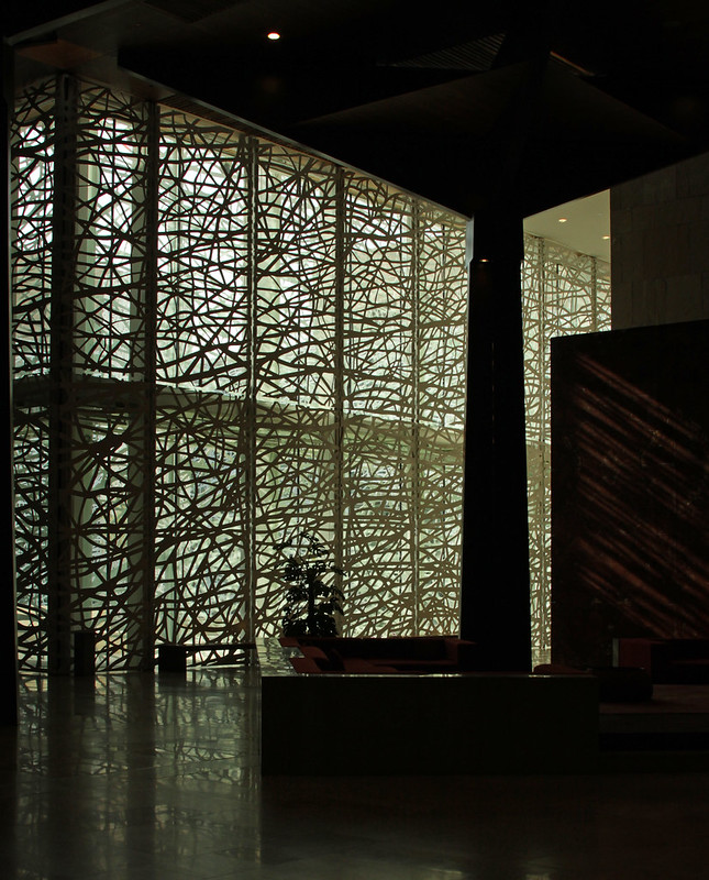
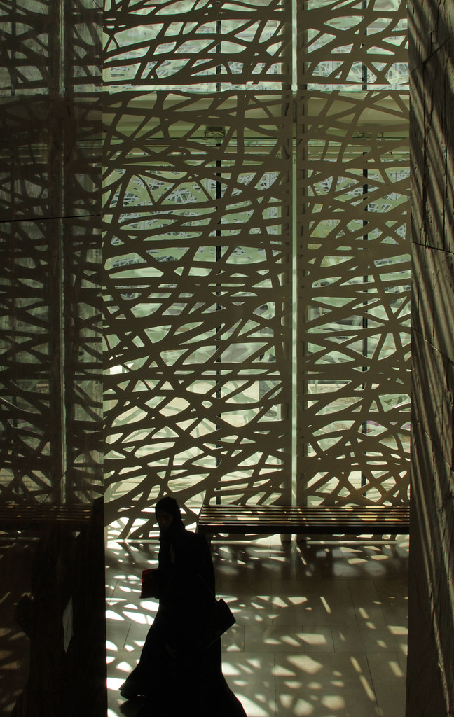
Here are some photos of the HBKU Student Center (2011) in Doha, Qatar, by Legorreta + Legorreta, photographed by Asli Aydin.
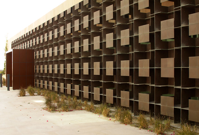
Central patio designed with Jan Hendrix.

To contribute your Flickr images for consideration, just:

Central patio designed with Jan Hendrix.


To contribute your Flickr images for consideration, just:
:: Join and add photos to the archidose pool, and/or
:: Tag your photos archidose
2014 Pritzker Architecture Prize: Shigeru Ban
Shigeru Ban is the 2014 Laureate of the Pritzker Architecture Prize.

Here's what I wrote at World-Architects on the award that was announced one hour ago:

Here's what I wrote at World-Architects on the award that was announced one hour ago:
Japanese architect Shigeru Ban has been selected as the 2014 Laureate of the prestigious Pritzker Architecture Prize. In a statement on the Pritzker Prize website, the award recognizes the architect's "elegant, innovative work for private clients" as well as the "resourceful design approach for his extensive humanitarian efforts." Both poles of Shigeru Ban's oeuvre are evident in two projects completed last year: Tamedia Office Building in Zürich and the Cardboard Cathedral in Christchurch, New Zealand. The former utilizes an innovative timber structure to create a pleasing office environment, while the latter serves as a temporary cathedral following the 2011 earthquake that damaged the Christchurch Cathedral. The official 2014 Pritzker Architecture Prize ceremony will take place at the Rijksmuseum, Amsterdam, on June 13.
Book of the Moment: Collage and Architecture
Over spring break I gave my first-year students an assignment to make a collage as part of a precedent study. If I had known about Jennifer A.E. Shields's Collage and Architecture, published in paperback last month by Routledge, I certainly would have used it to give them a little bit more guidance. Half the book, after all, is devoted to "collage methodologies in architectural analysis and design." The second half, in case you're wondering, includes six case studies, from Le Corbusier to Weiss/Manfredi, of "architecture as collage."

Text from the publisher:

Available at

Text from the publisher:
Collage and Architecture is the first book to cover collage as a tool for design in architecture, making it a valuable resource for students and practitioners. Author Jennifer Shields uses the artworks and built projects of leading artists and architects, such as Le Corbusier, Daniel Libeskind, and Teddy Cruz to illustrate the diversity of collage techniques. The six case study projects from Mexico, Argentina, Sweden, Norway, the United States, and Spain give you a global perspective of architecture as collage. Collage is an important instrument for analysis and design, and Shields’s presentation of this versatile medium draws on decades of relevance in art and architecture, to be adapted and transformed in your own work.Or maybe I'm just a sucker for a timeline chart (from the introduction, best viewed large):

Available at
Book Review: Materials for Design 2
Materials for Design 2 by Victoria Ballard Bell and Patrick Rand
Princeton Architectural Press, 2014
Paperback, 272 pages

Materials for Design was one of my favorite books I reviewed in 2007 (the book was published in 2006). In it, sixty case studies in five chapters (glass, concrete, wood, metals, and plastics) aim at strengthening the integral relationship between materials and design for students of architecture. The sequel, again penned by Bell and Rand, takes basically the same approach, adding masonry as a sixth chapter, but otherwise staying with the same format (and even the same tally of projects) that made the first book so good, all the while improving upon the few deficiencies of the first book (for me, that was mainly the inconsistent nature of the detail drawings).
The focus is still on educating students (some of the content came actually from a graduate seminar Rand taught at NC State University), but this time there is an awareness of the increasing popularity of design/build programs in American architectural schools as well as those abroad. There are Rural Studio, Studio 804, and design/buildLAB, to name just a few. But Studio 804 out of Lawrence, Kansas, is the only design/build program with a project in Materials for Design 2. This is too bad, not only considering the explicit reference to such programs in the book, but also because these academic programs are often laboratories for experimenting with materials. Think of early Rural Studio, such as the chapel made from car windshields, or almost any recent Solar Decathlon project, and material innovation is somewhere to be found.
The projects vary greatly in terms of geography, appearance, and how they creatively use their respective materials. The main consistency is a scale, as all of the buildings are quite small: ranging from a one-room pavilion in Basel to a seven-story office building in Copenhagen. This points to the fact small buildings offer room for experimentation with materials, since their scale does not require as great an investment as, say, a skyscraper, stadium or airport. Further, a number of the projects are temporary structures (making the Solar Decathlon omission glaring) – Thomas Heatherwick's UK Pavilion at the 2010 World Expo in Shanghai and the Italian Pavilion by Iodice Architetti at the same Expo, to name a couple – which signals the innovation opportunities that expos and other exhibitions allow.
The most welcome change from the first book is the addition of masonry as one of the material chapters. This is apparent even before opening the book, given how the glazed ceramic rods of Sauerbruch Hutton's Brandhorst Museum in Munich graces the cover. There are also traditional applications of brick as load-bearing walls, but this chapter alone shows the innovation that can happen in the make-up of the materials, how they are combined, and what sort of architecture they create. Not surprisingly, I lean toward the porous masonry walls of Anagram's South Asian Human Rights Documentation Center, Arturo Franco's Warehouse 8B Conversion, and Archi-Union's J-Office + Silk Wall. While one of the oldest materials, the contemporary uses of masonry show its design possibilities, like the materials in the rest of the book, are hardly exhausted.
Princeton Architectural Press, 2014
Paperback, 272 pages

Materials for Design was one of my favorite books I reviewed in 2007 (the book was published in 2006). In it, sixty case studies in five chapters (glass, concrete, wood, metals, and plastics) aim at strengthening the integral relationship between materials and design for students of architecture. The sequel, again penned by Bell and Rand, takes basically the same approach, adding masonry as a sixth chapter, but otherwise staying with the same format (and even the same tally of projects) that made the first book so good, all the while improving upon the few deficiencies of the first book (for me, that was mainly the inconsistent nature of the detail drawings).
The focus is still on educating students (some of the content came actually from a graduate seminar Rand taught at NC State University), but this time there is an awareness of the increasing popularity of design/build programs in American architectural schools as well as those abroad. There are Rural Studio, Studio 804, and design/buildLAB, to name just a few. But Studio 804 out of Lawrence, Kansas, is the only design/build program with a project in Materials for Design 2. This is too bad, not only considering the explicit reference to such programs in the book, but also because these academic programs are often laboratories for experimenting with materials. Think of early Rural Studio, such as the chapel made from car windshields, or almost any recent Solar Decathlon project, and material innovation is somewhere to be found.
The projects vary greatly in terms of geography, appearance, and how they creatively use their respective materials. The main consistency is a scale, as all of the buildings are quite small: ranging from a one-room pavilion in Basel to a seven-story office building in Copenhagen. This points to the fact small buildings offer room for experimentation with materials, since their scale does not require as great an investment as, say, a skyscraper, stadium or airport. Further, a number of the projects are temporary structures (making the Solar Decathlon omission glaring) – Thomas Heatherwick's UK Pavilion at the 2010 World Expo in Shanghai and the Italian Pavilion by Iodice Architetti at the same Expo, to name a couple – which signals the innovation opportunities that expos and other exhibitions allow.
The most welcome change from the first book is the addition of masonry as one of the material chapters. This is apparent even before opening the book, given how the glazed ceramic rods of Sauerbruch Hutton's Brandhorst Museum in Munich graces the cover. There are also traditional applications of brick as load-bearing walls, but this chapter alone shows the innovation that can happen in the make-up of the materials, how they are combined, and what sort of architecture they create. Not surprisingly, I lean toward the porous masonry walls of Anagram's South Asian Human Rights Documentation Center, Arturo Franco's Warehouse 8B Conversion, and Archi-Union's J-Office + Silk Wall. While one of the oldest materials, the contemporary uses of masonry show its design possibilities, like the materials in the rest of the book, are hardly exhausted.
Book Review: LC FOTO
LC FOTO: Le Corbusier Secret Photographer by Tim Benton
Lars Müller Publishers, 2013
Hardcover, 416 pages

Le Corbusier is easily one of the top three most written about modern architects, up there with Frank Lloyd Wright and Mies van der Rohe. A search for "Le Corbusier" in Amazon's books section yields 7,070 titles; if we safely say 10-120% of those books are by or about the Swiss/French architect, that's still around 1,000 titles (not to mention the additional titles that refer to him as Charles-Édouard Jeanneret rather than his pseudonym). Narrowing down the search by year, about 50 titles on or related to Le Corbusier came out last year, including this title by Tim Benton. What these numbers show is that any new publication on the architect must find a niche that has not been explored ad nauseam. Le Corbusier Redrawn and Cosmos of Light, two titles I reviewed last year, are cases in point; as is Benton's extremely detailed study of the Le Corbusier's photographic output.

Wait. Le Corbusier taking photos? While the architect's own books are populated with photographic evidence to support his arguments (think of the photos of cars alongside those of the Parthenon in Vers une Architecture), it's close to impossible to think of an example of Le Corbusier's own photos. Sketches, definitely, but not photos...except perhaps his "voyage d'orient" of 1911. And this is a sort of paradox, since in Corbu's time photography was a form of technology like cars and planes, something that he should have embraced over the old-fashioned method of drawing by hand. That he didn't says as much about Le Corbusier as it does about photography. As a tool for Le Corbusier they were more documentary-like, unable to express the subtleties of drawing or painting or his other means of expression.
Benton actually positions Le Corbusier's photos "between the professional architecture photograph and the pictorial travel picture...[belonging] to the genre of specialist photographs—those of geographers, engineers, archaeologists, and architects, who took photographs for particular reasons." Taking in the hundreds of photos collected in the book, it's hard not to agree with Benton's categorization. Corbu's photos are far from beautiful, yet they are more than simply "I was here" travel photos; there is clear intention in subject, framing and so forth, even if his techniques were not as refined as the rest of his output.

Benton's study is split into two sections, reflecting the two periods of Le Corbusier's life when he actively used cameras: "Jeanneret's First Photographic Campaign 1907-17" and "Le Corbusier, the Cinema, and Cinematographic Photography 1936-38." The first section is highly technical, focused on the cameras Le Corbusier experimented with and later abandoned, while the second section focuses on the places he went and people he traveled with more than the particulars of the cameras (though Benton does devote a few pages to the 16mm camera Corbu used). Chapters with text and thumbnail photos (second image above) alternate with larger photo spreads on black backgrounds (image above). Photos in the former are too small to grasp details, but many in the latter (enlargements of the thumbnails) are quite grainy, especially those blown up from 16mm films. Rounding out the study are QR codes prefacing many of the spreads, each one linked to short films that show Le Corbusier as enamored with the forms of nature as those of his industrial age.
Lars Müller Publishers, 2013
Hardcover, 416 pages

Le Corbusier is easily one of the top three most written about modern architects, up there with Frank Lloyd Wright and Mies van der Rohe. A search for "Le Corbusier" in Amazon's books section yields 7,070 titles; if we safely say 10-120% of those books are by or about the Swiss/French architect, that's still around 1,000 titles (not to mention the additional titles that refer to him as Charles-Édouard Jeanneret rather than his pseudonym). Narrowing down the search by year, about 50 titles on or related to Le Corbusier came out last year, including this title by Tim Benton. What these numbers show is that any new publication on the architect must find a niche that has not been explored ad nauseam. Le Corbusier Redrawn and Cosmos of Light, two titles I reviewed last year, are cases in point; as is Benton's extremely detailed study of the Le Corbusier's photographic output.

Wait. Le Corbusier taking photos? While the architect's own books are populated with photographic evidence to support his arguments (think of the photos of cars alongside those of the Parthenon in Vers une Architecture), it's close to impossible to think of an example of Le Corbusier's own photos. Sketches, definitely, but not photos...except perhaps his "voyage d'orient" of 1911. And this is a sort of paradox, since in Corbu's time photography was a form of technology like cars and planes, something that he should have embraced over the old-fashioned method of drawing by hand. That he didn't says as much about Le Corbusier as it does about photography. As a tool for Le Corbusier they were more documentary-like, unable to express the subtleties of drawing or painting or his other means of expression.
Benton actually positions Le Corbusier's photos "between the professional architecture photograph and the pictorial travel picture...[belonging] to the genre of specialist photographs—those of geographers, engineers, archaeologists, and architects, who took photographs for particular reasons." Taking in the hundreds of photos collected in the book, it's hard not to agree with Benton's categorization. Corbu's photos are far from beautiful, yet they are more than simply "I was here" travel photos; there is clear intention in subject, framing and so forth, even if his techniques were not as refined as the rest of his output.

Benton's study is split into two sections, reflecting the two periods of Le Corbusier's life when he actively used cameras: "Jeanneret's First Photographic Campaign 1907-17" and "Le Corbusier, the Cinema, and Cinematographic Photography 1936-38." The first section is highly technical, focused on the cameras Le Corbusier experimented with and later abandoned, while the second section focuses on the places he went and people he traveled with more than the particulars of the cameras (though Benton does devote a few pages to the 16mm camera Corbu used). Chapters with text and thumbnail photos (second image above) alternate with larger photo spreads on black backgrounds (image above). Photos in the former are too small to grasp details, but many in the latter (enlargements of the thumbnails) are quite grainy, especially those blown up from 16mm films. Rounding out the study are QR codes prefacing many of the spreads, each one linked to short films that show Le Corbusier as enamored with the forms of nature as those of his industrial age.
Today's archidose #742
Here are some photos of the EUROPEAN UNION PRIZE FOR CONTEMPORARY ARCHITECTURE – Mies van der Rohe Award 1988–2013 exhibition at DAM in Frankfurt, Germany, photographed by Frank Dinger.
D10 House by Werner Sobek:

Haus am Weinberg, Stuttgart, by UNStudio:

Barcelona Pavilion by Ludwig Mies van der Rohe:

Centre for Virtual Engineering ZVE by UNStudio:

Norwegian Wild Reindeer Pavilion by Snøhetta:

Metropol Parasol by J. Mayer H.:

Dune House by Jarmund / Vignaes Architects:

Strasbourg Hoenheim Tram Station by Zaha Hadid:

Bibliotheque Nationale de France by Dominique Perrault:

To contribute your Flickr images for consideration, just:
D10 House by Werner Sobek:
Haus am Weinberg, Stuttgart, by UNStudio:
Barcelona Pavilion by Ludwig Mies van der Rohe:
Centre for Virtual Engineering ZVE by UNStudio:
Norwegian Wild Reindeer Pavilion by Snøhetta:
Metropol Parasol by J. Mayer H.:
Dune House by Jarmund / Vignaes Architects:
Strasbourg Hoenheim Tram Station by Zaha Hadid:
Bibliotheque Nationale de France by Dominique Perrault:
To contribute your Flickr images for consideration, just:
:: Join and add photos to the archidose pool, and/or
:: Tag your photos archidose
Book Briefs #18: A Bunch of Journals
"Book Briefs" are an ongoing series of posts with two- or three-sentence first-hand descriptions of some of the numerous books that make their way into my library. These briefs are not full-blown reviews, but they are a way to share more books worthy of attention than can find their way into reviews on my daily or weekly pages.

1: Kerb 21 edited by Dion Gery, William Kennedy, Harriet Robertson, Bella Leber Smeaton | Melbourne Books | 2013
The first legal-to-drink issue of RMIT's Journal of Landscape Architecture is themed "Uncharted Territories." The editors explain that these "manifest in an uncertain future," and therefore the contributors are those who "have the capacity to charter these territories and operate within them." They even map the 23 contributors within a landscape-like surface (akin to the cover) that moves from "essence of discipline" to "proliferation of knowledge" in the x-direction and from "intentional" to "intuitive" in the y-direction. Most lie on the perimeter, leaving a hole in the center; this middle ground equates perhaps with those not comfortable with an uncertain future. Whatever the case, the essays, projects and interviews are wide-ranging in subject, so landscape architecture is represented, but so is art (most notably with Marina Abramović), fashion, technology, and even publishing. The issue gives landscape architecture students plenty of ammunition for laying out the course of their practices and potentially the future of the profession.
2: Soiled No. 4 - Windowscrapers edited by Joseph Altshuler | CARTOGRAM architecture+urban design | 2013
Windowscrapers is the fourth issue of the 'zine Soiled, following the appropriately titled Groundscrapers, Skinscrapers, and Platescrapers (issue five will be Cloudscrapers). Billed as "an architectural periodical that makes a mess of the built environment and the politics of space" and "a venue for architectural storytelling," Soiled is one of the freshest architectural publications I've come across in recent years. It has the editorial focus of another favorite MAS Context, balanced by the diversity of CLOG. In the case of Windowscrapers, transparency, refractivity and reflectivity are "probed" in essays, illustrations, stories and projects on voyeurism, (intellectual) slapstick comedy, window shopping, (creative) historic preservation, and art, among other things. It makes me curious how writers and architects will respond to "air-space as a site for occupation, manipulation, and activation" in the next issue.
3: (IN)formal LA: The Space of Politics edited by Victor J. Jones | eVolo publications | 2013 | Amazon
Technically a book rather than a journal, this title is the first non-skyscraper-competition book of hopefully many more from eVolo. It is a slim and handsome skinny book that originated from a 2011 workshop at the USC School of Architecture, organized by Stefano de Martino and Victor J. Jones, who edited the volume. A central portion of the book documents the workshop, set off from the other pages in yellow. The rest of the contents are essays, both old and new, all addressing Los Angeles's informality in some manner. Ironically, the book starts with its antithesis, the severe formal and institutional control of the Getty Center in Diane Ghirardo's "Invisible Acropolis," immediately moving to a more appropriate text culled from Roger Sherman's great book L.A. Under the Influence. Reyner Banham's well-known BBC documentary about the city is an inspiration for much of the proceedings, evident in the way the USC students left the studio for the city and the way the contributors prioritize firsthand experience over other accounts.

4: Boundaries n. 7: Free Architecture edited by Luc Sampò | Boundaries International Architectural Magazine | January - March 2013
What is "free architecture"? According to Boundaries editor-in-chief Luc Sampò it recalls "free software," which is the forerunner of the open-source movement, where code is shared amongst programmers rather than horded as proprietary. Most likely you are reading this blog post on a browser, like Firefox, that uses open-source software. Open-source, or free architecture follows the same principle: architects share designs that can be used around the world by whoever chooses to download the plans and build away. This runs counter to the typical semi-copyrighted nature of most architectural works, but the application to third-world and developing countries is obvious, something that comes across in the selection of projects gracing the pages of this issue, most of which are labelled with Creative Commons licenses.
5: Boundaries n. 8: Architecture and Utopia by Author | Publisher | April - June 2013
Where to go after "free architecture"? One logical step is into the realm of Utopia; after all, isn't open-source a Utopian ideal? Doesn't open-source break down political and social boundaries to promote architecture as a means of bettering people's lives? Not surprisingly, this issue is heavier on material outside of projects, unlike its predecessor. There is also research, photography, and manifestos. The latter (as well as a "year that was" paying tribute to Utopias of the 1960s) is a highlight of the issue, featuring responses by architects like Rintala Eggertsson and TYIN. Utopia is hardly the most popular topic in architectural discourse today (an introductory essay by Nathaniel Coleman discusses how architects like Zaha Hadid divorce their ideas of Utopia from political and social concerns, something much in the news recently), but it's not an idea that will go away, no matter how impossible the goal may be. As the gap between rich and poor increases, architects become more socially aware, and Utopia follows close behind.
6: a+u 2014:03: Supermodels by Hisao Suzuki | JA+U | February 2014
In 1982 Hisao Suzuki traveled from Japan to Spain, lured by the architecture of Antonio Gaudi. He stayed in Barcelona and has since been the principal photographer of El Croquis. His photographs involve visits to completed buildings but also to the offices of architects, where he often shoots architectural models. This handsome volume of A+U assembles a smattering of the 1,000 model photos Suzuki sent to the Japanese publication for consideration. Most of the models are by well-known architects, like the cover photo of the Prada Tokyo by Herzog and de Meuron. Likewise, most are lit by natural light, Suzuki's preferred means of lighting models. His stories accompanying the photographs are as rewarding as the consistently beautiful photos of the models themselves.

1: Kerb 21 edited by Dion Gery, William Kennedy, Harriet Robertson, Bella Leber Smeaton | Melbourne Books | 2013
The first legal-to-drink issue of RMIT's Journal of Landscape Architecture is themed "Uncharted Territories." The editors explain that these "manifest in an uncertain future," and therefore the contributors are those who "have the capacity to charter these territories and operate within them." They even map the 23 contributors within a landscape-like surface (akin to the cover) that moves from "essence of discipline" to "proliferation of knowledge" in the x-direction and from "intentional" to "intuitive" in the y-direction. Most lie on the perimeter, leaving a hole in the center; this middle ground equates perhaps with those not comfortable with an uncertain future. Whatever the case, the essays, projects and interviews are wide-ranging in subject, so landscape architecture is represented, but so is art (most notably with Marina Abramović), fashion, technology, and even publishing. The issue gives landscape architecture students plenty of ammunition for laying out the course of their practices and potentially the future of the profession.
2: Soiled No. 4 - Windowscrapers edited by Joseph Altshuler | CARTOGRAM architecture+urban design | 2013
Windowscrapers is the fourth issue of the 'zine Soiled, following the appropriately titled Groundscrapers, Skinscrapers, and Platescrapers (issue five will be Cloudscrapers). Billed as "an architectural periodical that makes a mess of the built environment and the politics of space" and "a venue for architectural storytelling," Soiled is one of the freshest architectural publications I've come across in recent years. It has the editorial focus of another favorite MAS Context, balanced by the diversity of CLOG. In the case of Windowscrapers, transparency, refractivity and reflectivity are "probed" in essays, illustrations, stories and projects on voyeurism, (intellectual) slapstick comedy, window shopping, (creative) historic preservation, and art, among other things. It makes me curious how writers and architects will respond to "air-space as a site for occupation, manipulation, and activation" in the next issue.
3: (IN)formal LA: The Space of Politics edited by Victor J. Jones | eVolo publications | 2013 | Amazon
Technically a book rather than a journal, this title is the first non-skyscraper-competition book of hopefully many more from eVolo. It is a slim and handsome skinny book that originated from a 2011 workshop at the USC School of Architecture, organized by Stefano de Martino and Victor J. Jones, who edited the volume. A central portion of the book documents the workshop, set off from the other pages in yellow. The rest of the contents are essays, both old and new, all addressing Los Angeles's informality in some manner. Ironically, the book starts with its antithesis, the severe formal and institutional control of the Getty Center in Diane Ghirardo's "Invisible Acropolis," immediately moving to a more appropriate text culled from Roger Sherman's great book L.A. Under the Influence. Reyner Banham's well-known BBC documentary about the city is an inspiration for much of the proceedings, evident in the way the USC students left the studio for the city and the way the contributors prioritize firsthand experience over other accounts.

4: Boundaries n. 7: Free Architecture edited by Luc Sampò | Boundaries International Architectural Magazine | January - March 2013
What is "free architecture"? According to Boundaries editor-in-chief Luc Sampò it recalls "free software," which is the forerunner of the open-source movement, where code is shared amongst programmers rather than horded as proprietary. Most likely you are reading this blog post on a browser, like Firefox, that uses open-source software. Open-source, or free architecture follows the same principle: architects share designs that can be used around the world by whoever chooses to download the plans and build away. This runs counter to the typical semi-copyrighted nature of most architectural works, but the application to third-world and developing countries is obvious, something that comes across in the selection of projects gracing the pages of this issue, most of which are labelled with Creative Commons licenses.
5: Boundaries n. 8: Architecture and Utopia by Author | Publisher | April - June 2013
Where to go after "free architecture"? One logical step is into the realm of Utopia; after all, isn't open-source a Utopian ideal? Doesn't open-source break down political and social boundaries to promote architecture as a means of bettering people's lives? Not surprisingly, this issue is heavier on material outside of projects, unlike its predecessor. There is also research, photography, and manifestos. The latter (as well as a "year that was" paying tribute to Utopias of the 1960s) is a highlight of the issue, featuring responses by architects like Rintala Eggertsson and TYIN. Utopia is hardly the most popular topic in architectural discourse today (an introductory essay by Nathaniel Coleman discusses how architects like Zaha Hadid divorce their ideas of Utopia from political and social concerns, something much in the news recently), but it's not an idea that will go away, no matter how impossible the goal may be. As the gap between rich and poor increases, architects become more socially aware, and Utopia follows close behind.
6: a+u 2014:03: Supermodels by Hisao Suzuki | JA+U | February 2014
In 1982 Hisao Suzuki traveled from Japan to Spain, lured by the architecture of Antonio Gaudi. He stayed in Barcelona and has since been the principal photographer of El Croquis. His photographs involve visits to completed buildings but also to the offices of architects, where he often shoots architectural models. This handsome volume of A+U assembles a smattering of the 1,000 model photos Suzuki sent to the Japanese publication for consideration. Most of the models are by well-known architects, like the cover photo of the Prada Tokyo by Herzog and de Meuron. Likewise, most are lit by natural light, Suzuki's preferred means of lighting models. His stories accompanying the photographs are as rewarding as the consistently beautiful photos of the models themselves.
Subscribe to:
Comments (Atom)