It was 1994 when Samuel Mockbee and D.K. Ruth started Auburn University's Rural Studio, an undergraduate design/build program in Western Alabama. Since then the participating third- and fifth-year students have designed and built innumerable houses and community projects for the residents of Hale County, Alabama, in the process becoming a model for other university design/build programs in the United States and other countries.
In conjunction with Rural Studio's anniversary, photographer Timothy Hursley "fired up the Alabama silo" last Friday:
[Photograph courtesy of Timothy Hursley. For more on the silo, watch "SoLost: The Beauty of a Broken Silo."]
This two-decade milestone also sees the publication of Rural Studio at Twenty, by current director Andrew Freear, Elena Barthel, Andrea Oppenheimer Dean, who penned the first two PAPress books on Rural Studio, and Hursley, who shot the studio's projects for all three books. A review of Rural Studio at Twenty will follow on this blog soon after its May 20 publication.
Lastly, this anniversary inspired me to profile the Rural Studio and nine other university design/build programs in the piece "Architecture Students Designing AND Building" for the World-Architects eMagazine. Rural Studio is certainly the most famous, but the piece also includes AA Design & Make, Studio 804, University of Tokyo's DFL, and Yale's Vlock Building Project, among others.
Deux Folies
Earlier today I received an email from Lesétablissements Tourneux in regards to their Lieu-Dit le Temple, a wooden temple in the archeological part of Bliesbruck, France.
It's an appealing construction in the vein of the folly in the landscape.
It has a strong presence at night, and it begs to be climbed.
But it's a far cry from their Astronef, a rocket-like construction in the castle Malbrouck à Manderen.
But what at first glance looks like a goof and arbitrary piece meant to shock...
...is very carefully placed, especially when seen from a distance:
And like the wooden folly, the rocket is a means of experiencing the landscape, in this case via a periscope.
It's hard to see each design coming from the same studio, but each folly is playful in its own way.
Today's archidose #751
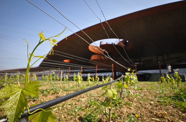
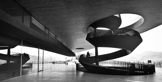
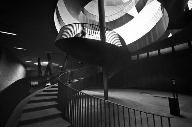
Here are some photos of Marchesi Antinori Winery (2012) in Bargino, San Casciano Val di Pesa, Italy, by Archea Associati, photographed by Marco Forgione. See my previous posts on the project from 2005, 2011, and 2012.
To contribute your Flickr images for consideration, just:
:: Join and add photos to the archidose pool, and/or
:: Tag your photos archidose
Book Review: Platform 6
GSD Platform 6 edited by Rosetta Elkin
Actar, 2014
Paperback, 368 pages
While every student from every architecture school probably thinks that each year they is deserving of a book that sums up the projects, lectures, exhibitions, events, seminars, publications, and other happenings, not that many schools are able to make it happen. In particular a few Ivy League schools come to mind: Columbia GSAPP's Abstract, Yale SOA's Retrospecta, and Harvard GSD's Platform (the successor to Studio Works). The latter is especially significant given its size (nearly 400 pages), its international distribution through publisher Actar, and the amount of material inside. A prospective student would no doubt be overwhelmed by the sheer amount of stuff happening at the Graduate School of Design as evidenced by the projects, transcripts, and personalities throughout.
Harvard GSD is not unique in needing to find an adequate book structure and graphic design to make sense of the multitudes of output. GSAPP's publications in recent years have been handled by star designer Stefan Sagmeister, who tends for bold statements like holes or an empty box. But Harvard opts for a simple approach that delineates the different work performed through subtle changes in color and graphic treatment. Gray pages signal lectures and publications, for example, and the color blue signals historical content. Unique moments happen with the essays that are printed on slightly smaller and lighter-weight green pages (spread above). The various types of output are interspersed to make the book most suitable for browsing; that is about the only way to go about it, since the book lacks a table of contents (it does have an index, though).
As a visually rich feast for browsing, Platform 6 does a great job of giving people a taste of what Harvard GSD is all about, at least within a particular school year. Yet for those looking to dig deeper they have to venture elsewhere. Tod Williams and Billie Tsien's Senior Loeb Scholar Lecture must have yielded plenty of valuable insight, but all we are treated to is a photo of Billie opposite four short quotes from the talk. This is one example of how the book covers just about everything that happened throughout the year without giving the reader more than just a taste. Only the green inserts really give the reader something substantial, and there are only four of them. Well, five actually, but the last one is by editor Rosetta Elkin on the complications of compiling one year of pedagogy into one volume!
Elkin's essay does elucidate some of the intent of how the book was structured and designed, but the page-to-page juxtapositions are quite subtle: Toyo Ito referencing metabolism on one page followed by "an architecture thesis that questions the autonomy of the urban dwelling" on the next followed by an urban planning project in Burkina Faso that proposes modular housing after that. Perhaps these relationships are a "tool for revealing emergent patterns that operate across public event, individual thesis, and global narrative," but I would not use the word "powerful" as Elkin does to describe it. Nevertheless, Elkin's words do point to the rewards that come with close reading of the school's consistently high-quality output documented in these pages.
Today's archidose #750
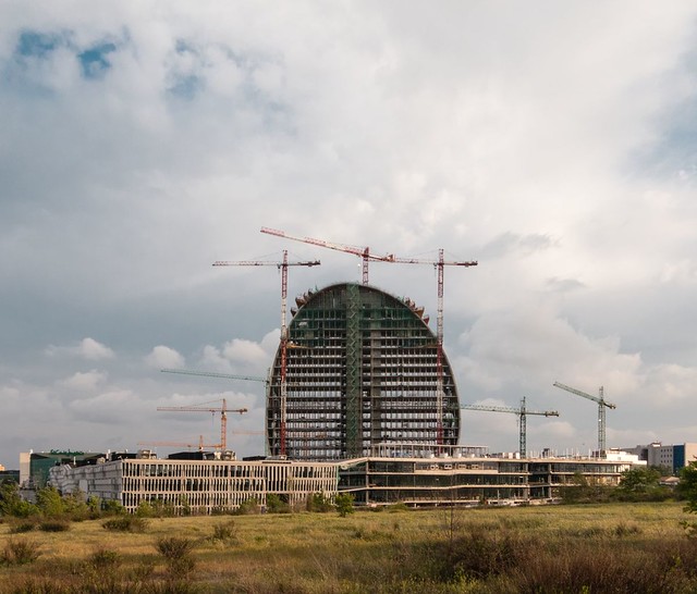
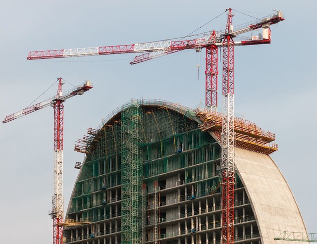
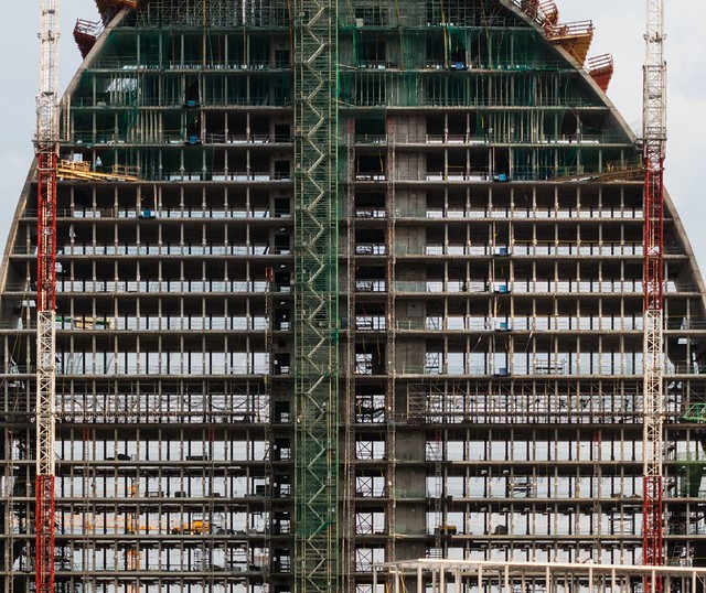
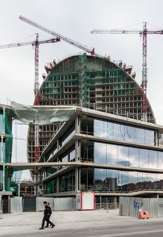
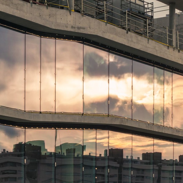
Here are some photos of New Headquarters for BBVA (2015) in Madrid, Spain, by Herzog & de Meuron, photographed by Ximo Michavila.
To contribute your Flickr images for consideration, just:
:: Join and add photos to the archidose pool, and/or
:: Tag your photos archidose
Memory, Authenticity, Scale, Emotion
On Tuesday, April 29, the team from Davis Brody Bond will discuss the design of the 9/11 Memorial Museum at The New School. Details are below.
Memory, Authenticity, Scale, Emotion: A Discussion with the Architects of the National 9/11 Memorial Museum
Tuesday, April 29, 2014 at 5:00 pm to 7:00 pm
The Auditorium at 66 West 12th Street, Alvin Johnson/J.M. Kaplan Hall
Join the lead design architects of the 9/11 Memorial Museum and scholars for a discussion of designing and building this new landmark museum located beneath the 9/11 Memorial at the World Trade Center in lower Manhattan in New York, due to open this May.
Architects from Davis Brody Bond will discuss the technically challenging and emotional task of building a museum to present and preserve the history and memories of the events of 9/11 and the challenges of translating the existing geometries of the site into a series of coherent spaces punctuated by surface, texture, and volume. A panel discussion with scholars will explore the four principles that guided the architects work: memory, authenticity, scale and emotion, and explore the larger global context of memorials and museums built or planned on the sites of traumatic events. A Q&A will follow.
Davis Brody Bond will be represented by partners Steven M. Davis, FAIA, Carl F. Krebs, AIA, and Mark Wagner, AIA, Associate Partner, who have been involved with the project since its inception in 2004. Steven Davis developed the Public Space Master Plan for the World Trade Center in 1992 and Carl Krebs was the Partner-in-Charge for Davis Brody Bond’s participation in the conception of the 9/11 Memorial. Davis Brody Bond is also part of the core team that designed the Smithsonian Institution’s National Museum of African American History and Culture, currently under construction on the National Mall in Washington, DC, and the Portico Galley at The Frick Collection in New York City completed in 2011.
The panel discussion includes Jonathan Bach, chair of the Global Studies Program at The New School; Marita Sturken, professor of Media, Culture and Communication at NYU and author of Tourists of History: Memory, Kitsch, and Consumerism from Oklahoma City to Ground Zero; and Brigitte Sion, co-organizer of the Transdisciplinary Project “The Politics of Memory in Global Context” at Columbia University’s Committee on Global Thought.
Sponsored by the Global Studies Program at The New School.
Free. No tickets or reservations required.
Peanuts Aloft
I've featured Swiss artists Zimoun a couple times before, and each time I see one of their installations made with cardboard boxes, cork balls and motors, I wonder what else they are capable of. A new avenue that achieves similar effects of sound and vision through aggregation and movement can be found in an installation at Art Museum Lugano:
Instead of cardboard and cork, Zimoun uses 36 ventilators and 4.7 cubic meters (166 cubic feet) of packing peanuts to create a bubbling, foamy presence in one of the museum's galleries. What's most interesting is that while previous installations used objects (cardboard boxes) to create spaces for sounds, this one fills an existing space with a medium that enables visitors to visualize the movement of air.
Today's archidose #749
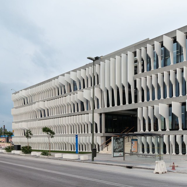
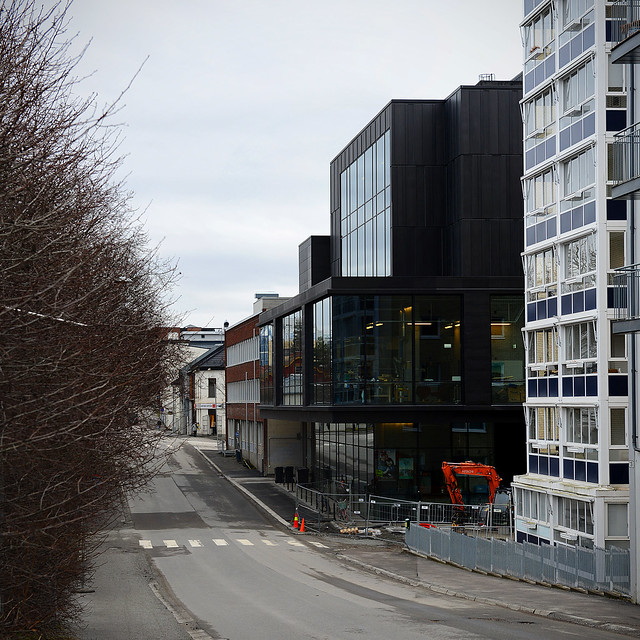
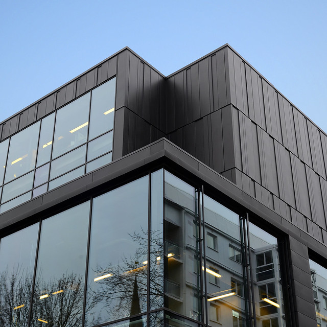
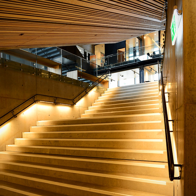
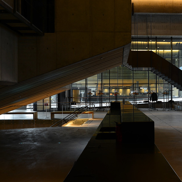
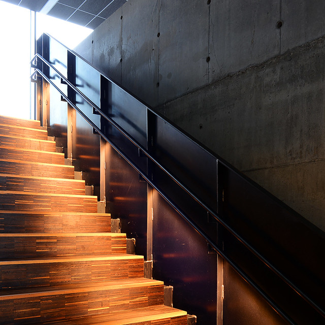
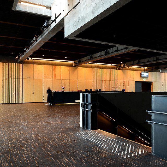
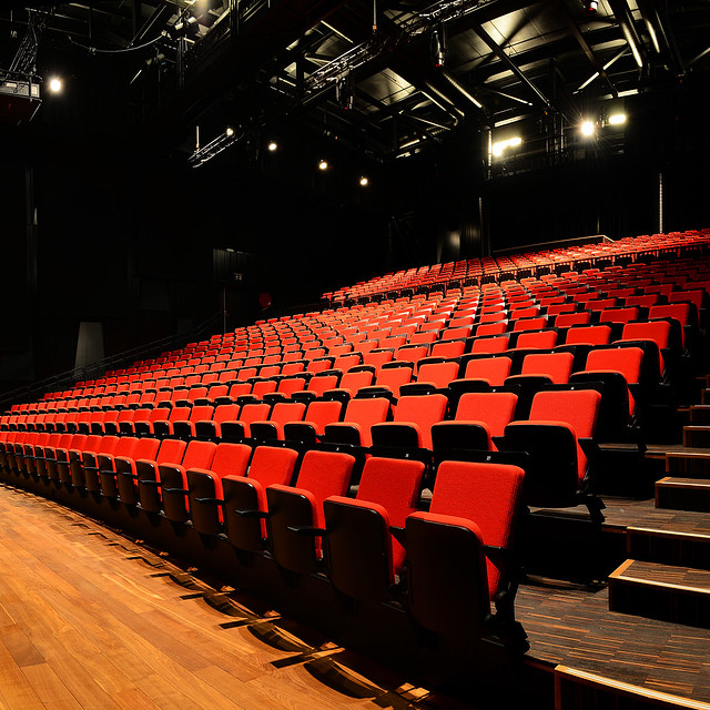
Here are some photos of Hamar Kulturhus (2014) in Hamar, Norway, by Tegnestuen Vandkunsten, photographed by Flemming Ibsen.
To contribute your Flickr images for consideration, just:
:: Join and add photos to the archidose pool, and/or
:: Tag your photos archidose
Book Review: The Vitra Campus
The Vitra Campus: Architecture – Design – Industry edited by Mateo Kries
Vitra Design Museum, 2014
Paperback, 200 pages
[Cover of German edition. All images are courtesy of Vitra Design Museum.]
When I traveled for a couple weeks after the completion of a semester in Italy in 1995, the first stop was in Weil am Rhein, Germany, to visit the Vitra Campus. Nowhere else in Europe could the density of contemporary architecture be found, particularly with buildings by Frank Gehry, Tadao Ando, and Zaha Hadid. Remember, this was in the days before Hadid won the Pritzker and had buildings opening at the rate of something like one per month. Yes, my friends and I missed the tour of the Fire Station literally by two minutes, but the experience of Gehry's Design Museum and Ando's Conference Center was enough to make the visit worthwhile.
Just shy of 20 years later I was able to return to Weil am Rhein, and in the intervening years the campus of factory and public buildings has been joined by Herzog & de Meuron's VitraHaus, a circular factory building by SANAA, and numerous small structures by R. Buckminster Fuller, Jean Prouvé, and Renzo Piano. These additions continue what started in 1981, when Vitra was forced to rebuild after a major fire destroyed about half of its facilities. In retrospect it makes a lot of sense that a company focused on furniture designed by important names would hire well-known architects to design their new buildings. That the place would become an important archi-tourist site in the middle of Western Europe (with a world-class design museum creating great exhibitions like Louis Kahn: The Power of Architecture, to boot) might not have been foreseen, but that fact justifies this new book from the Vitra Design Museum.
The first thing one sees when opening the cover is a simplified map of the campus with labeled buildings in gray against a white background. This map on the inside of the front cover folds out to reveal a timeline that continues to the inside of the back cover. So even before delving into book's introduction or its foreword, one has a handle on the geography and built history of Vitra; an understanding that does not require even a visit. Inside, the projects are found chronologically with color photos, brief descriptions, and a short bio and list of important projects on their creators. At the end of the book is Hubertus Adam's interview with Rolf Fehlbaum, Vitra's manager at the time of the fire and the main instigator of the campus's vision. Appropriately the interview is titled "The Client as Curator."
While the interview with Fehlbaum provides some valuable insight on the shaping of the campus, the rest of the book is not particularly deep. But it doesn't need to be. The book acts as a guide to the campus, but it is also a memento for those who were able to visit and a celebration for a company that has used architecture to extend its appeal and create a place the public can actually visit, unlike most factories. Some of the best illustrations are the photographs that depict the spaces where the public may not venture, such as the factory floor of the SANAA building; even more of these types of behind-the-scenes shots would have been welcome. After all architecture has the double role of making places (exteriors) and shaping spaces (interiors). This book captures how Vitra has embraced that role in the last 30+ years through a diverse assemblage of buildings.
A Virtual Visit to DDP
Wanted to visit Zaha Hadid's Dongdaemun Design Plaza but don't think you'll make it to Seoul anytime soon?
Then hop on over to Google Maps and browse through the building through the interior street views.
Here's a smattering of the building's mainly empty, white, and curvy interiors.
Then hop on over to Google Maps and browse through the building through the interior street views.
Here's a smattering of the building's mainly empty, white, and curvy interiors.
BBP's Berm
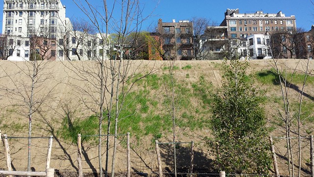
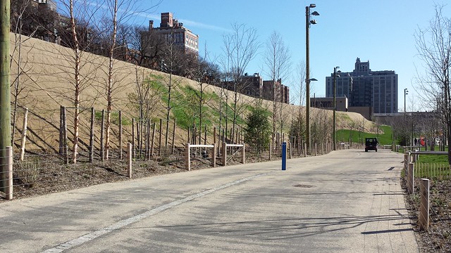
It's been a while since I've been to Brooklyn Bridge Park, so a couple days ago I was surprised to see the planned berm blocking out the noise of the BQE has been constructed:
Even more surprising is just how well it works. When walking on the path alongside the berm, the sound of the three stacked lanes of traffic is completely nonexistent. It's amazing.
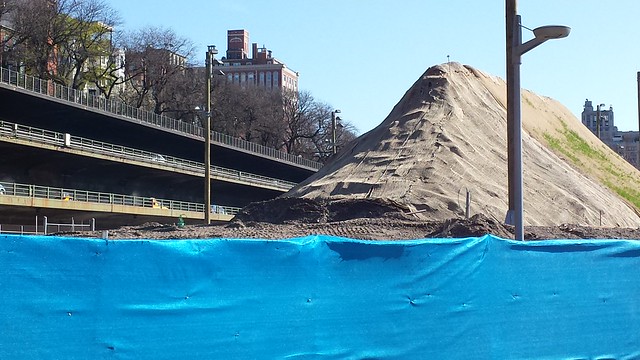
Though it's also amazing to grasp the scale of the berm at the southern end, where the noise of traffic resumes:
Even more surprising is just how well it works. When walking on the path alongside the berm, the sound of the three stacked lanes of traffic is completely nonexistent. It's amazing.
Though it's also amazing to grasp the scale of the berm at the southern end, where the noise of traffic resumes:
Lebbeus Woods, Architect
[Conflict Space, 2006 – All photos of the exhibition at The Drawing Center by John Hill.]
There is something appealing about cycles, about the sun rising and setting, the changing of the seasons, the earth rotating about its axis as it revolves around the sun, even the way some of the best narratives seem to come full circle on themselves. The life of Lebbeus Woods (1940-2012) is a remarkable cyclical composition when seen relative to the oldest and most recent pieces in the exhibition Lebbeus Woods, Architect, opening today at The Drawing Center in SoHo. First is Einstein Tomb, which was published as Pamphlet Architecture #6 (the long out-of-print title is available at The Drawing Center as part of the exhibition) in 1980.
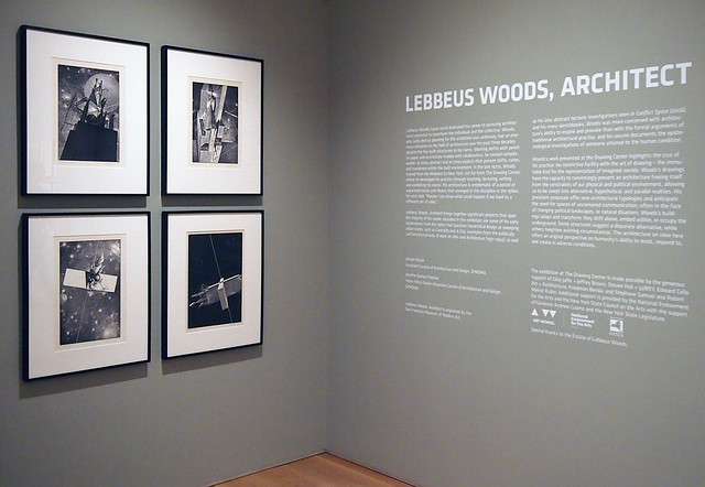
[Einstein Tomb, 1980]
Through words and drawings Woods speaks in PA#6 about Einstein's world-changing view of the universe as "a warp of finite duration and boundary yet of infinite renewal and continuity." Woods finds the circle to be the form of the Eisensteinian universe, as it "creates the epicycles of day, month, year, and millennium," while also tapping into the mystical realm of Cabala. Through this view Woods designs a tomb whose form "has always been known" and which we can envision spinning infinitely about its axis. Woods describes the tomb as "a vessel journeying outward on a beam of light," as poetic an epitaph as can be imagined.
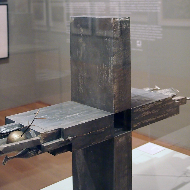
[Einstein Tomb, 1980]
[Einstein Tomb, 1980]
PA#6 was published in 1980 with Steven Holl, whom Woods met some years before and pitched the idea for the project while at a diner not far from The Drawing Center, in the downtown neighborhood where Woods lived. Thirty years after Einstein Tomb, Woods and Holl collaborated (with Christoph a. Kumpusch) on what would become Woods's last major project and his only full-scale, permanent work: The Light Pavilion.
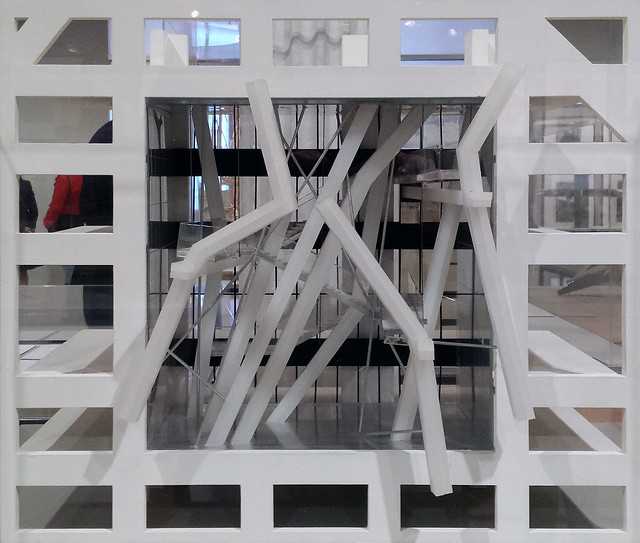
[Light Pavilion, 2011]
The pavilion is set into a four-story-high space carved from Holl's huge Sliced Porosity Block project in Chengdu, China. Three decades after Einstein Tomb, it's clear that Woods was still infatuated with science, especially the notion of "a beam of light." The piece appears to capture the moment of light/energy's creation, solidifying it in glass, polycarbonate, and steel. So from 1980 to 2011 in these two projects, Woods's life came full circle through the preoccupations of its creator, his collaborations, and the stories he endeavored to tell through drawings, models, writings, exhibitions, teaching, and lecturing.
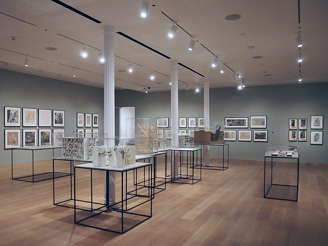
It's important to point out the various media (drawings, models, words, etc.) through which Woods explored his designs, for while he is known primarily as an illustrator that label is limiting. It is telling that curators Joseph Becker and Jennifer Dunlop Fletcher chose the title Lebbeus Woods, Architect – rather than, say, Lebbeus Woods, Illustrator – for the exhibition that started at SFMOMA and traveled to the Broad Art Museum before arriving in Woods's home city.
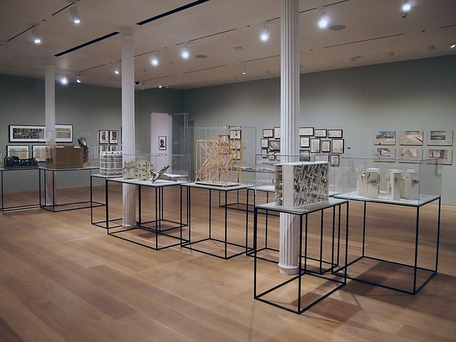
Woods may not have realized buildings like others called "architect," but he explored the shaping of form, space, and light through drawings, models and words, as well as through his work in academia, just like other architects. He did not just draw amazing pictures (though he was often paid early in his career to do just that); he imagined worlds that arose from life-changing ideas in science and philosophy, from the destruction of natural disaster and warfare, and generally from the conditions of the modern world where other architects dared not tread.
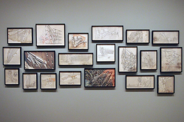
[High Houses and Sarajevo, from War and Architecture, 1993]
According to The Drawing Center, "Woods worked cyclically, returning often to themes of architecture's ability to transform, resist, and free the collective and the individual." Therefore it makes sens that the curators "provide a thematic, rather than chronological, framework for understanding the experimental and timeless nature of Woods's work." Clusters of drawings like those above and below illustrate how these themes and projects are experienced in the exhibition.
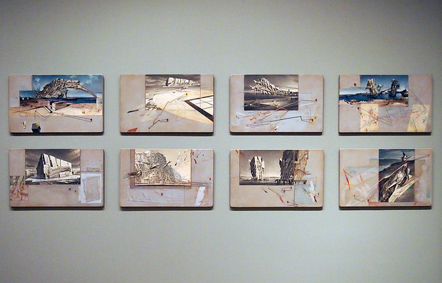
[San Francisco: Inhabiting the Quake, 1995]
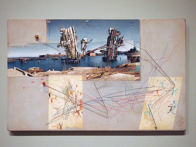
[Shard House, from San Francisco: Inhabiting the Quake, 1995]
A cyclical reading of Woods's career makes sense, given his consistently sure hand and distinctive form-making. He applied the themes and lessons of each project to others like a feedback loop rather than in a linear fashion; or at least that's the sense I get from absorbing his drawings and the models he developed with his collaborators. The projects he worked on during the immensely productive three decades from around 1980 until his death (before that he worked for Eero Saarinen and Kevin Roche in the 1960s and had a private practice in the 1970s) are akin to the epicycles of the Einsteinian universe.
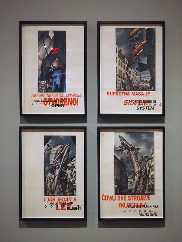
[Zagreb Free Zone, 1991]
[Zagreb Free Zone, 1991]
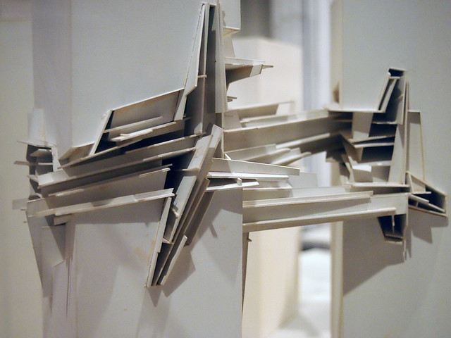
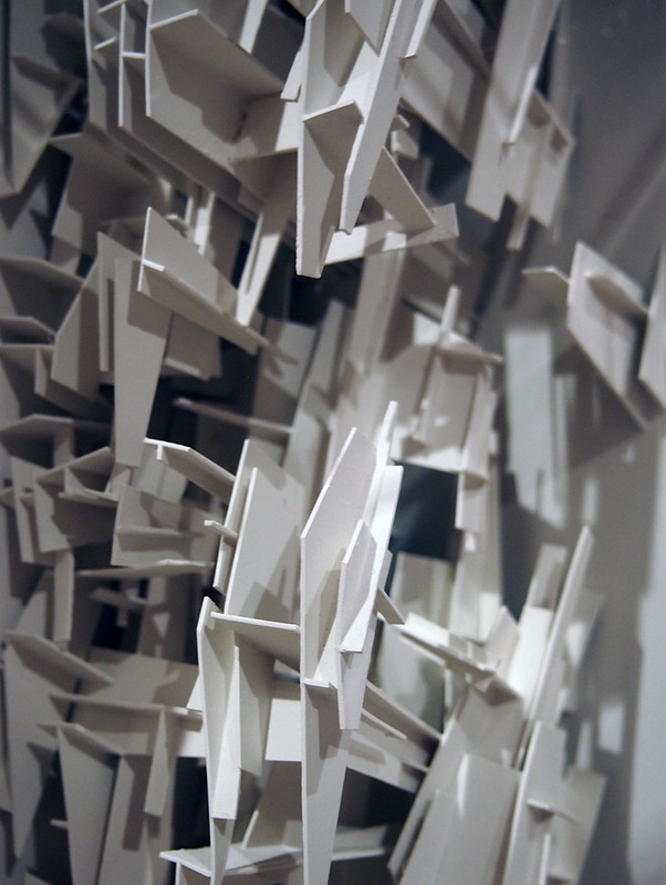
That the third and final leg of Lebbeus Woods, Architect is at The Drawing Center makes total sense, not only because Woods lived in New York City, but because the institution focuses on that overlooked media of art: drawing. Yet even though Woods is easily one of the best architectural delineators of the last 100 years, as mentioned earlier he did not draw at the expense of explorations in other media. It's then worth highlighting the models he built with talented model builders, each given credit in the exhibition, whose central area by the cast-iron columns is loaded with models in vitrines.
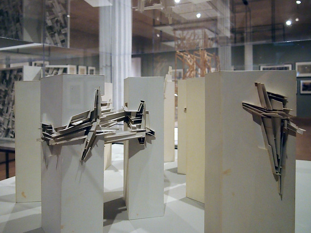
[Nine Reconstructed Boxes, 1999]
[Nine Reconstructed Boxes, 1999]
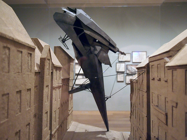
In particular I'm amazed by the model Terrain that Woods built with Dwayne Oyler, an old classmate of mine and one-half of Oyler Wu Collaborative. The valise-like model, which is now in the MoMA collection, is located in a prominent location near the front door of The Drawing Center. At the opening reception last night, I noticed many people immediately drawn to the model rather than the large drawings or introductory text on the nearby walls.
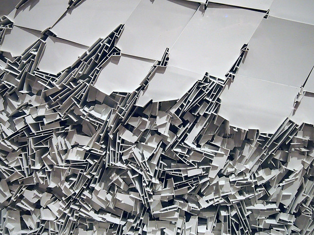
[Terrain, 1999]
[Terrain, 1999]
I recall visiting NYC in the late 1990s with some fellow classmates and seeing the model in progress in Dwayne's tiny SoHo apartment. The skill and patience infused in such a complex design is obvious, but it and other models and makers should be commended for being able to turn Woods's 2-D drawings into 3-D models – no easy feats, but I'd wager eminently rewarding ones.
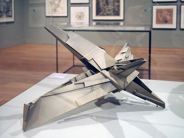
[Star House, 1996]
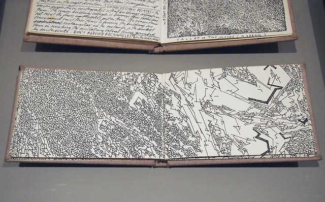
A third aspect of the exhibition – in addition to the illustrations and models – are the in-progress drawings found in the sketchbooks that recorded Woods's thoughts and doodles. On display under glass in vitrines, the first thing one notices is the consistent format of the sketchbooks, something again in common with Steven Holl, whose well-known watercolors are organized methodically in his office. Woods favored a small, landscape-oriented sketchbook with a linen cover, but as can be seen he often ignored the fold and let drawings extend from one page to the next.
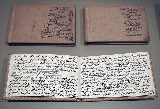
[Sketchbooks, 1999-2000]
[Sketchbooks, 1999-2000]
This last photo, a sketch from Nine Reconstructed Boxes, is one of the oddest pieces in the exhibition, for the polish of Woods's final drawings and even his sketchbooks is marred by some coffee stains. Yes, every drawing and model respectively exhibits the hands of Woods and his collaborators, but this sketch reveals the accident, the all-too-human occurrence that has happened to all of us at one time or another. More important than the fact the spill happened is the fact it remains, that the sketch was not thrown away and started over on clean paper.
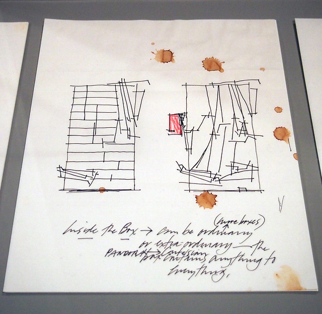
[Sketch from Nine Reconstructed Boxes, 1999]
Yet we can find in these coffee stains as much about what Woods devoted his life to as in the ink of his imagined places. For his designs were ultimately about freedom and humanity in the face of, per the curators, "contemporary political, social, and ideological conditions, and how one person contributes to the development and mutation of the built world." His contribution is felt all the more strongly as we imagine Woods over his paper with pen in one hand and coffee in the other.
Subscribe to:
Posts (Atom)