
In Chicago
If you've been wondering why I haven't posted in some days, it's because I'm in Chicago covering the AIA Convention for World-Architects. Posts should return to normal next week.


Today's archidose #761
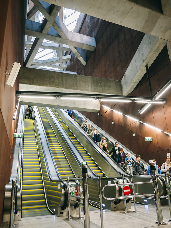
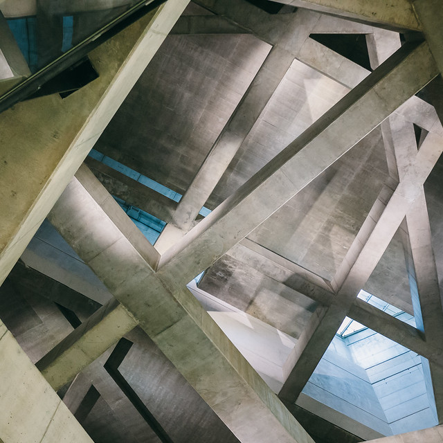
Here are some photos of the M4 FŐVÁM STATION (2010) in Budapest, Hungary, by Spora Architects, photographed by A.P.

To contribute your Flickr images for consideration, just:


To contribute your Flickr images for consideration, just:
:: Join and add photos to the archidose pool, and/or
:: Tag your photos archidose
Book Review: Architectural Guide Venice
Venice Architectural Guide: Buildings and Projects After 1950 by Clemens F. Kusch and Anabel Gelhaar
DOM Publishers, 2014
Paperback, 280 pages

I've reviewed a number of architectural guides from Berlin's DOM Publishers (Japan, Taiwan, Pyongyang), but not until recently was I able to use one as properly designed – as a companion to traversing a city when in that city. Such is the case with Venice, when I took the publisher's latest book with me to the opening of Rem Koolhaas's much-anticipated Biennale. Before delving inside it's worth pointing out that, like DOM's other architectural guides, the book is tall and slender – hardly small but still portable, as it's not too thick, like certain guidebooks.

The book is organized into nine color-coded, geographical sections (well, actually eight are geographical, since the ninth is devoted to a "hypothetical Venice" that is scattered throughout the city) that are visible on a map in a fold-out behind the front cover. The back-cover fold-out includes a handy map of the Actv (water bus) network. At the start of each section are thorough maps (above) that locate the buildings in the guide but also recommended a route for seeing them. If any city is deserving of such routes it's Venice, where getting lost is the norm. (That said, there is value in leaving the guidebook in the hotel on some days so as to actually get lost and discover new things, one of the joys of being in Venice.)

One big difference between the Architectural Guide Venice and other DOM guides I've reviewed is the inclusion of aerial photographs (above) – lots of them. Each chapter has at least two or three, each with certain landmarks (not necessarily post-1950 projects in the guide) highlighted. These aerials do not function like the maps, aiding navigation through the maze that is Venice, but nevertheless they are helpful in understanding the extents of each section through their edges, be it the Grand Canal or the Guidecca Canal, for example. And of course it's just fun to look at the aerials to survey the mind-boggling complexity and beauty of Venice from above.

The authors acknowledge that there is a glut of guidebooks on Venice, but none of them to date have focused on architecture in the modern era. Doing so may seem like an odd choice in Venice, given that most of what is seen on a visit is old – turn a corner from one street lined with old buildings to another street and you'll find more old buildings. Regardless of this fact, there are plenty of post-1950 gems in the city, be it interior renovations (Carlo Scarpa's numerous projects and Tadao Ando's work for Palazzo Grassi (above) are two notable examples) or the many freestanding buildings in the Giardini (below) and the Guidecca, where Cino Zucchi has designed many apartment buildings.

The grounds of the Venice Biennale – the Giardini – are highlighted on yellow pages in chapter five, acknowledging the importance of this event (alternating art Biennales in odd years and architecture Biennales in even years, with cinema, dance, music, theatre interspersed throughou) in the cultural life of the city. A detailed map showing all of the national pavilions in the Giardini (even the ones done before WWII) is a helpful addition for those who visit, as I did on my first trip to this somewhat removed area, when the Biennale is not in session.

The ninth and last chapter, as mentioned, focuses on"hypothetical Venice." The other eight chapters include projects that are in progress, but this one shows us notable projects that never happened. The above spread highlights the unsuccessful attempts of Frank Lloyd Wright and Le Corbusier to erect substantial edifices in the city. Their luck is echoed by architects today, who must venture to the mainland (Sauerbruch Hutton's M9) or another island (David Chipperfield's San Michele expansion) to do something more than interior renovations or small interventions.
All tolled, this is easily the best architectural guide that DOM has yet to publish, since it is so thorough in orienting the reader/visitor to the joys of Venice, be it the modern projects or its historical fabric. The best guidebooks are those that take into account how they will be used when "in location," and this one does it so well that it should be a model for other authors tackling other cities, be it for DOM or other publishers. Yes, much of the best qualities of the book arise from the specific circumstances of Venice, but the general approach and apparent joy the authors had in finding the best format for exploring the city are definitely worth exporting.
DOM Publishers, 2014
Paperback, 280 pages

I've reviewed a number of architectural guides from Berlin's DOM Publishers (Japan, Taiwan, Pyongyang), but not until recently was I able to use one as properly designed – as a companion to traversing a city when in that city. Such is the case with Venice, when I took the publisher's latest book with me to the opening of Rem Koolhaas's much-anticipated Biennale. Before delving inside it's worth pointing out that, like DOM's other architectural guides, the book is tall and slender – hardly small but still portable, as it's not too thick, like certain guidebooks.

The book is organized into nine color-coded, geographical sections (well, actually eight are geographical, since the ninth is devoted to a "hypothetical Venice" that is scattered throughout the city) that are visible on a map in a fold-out behind the front cover. The back-cover fold-out includes a handy map of the Actv (water bus) network. At the start of each section are thorough maps (above) that locate the buildings in the guide but also recommended a route for seeing them. If any city is deserving of such routes it's Venice, where getting lost is the norm. (That said, there is value in leaving the guidebook in the hotel on some days so as to actually get lost and discover new things, one of the joys of being in Venice.)

One big difference between the Architectural Guide Venice and other DOM guides I've reviewed is the inclusion of aerial photographs (above) – lots of them. Each chapter has at least two or three, each with certain landmarks (not necessarily post-1950 projects in the guide) highlighted. These aerials do not function like the maps, aiding navigation through the maze that is Venice, but nevertheless they are helpful in understanding the extents of each section through their edges, be it the Grand Canal or the Guidecca Canal, for example. And of course it's just fun to look at the aerials to survey the mind-boggling complexity and beauty of Venice from above.

The authors acknowledge that there is a glut of guidebooks on Venice, but none of them to date have focused on architecture in the modern era. Doing so may seem like an odd choice in Venice, given that most of what is seen on a visit is old – turn a corner from one street lined with old buildings to another street and you'll find more old buildings. Regardless of this fact, there are plenty of post-1950 gems in the city, be it interior renovations (Carlo Scarpa's numerous projects and Tadao Ando's work for Palazzo Grassi (above) are two notable examples) or the many freestanding buildings in the Giardini (below) and the Guidecca, where Cino Zucchi has designed many apartment buildings.

The grounds of the Venice Biennale – the Giardini – are highlighted on yellow pages in chapter five, acknowledging the importance of this event (alternating art Biennales in odd years and architecture Biennales in even years, with cinema, dance, music, theatre interspersed throughou) in the cultural life of the city. A detailed map showing all of the national pavilions in the Giardini (even the ones done before WWII) is a helpful addition for those who visit, as I did on my first trip to this somewhat removed area, when the Biennale is not in session.

The ninth and last chapter, as mentioned, focuses on"hypothetical Venice." The other eight chapters include projects that are in progress, but this one shows us notable projects that never happened. The above spread highlights the unsuccessful attempts of Frank Lloyd Wright and Le Corbusier to erect substantial edifices in the city. Their luck is echoed by architects today, who must venture to the mainland (Sauerbruch Hutton's M9) or another island (David Chipperfield's San Michele expansion) to do something more than interior renovations or small interventions.
All tolled, this is easily the best architectural guide that DOM has yet to publish, since it is so thorough in orienting the reader/visitor to the joys of Venice, be it the modern projects or its historical fabric. The best guidebooks are those that take into account how they will be used when "in location," and this one does it so well that it should be a model for other authors tackling other cities, be it for DOM or other publishers. Yes, much of the best qualities of the book arise from the specific circumstances of Venice, but the general approach and apparent joy the authors had in finding the best format for exploring the city are definitely worth exporting.
A Visit to the 9/11 Museum, Part 2
A few weeks ago I started compiling my photos and impressions from my opening-day visit to the 9/11 Memorial Museum, focusing on Snøhetta's above-ground entry pavilion in Part 1. Although it took me more than "a few days" to continue, here is Part 2 on Davis Brody Bond's below-grade museum.
[All photographs by John Hill]
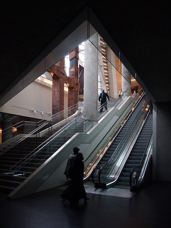
As mentioned at the end of Part 1, there is a distinct impression of moving from light to dark in descending the stairs or escalator next to the Twin Towers' rusty tridents that anchor one end of the entry pavilion. That sensation is somewhat tangible in the above photo, looking from the museum's lobby level back to the pavilion.
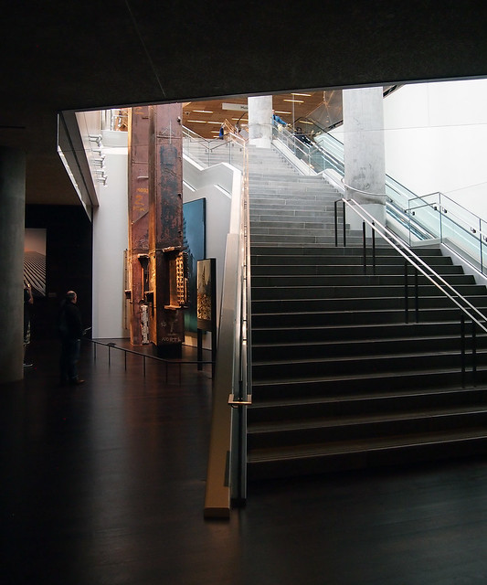
Once descending to the lobby level, it's natural to want to see the base of the tridents, which are placed adjacent to the stairs; the steps flare around the tridents, as if to embrace them or as if they're carved away to make room for the uprights.
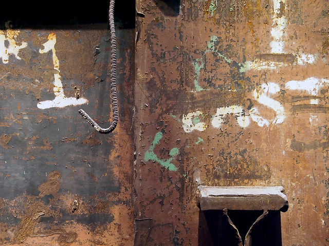
Up close (photo above) the tridents bear the marks of time, destruction (the mangled rebar, in particular), and people.
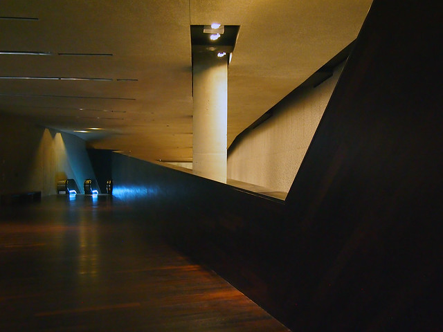
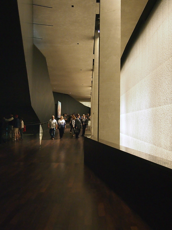
The level that the stairs deliver us to is the Concourse Lobby, which is an information desk, coat check, a group meeting area, and the museum store (more on that later). The lobby's floors, walls, and ceiling are dark, but, just like the stairs are bent around the tridents, the walls are cut to reveal lighter, illuminated walls beyond. As we'll discover in our journey, these are the walls of the memorial pools, the footprints of the Twin Towers.
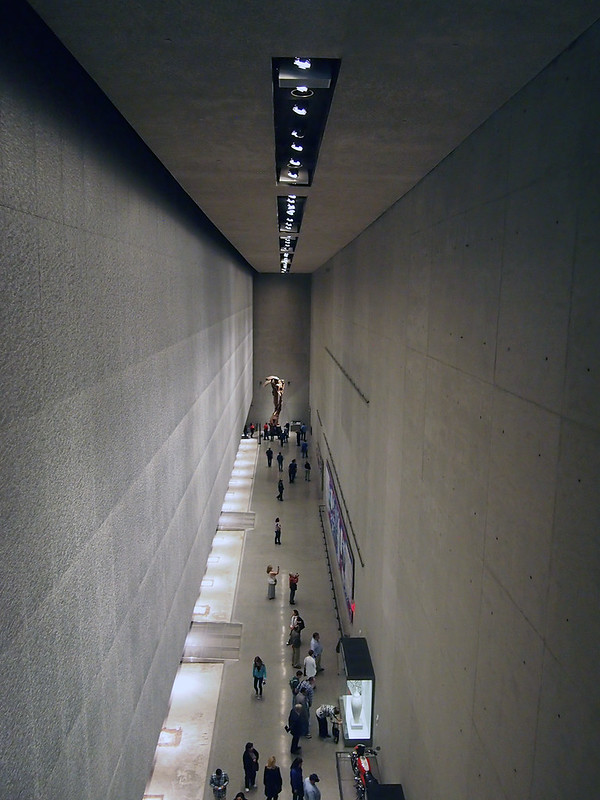
The dark walls are cut low in a couple spots, giving views of the spaces below. One such view (photo above) reveals a long gallery with a sculpture at the end that is reminiscent of the Winged Victory of Samothrace. Perhaps the mangled steel from the Twin Towers was selected for aesthetic reasons along these lines, but it is one of the remnants from the original World Trade Center that gives a sense of scale of the physical destruction that took place in 2001.
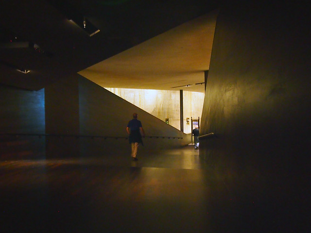
Davis Brody Bond's museum is made up of three levels, in this subterranean order:
C-1: Concourse Lobby
C-2: The Ramp
C-4: Exhibitions and Education Center
(I'm guessing C-3 consists of the inaccessible memorial pools whose perimeters were accessible in Michael Arad's original "Reflecting Absence" proposal but then enclosed over the memorial's evolution, primarily in reference to the thoughts of the victim's families.)
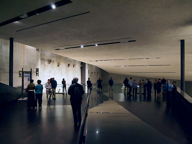
The Ramp, which references the utilitarian ramp that brought workers down to the level of bedroom at Ground Zero for years, starts at a multimedia section where we hear voices of people's initial impressions. Things are still fairly abstract at this point, but as we descend gradually toward the concrete "bathtub"'s slurry wall, they get more and more vivid.
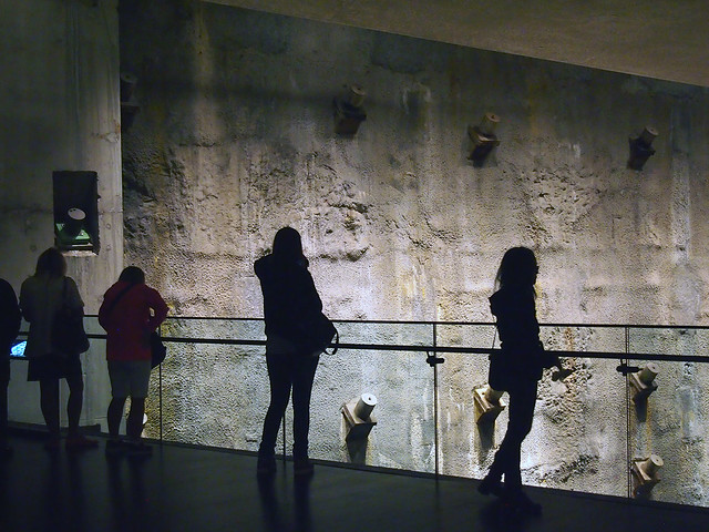
A large landing where The Ramp does a switchback gives an overview of the large Foundation Hall, one side of which exposes the slurry wall (photo above).
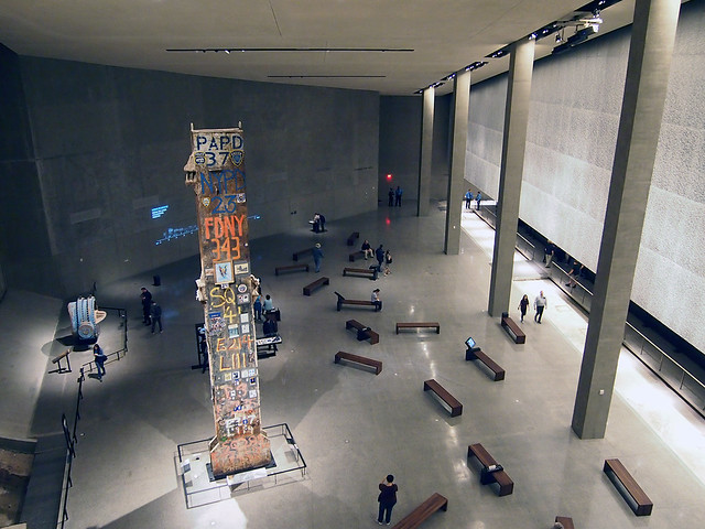
In the middle of the Foundation Hall is the 36-foot-tall "Last Column" (photo above), the last piece to be removed from the rubble, now littered with notes and photographs.
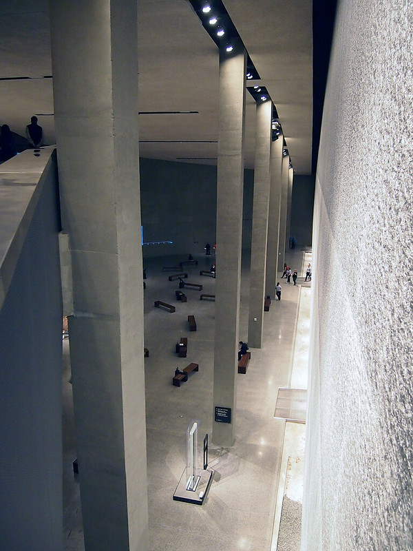
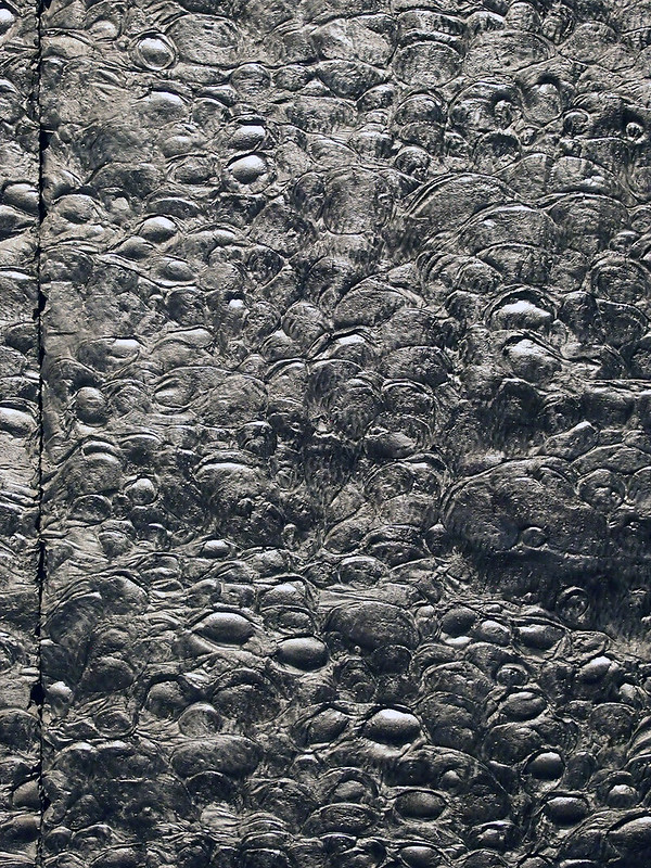
The Ramp's switchback brings us closes to one of the tower footprints, which are lined with a textured aluminum that is illuminated from above. From the spot of the photo above, one can look from the Foundation Hall to the panel to see the intricate, if random, pattern of the aluminum:
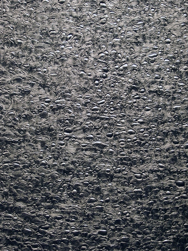
An even closer view:
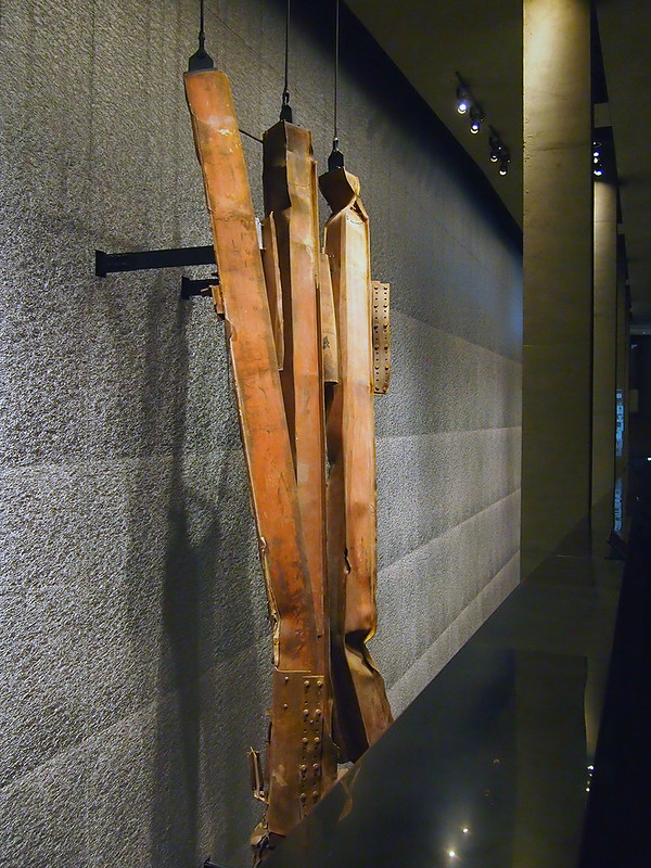
Another of the many artifacts on display comes into view after further descending the ramp after the switchback:
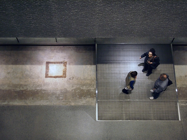
And peering down in the gap between The Ramp and the aluminum wall reveals not only people traversing a steel-grate bridge to the exhibition housed below one of the memorial pools (photo below), but also the base of the box columns embedded in the concrete and bedrock.
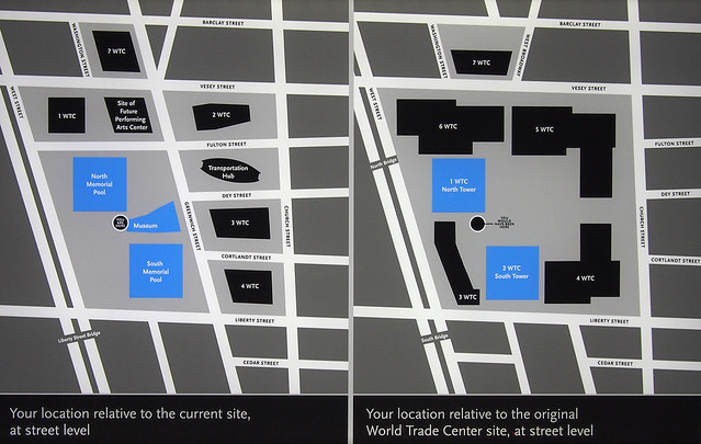
Part of the way down the ramp there is a sign (photo above) that indicates "your location relative to the original World Trade Center site." The dot, also shown relative to the current site, coincides with the tip of the 9/11 Memorial Museum's entry pavilion. Given The Ramp's back-and-forth journey, we've traveled to the west, to the very edge of West Street, and back to reach this point between the towers/pools.
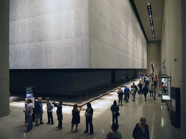
From this point we are ready to descend to level C-4 (photo above), which is approximately seven stories below the plaza. This level is probably the most important one in the museum, for it coincides with the original excavation of the site, which needed to reach the bedrock at this level for a solid foundation for the Twin Towers, the other WTC buildings, and the below-grade parking and other services. (Note the Somothrace-esque steel again in the above photo.)
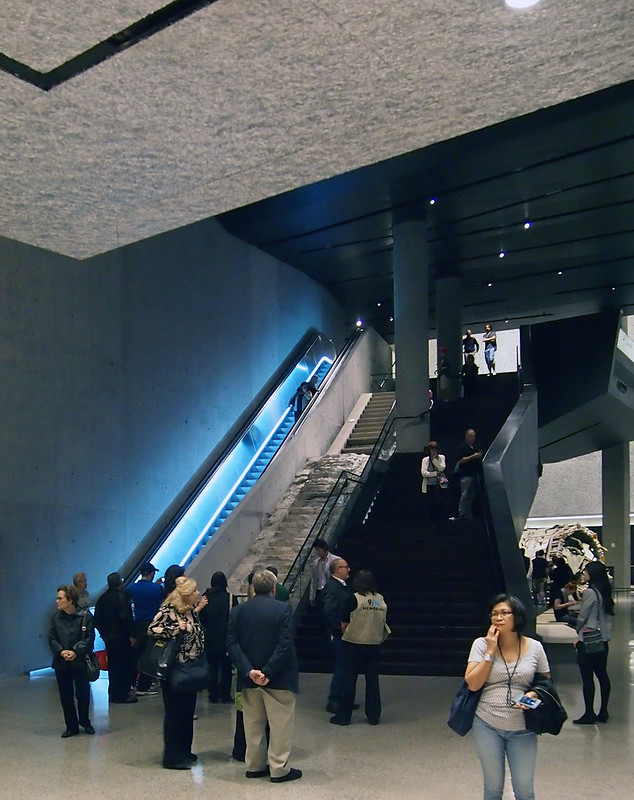
The Ramp does not touch this lowest level; rather it brings us to the Survivor's Staircase, which was originally located on the northern edge of the site and brought many of the survivors, as the name indicates, to safety. Now it is tucked rather awkwardly between a dark staircase and a glowing escalator (photo above), though a concrete guardrail between it and the escalator does provide a fitting backdrop for photos.
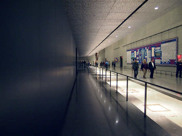
From the pavilion to the lobby to this level, our route is strictly determined (the only other option being elevators rather than The Ramp), but from here our path is only loosely defined. If we follow the order of the pages in the Museum Map picked up at the information desk on the lobby level, we head to the South Tower footprint, which is straight ahead after descending the stair adjacent to the Survivor's Stair. This is the direction above, toward the steel against the concrete backdrop.
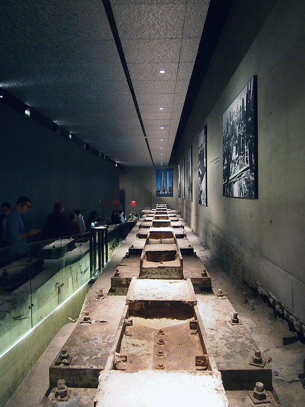
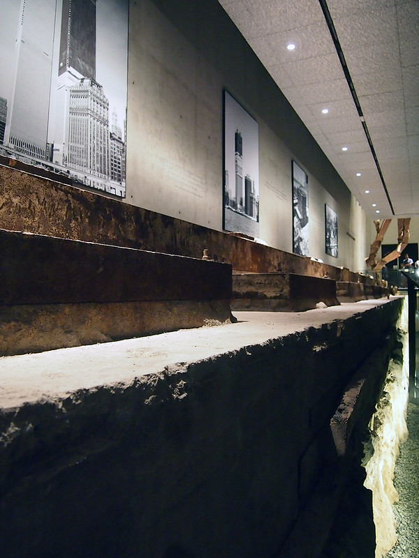
A left-turn at the mangled steel "sculpture" brings us to the South Tower Excavation, where a ramp descends alongside the hefty steel foundation that is anchored to the bedrock that we first see from above (photo above) then from eye level (photo below). Like the cut-off box columns we first saw from above, and which define the perimeter of each tower's footprint, this excavation strongly illustrates the scale of the towers and therefore the scale of the destruction.
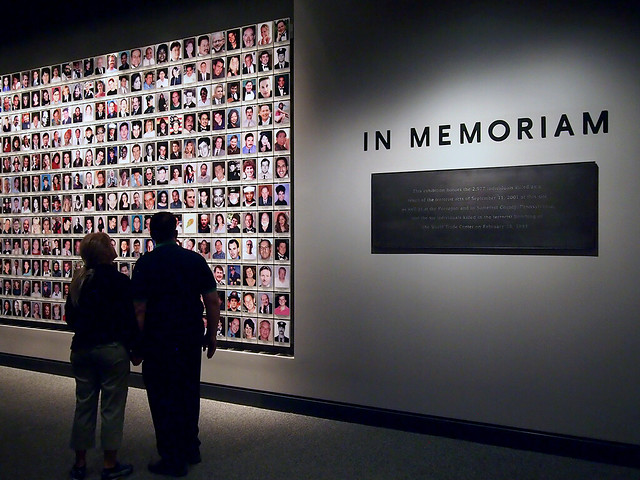
Of the North and South Towers, the former is used to its entirety for the museum's main exhibition, but the latter is only partially occupied (due to the tangle of below-grade infrastructure and new construction happening on the WTC site, the extent of which we'll see in a diagram soon), about half of it used for the In Memoriam exhibition. Nearly 3,000 photos (one for each survivor) line the walls in this room, with a room-within-a-room adding a multimedia aspect to the exhibition. It's here where weight of the museum and its subject really hits; mangled steel and other signs of destruction are one thing, but the smiling faces of those killed on September 11, 2001 (and 1993, the bombing that the museum also memorializes) shifts the context from one of scale to one of people. It's not about the number of people killed, but that each one had a life and a story that was cut short.
Between the North and South Towers is the Memorial Hall, one side of which is graced by Spencer Finch's huge artwork Trying to Remember the Color of the Sky on That September Morning.
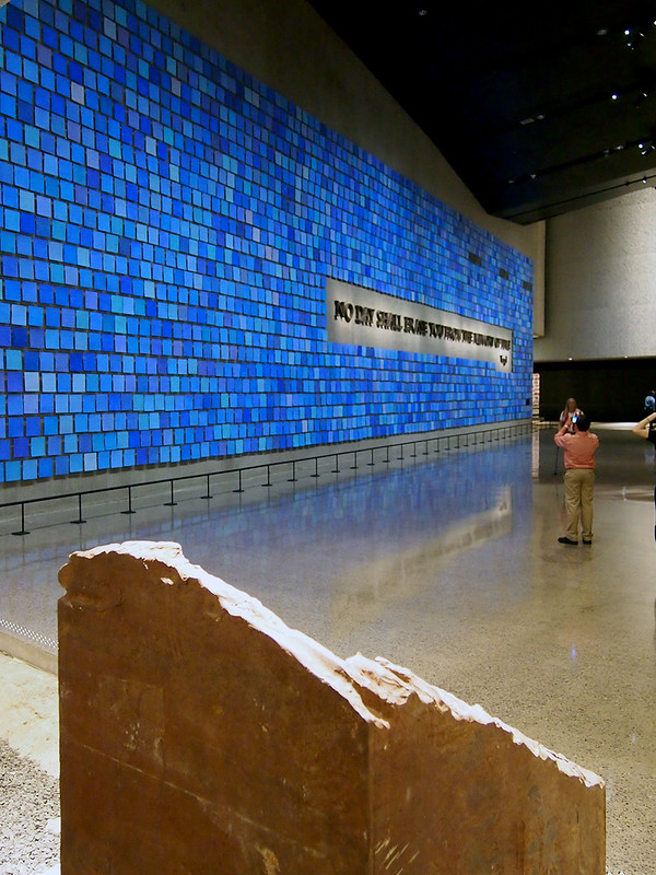
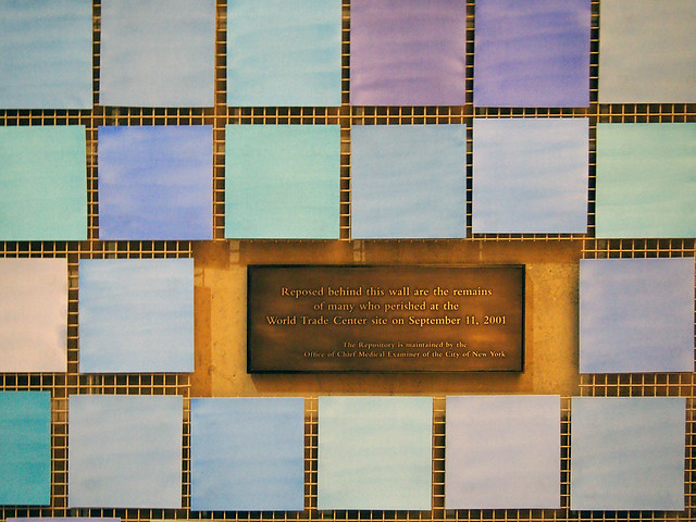
Finch painted each of the nearly 3,000 pieces of paper (one for each victim) by hand. Mounted on wire, they abstractly recall not so much the sky but the "have you seen..." notes and notes of mourning that New Yorkers posted on fences in the days after September 11. A Virgil quote in large text is highlighted by the grid of blues, but a cutout in the grid's bottom-right corner is a plaque that discreetly announces that "the remains of many who perished at the World Trade Center site on September 11, 2001" are behind the wall:
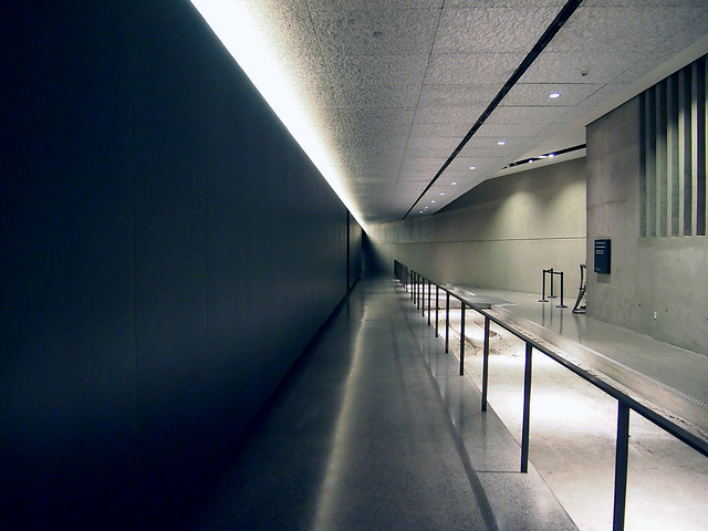
My journey on opening day took me around the North Tower alongside Finch's artwork (photo above), an empty space that looks like a dead end, but which has the North Tower Excavation (like the South Tower one but not as dramatic) around the corner.
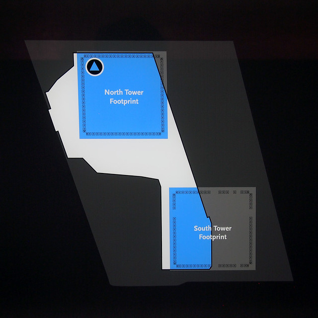
At the end of the North Tower Excavation is a graphic (photo above) that shows the extent of the C-4 Level of the museum. This is one of the most helpful bits of information in the whole museum, but unfortunately it's tucked into an area that is not traversed by many people, and it is not included in the Museum Map (the North and South Towers are show on different pages, never relative to each other).
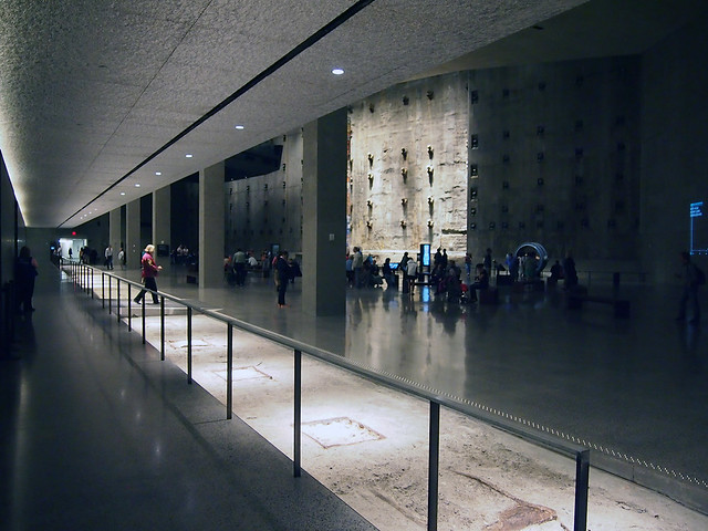
Turning the corner we see the Foundation Hall, now from the opposite angle as that from The Ramp earlier.
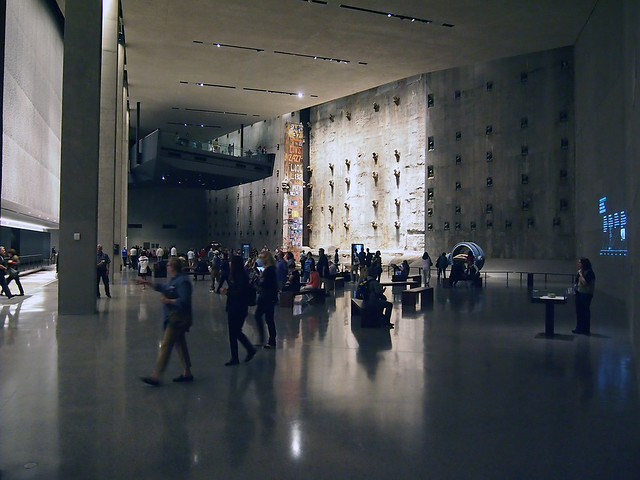
From here we see the slurry wall (photo below) and the Last Column, but also The Ramp overlooking the Foundation Hall (photo above).
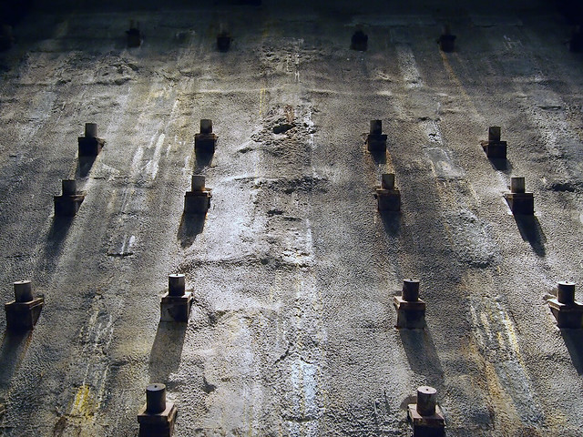
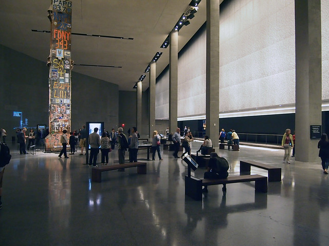
Easily the largest space in the museum (made to look even larger by the polished concrete floor reflecting the columns and walls), the Foundation Hall is also the oddest, doing many things at once. In addition to the large-scale artifacts like the slurry wall and the Last Column, there is a graphic timeline projected onto a concrete wall and interactive kiosks on some of the benches scattered about the hall. Some of the benches are empty, apparently places of rest, but it is hard to rest in a space (much less any part of the museum) where so much is happening.
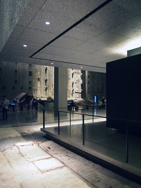
The Foundation Hall borders the North Tower Footprint, which is where the main exhibition is located. One traverses a bridge over the base of the box columns to reach the walkway that wraps the tower (photo above). I don't know the intention, but the combination of cantilevered aluminum walls, walkway, and dark walls resembles a Modernist office building, very Miesian but serving as a cultural memorial to a place where thousands of people used to work.

Photos are not allowed in the main exhibition (a fact that did not stop many people on opening day), but my only covert, smartphone photo of a waist-high stand with tissues (above) visually describes better than I could say in words how grueling it is to relive that Tuesday minute by minute through the exhibitions videos, photos, and numerous other artifacts.
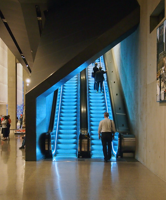
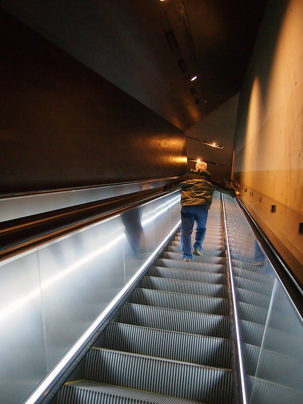
The way out of the museum is not a slow ascent back up The Ramp but a ride up the illuminated escalator (both run up).
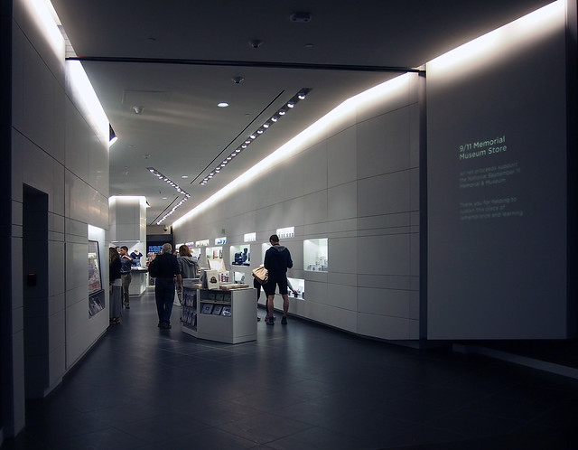
This ride brings us back to the C-1 Concourse Lobby level, where the aforementioned Museum Store is located. Controversial for obvious reasons, the store's design is tasteful, and its white walls seem to bridge the light of upstairs and the darkness below. This commercial realm is also a bridge, as it shifts visitors from mourners back into shoppers.
Any positive relief that should come from ascending back to the plaza and street from the museum at bedrock – from darkness back to light – doesn't occur. But the store does the job of putting us back into a more "normal" state of mind, which is a good and bad thing. Good for remedying the mental and emotional exhaustion of the museum and its exhibition. Bad for clearing away the thoughts that should occupy our minds for longer, thoughts that ideally instill an appreciation of life, prioritize tolerance, and shape the peaceful resolution of conflicts. The 9/11 Memorial Museum tells us how we have handled those things in the last 14 years, just as the store locates our 21st-century priorities.

[All photographs by John Hill]
As mentioned at the end of Part 1, there is a distinct impression of moving from light to dark in descending the stairs or escalator next to the Twin Towers' rusty tridents that anchor one end of the entry pavilion. That sensation is somewhat tangible in the above photo, looking from the museum's lobby level back to the pavilion.

Once descending to the lobby level, it's natural to want to see the base of the tridents, which are placed adjacent to the stairs; the steps flare around the tridents, as if to embrace them or as if they're carved away to make room for the uprights.

Up close (photo above) the tridents bear the marks of time, destruction (the mangled rebar, in particular), and people.

The level that the stairs deliver us to is the Concourse Lobby, which is an information desk, coat check, a group meeting area, and the museum store (more on that later). The lobby's floors, walls, and ceiling are dark, but, just like the stairs are bent around the tridents, the walls are cut to reveal lighter, illuminated walls beyond. As we'll discover in our journey, these are the walls of the memorial pools, the footprints of the Twin Towers.

The dark walls are cut low in a couple spots, giving views of the spaces below. One such view (photo above) reveals a long gallery with a sculpture at the end that is reminiscent of the Winged Victory of Samothrace. Perhaps the mangled steel from the Twin Towers was selected for aesthetic reasons along these lines, but it is one of the remnants from the original World Trade Center that gives a sense of scale of the physical destruction that took place in 2001.

Davis Brody Bond's museum is made up of three levels, in this subterranean order:
C-1: Concourse Lobby
C-2: The Ramp
C-4: Exhibitions and Education Center
(I'm guessing C-3 consists of the inaccessible memorial pools whose perimeters were accessible in Michael Arad's original "Reflecting Absence" proposal but then enclosed over the memorial's evolution, primarily in reference to the thoughts of the victim's families.)

The Ramp, which references the utilitarian ramp that brought workers down to the level of bedroom at Ground Zero for years, starts at a multimedia section where we hear voices of people's initial impressions. Things are still fairly abstract at this point, but as we descend gradually toward the concrete "bathtub"'s slurry wall, they get more and more vivid.

A large landing where The Ramp does a switchback gives an overview of the large Foundation Hall, one side of which exposes the slurry wall (photo above).

In the middle of the Foundation Hall is the 36-foot-tall "Last Column" (photo above), the last piece to be removed from the rubble, now littered with notes and photographs.

The Ramp's switchback brings us closes to one of the tower footprints, which are lined with a textured aluminum that is illuminated from above. From the spot of the photo above, one can look from the Foundation Hall to the panel to see the intricate, if random, pattern of the aluminum:

An even closer view:

Another of the many artifacts on display comes into view after further descending the ramp after the switchback:

And peering down in the gap between The Ramp and the aluminum wall reveals not only people traversing a steel-grate bridge to the exhibition housed below one of the memorial pools (photo below), but also the base of the box columns embedded in the concrete and bedrock.


Part of the way down the ramp there is a sign (photo above) that indicates "your location relative to the original World Trade Center site." The dot, also shown relative to the current site, coincides with the tip of the 9/11 Memorial Museum's entry pavilion. Given The Ramp's back-and-forth journey, we've traveled to the west, to the very edge of West Street, and back to reach this point between the towers/pools.

From this point we are ready to descend to level C-4 (photo above), which is approximately seven stories below the plaza. This level is probably the most important one in the museum, for it coincides with the original excavation of the site, which needed to reach the bedrock at this level for a solid foundation for the Twin Towers, the other WTC buildings, and the below-grade parking and other services. (Note the Somothrace-esque steel again in the above photo.)

The Ramp does not touch this lowest level; rather it brings us to the Survivor's Staircase, which was originally located on the northern edge of the site and brought many of the survivors, as the name indicates, to safety. Now it is tucked rather awkwardly between a dark staircase and a glowing escalator (photo above), though a concrete guardrail between it and the escalator does provide a fitting backdrop for photos.

From the pavilion to the lobby to this level, our route is strictly determined (the only other option being elevators rather than The Ramp), but from here our path is only loosely defined. If we follow the order of the pages in the Museum Map picked up at the information desk on the lobby level, we head to the South Tower footprint, which is straight ahead after descending the stair adjacent to the Survivor's Stair. This is the direction above, toward the steel against the concrete backdrop.

A left-turn at the mangled steel "sculpture" brings us to the South Tower Excavation, where a ramp descends alongside the hefty steel foundation that is anchored to the bedrock that we first see from above (photo above) then from eye level (photo below). Like the cut-off box columns we first saw from above, and which define the perimeter of each tower's footprint, this excavation strongly illustrates the scale of the towers and therefore the scale of the destruction.

Of the North and South Towers, the former is used to its entirety for the museum's main exhibition, but the latter is only partially occupied (due to the tangle of below-grade infrastructure and new construction happening on the WTC site, the extent of which we'll see in a diagram soon), about half of it used for the In Memoriam exhibition. Nearly 3,000 photos (one for each survivor) line the walls in this room, with a room-within-a-room adding a multimedia aspect to the exhibition. It's here where weight of the museum and its subject really hits; mangled steel and other signs of destruction are one thing, but the smiling faces of those killed on September 11, 2001 (and 1993, the bombing that the museum also memorializes) shifts the context from one of scale to one of people. It's not about the number of people killed, but that each one had a life and a story that was cut short.

Between the North and South Towers is the Memorial Hall, one side of which is graced by Spencer Finch's huge artwork Trying to Remember the Color of the Sky on That September Morning.

Finch painted each of the nearly 3,000 pieces of paper (one for each victim) by hand. Mounted on wire, they abstractly recall not so much the sky but the "have you seen..." notes and notes of mourning that New Yorkers posted on fences in the days after September 11. A Virgil quote in large text is highlighted by the grid of blues, but a cutout in the grid's bottom-right corner is a plaque that discreetly announces that "the remains of many who perished at the World Trade Center site on September 11, 2001" are behind the wall:


My journey on opening day took me around the North Tower alongside Finch's artwork (photo above), an empty space that looks like a dead end, but which has the North Tower Excavation (like the South Tower one but not as dramatic) around the corner.

At the end of the North Tower Excavation is a graphic (photo above) that shows the extent of the C-4 Level of the museum. This is one of the most helpful bits of information in the whole museum, but unfortunately it's tucked into an area that is not traversed by many people, and it is not included in the Museum Map (the North and South Towers are show on different pages, never relative to each other).

Turning the corner we see the Foundation Hall, now from the opposite angle as that from The Ramp earlier.

From here we see the slurry wall (photo below) and the Last Column, but also The Ramp overlooking the Foundation Hall (photo above).


Easily the largest space in the museum (made to look even larger by the polished concrete floor reflecting the columns and walls), the Foundation Hall is also the oddest, doing many things at once. In addition to the large-scale artifacts like the slurry wall and the Last Column, there is a graphic timeline projected onto a concrete wall and interactive kiosks on some of the benches scattered about the hall. Some of the benches are empty, apparently places of rest, but it is hard to rest in a space (much less any part of the museum) where so much is happening.

The Foundation Hall borders the North Tower Footprint, which is where the main exhibition is located. One traverses a bridge over the base of the box columns to reach the walkway that wraps the tower (photo above). I don't know the intention, but the combination of cantilevered aluminum walls, walkway, and dark walls resembles a Modernist office building, very Miesian but serving as a cultural memorial to a place where thousands of people used to work.

Photos are not allowed in the main exhibition (a fact that did not stop many people on opening day), but my only covert, smartphone photo of a waist-high stand with tissues (above) visually describes better than I could say in words how grueling it is to relive that Tuesday minute by minute through the exhibitions videos, photos, and numerous other artifacts.

The way out of the museum is not a slow ascent back up The Ramp but a ride up the illuminated escalator (both run up).

This ride brings us back to the C-1 Concourse Lobby level, where the aforementioned Museum Store is located. Controversial for obvious reasons, the store's design is tasteful, and its white walls seem to bridge the light of upstairs and the darkness below. This commercial realm is also a bridge, as it shifts visitors from mourners back into shoppers.

Any positive relief that should come from ascending back to the plaza and street from the museum at bedrock – from darkness back to light – doesn't occur. But the store does the job of putting us back into a more "normal" state of mind, which is a good and bad thing. Good for remedying the mental and emotional exhaustion of the museum and its exhibition. Bad for clearing away the thoughts that should occupy our minds for longer, thoughts that ideally instill an appreciation of life, prioritize tolerance, and shape the peaceful resolution of conflicts. The 9/11 Memorial Museum tells us how we have handled those things in the last 14 years, just as the store locates our 21st-century priorities.
Today's archidose #760
Here are some photos of Amsterdam's Noord-Zuidlijn tunnel (under construction, to be completed in 2017) from a May 25 tour, photographed by Matthijs Borghgraef.
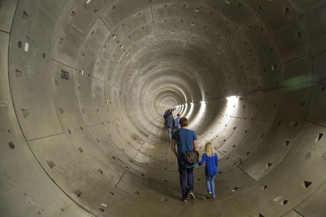
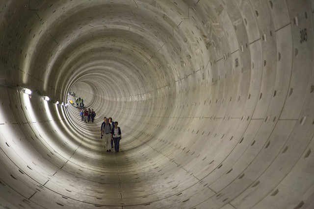
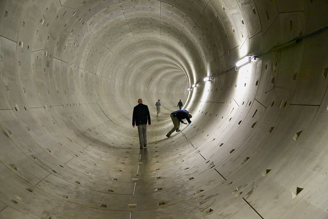
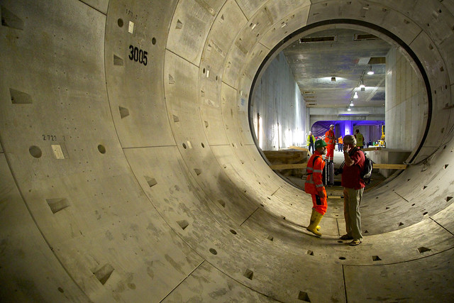
To contribute your Flickr images for consideration, just:


To contribute your Flickr images for consideration, just:
:: Join and add photos to the archidose pool, and/or
:: Tag your photos archidose
Xarelto's Architecture Equation
Watching this commercial for prescription drug Xarelto earlier today I couldn't help notice that...

A visit to a Mario Botta building (Bechtler Museum of Modern Art in Charlotte, North Carolina)
+

Seeing a model of the Roman Coliseum in one of its galleries
+

Popping some Xarelto
=

A trip to see the Coliseum in person (well, through a car window, at least).

Thank you, Xarelto! (and Mr. Botta and Mr. Bechtler)

A visit to a Mario Botta building (Bechtler Museum of Modern Art in Charlotte, North Carolina)
+

Seeing a model of the Roman Coliseum in one of its galleries
+

Popping some Xarelto
=

A trip to see the Coliseum in person (well, through a car window, at least).

Thank you, Xarelto! (and Mr. Botta and Mr. Bechtler)
Subscribe to:
Comments (Atom)