Today's archidose #791

Here are some photos of the Fondation Louis Vuitton (2014) in Paris by Gehry Partners, photographed by C D _Fr.

Fondation Louis Vuitton, Paris

Fondation Louis Vuitton, Paris

Fondation Louis Vuitton, Paris

Fondation Louis Vuitton, Paris

Fondation Louis Vuitton, Paris

Fondation Louis Vuitton, Paris

To contribute your Flickr images for consideration, just:
:: Join and add photos to the archidose pool
To contribute your Instagram images for consideration, just:
:: Tag your photos #archidose

Why Bother with Facebook?

On Tuesday I tooted my own horn, and today I vent some steam – Facebook steam.

If, like me, you have or administer a Facebook fan page, you probably know that the number of people who see your posts on their walls is at the mercy of Facebook's algorithms. In late 2013 Facebook implemented a change to the algorithm that determines what content appears on people's walls, greatly affecting fan pages. Cynically, it can be seen as a ploy to get more money through post-boosting (paying for more eyes to see the posts), but at the time it was said to be directed at getting more "news" on people's walls over "viral memes," which were seen by Facebook honchos as shallow and unappealing.

What the above tweaking did to my archidose fan page, which can't really be considered news and is hardly a page that sells anything and therefore can't afford to boost posts, was to make its "reach" (number of people seeing posts on their walls) plummet – from roughly 1,000-3,000 per post (or 10-30% of my ~10,000 fans) right before the tweak to about 100-300 per post after (1-3%). This screenshot of a post from summer 2014 illustrates just how small a reach is now taking place:


[Screenshot from my archidose fan page]

Now I'm aware that a whole industry exists to help companies take advantage of Facebook, keeping on top of the weekly tweaks that range from minor to, in the above case, pretty major. But I use Facebook as a way to let people know about a blog post or a book received, or sometimes to link to content on another site; it's more about sharing than profiting, even if clicks to my site notch up the ads being counted and chances of people buying books via the Amazon sidebar; we're talking pennies at a time – nothing for me to get upset about. I'm not going to pay for tips and tricks, and I'm not going to pay Facebook hundreds of dollars per post to get a thousand more eyes scrolling past my posts on their walls.

So basically I'm venting because the question posed in the title of this post is serious: Why bother with Facebook? What is the point of me manually posting to Facebook if only 1.6% of my fans see my posts on their walls? (1.6% is based on the 180 people reached in the Book Briefs #19 post and the 10,656 fans I have right now.) My emails sent to subscribers are automated, and I'm pretty sure a lot more people see my blog posts in their inbox than on Facebook (and they don't even have to click over the website to read the content, since it's all in the email – that's how much I don't care about traffic to my site).

So what do you think, should I bother with Facebook?

Today's archidose #790

Here are some of my photos of Situation NY by Jana Winderen and Marc Fornes / THEVERYMANY now at the Storefront for Art and Architecture. See a dozen more photos of the installation in my Situation NY Flickr set.

Situation NY

Situation NY

Situation NY

Situation NY

Situation NY

To contribute your Flickr images for consideration, just:
:: Join and add photos to the archidose pool
To contribute your Instagram images for consideration, just:
:: Tag your photos #archidose

A Sometimes (Published) Photographer

Pardon some tooting of my own horn, but it's not everyday (or every year, to be more accurate) that my photos are found in not one, not two, but three publications. Such is the case with the below magazine and books.

Now, I'm no pro at photography, but photographing buildings is important for me in understanding them and then writing about them on this blog. So over the years I've amassed a good number of them (hopefully improving in that time) and occasionally gotten requests to publish them. In many cases my photos aren't used, or more often they are but I never see those results. But in the last few months the below publications have been released, so I've received the shock of seeing my photos on paper – a shock often due to the lag time of print publications, as I had forgotten about my contributions in the intervening months and years.


Issue 981 of Domus magazine:


[Domus issue 981 cover]


[Domus issue 981 spread with my photos of Louis I. Kahn's FDR Memorial]


Le Langage hypermoderne de l’architecture by Nicolas Bruno Jacquet (Editions Parenthéses)


[Le Langage hypermoderne de l’architecture cover]


[Le Langage hypermoderne de l’architecture spread with my photo of Peter Zumthor's Thermal Vals]


Cool Chicago: an inspirational guide to what's best in the city by Kathleen Maguire (Pavilion):


[Cool Chicago cover]


[Cool Chicago spread with my photos of John Ronan's Poetry Foundation]

Today's archidose #789

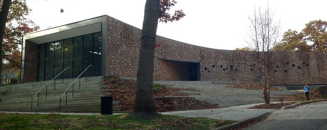
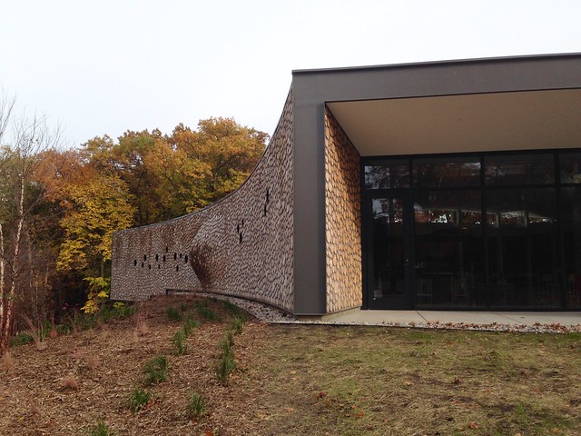
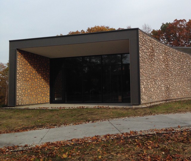
Here are some photos of the Arcus Center for Social Justice Leadership (2014) at Kalamazoo College, Michigan, by Studio Gang Architects, photographed by Trefoil.

Arcus Center

Arcus Center

Arcus Center

Arcus Center

Arcus Center

To contribute your Flickr images for consideration, just:
:: Join and add photos to the archidose pool
To contribute your Instagram images for consideration, just:
:: Tag your photos #archidose

Today's archidose #788

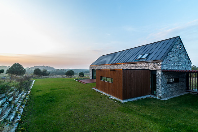
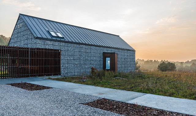
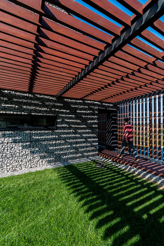
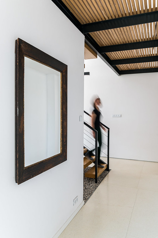
Here are some photos of House in Jura (2012) near Zawiercie, Poland, by Kropka Studio, photographed by Maciek Lulko. (See more on the project at Europaconcorsi.)

Landscape house

Landscape house

Landscape house

Landscape house

Landscape house

To contribute your Flickr images for consideration, just:
:: Join and add photos to the archidose pool
To contribute your Instagram images for consideration, just:
:: Tag your photos #archidose

Cloning W57

It was just a matter of time before other architects started taking the leaning-pyramid form of Bjarke Ingels Group's W57 development under construction on Manhattan's west side...

[W57 under construction | Photo by Rasmus Hjortshøj]

...and creating inferior versions of it. First up appears to be Kutnicki Bernstein Architects' 500 Metropolitan Avenue, a hotel/residential building in the early stages of construction in Brooklyn, next to the L/G stop and across from the BQE:

[Image from kba website]

For more tasty construction shots of BIG's W57, be sure to check out Rasmus Hjortshøj's website.

Guggenheim Helsinki's 1,715 Submissions

Stage One Gallery of the open, anonymous international, two-stage competition for the design of a proposed Guggenheim museum in the Finnish capital of Helsinki:

Book Review: Three Books for Kids

Sunrise to High-Rise: A wallbook of architecture through the ages by Lucy Dalzell
Cicada Books, 2014
Hardcover, 24 pages

Who Built That? Modern Houses by Didier Cornille
Princeton Architectural Press, 2014
Paperback, 84 pages

Who Built That? Skyscrapers by Didier Cornille
Princeton Architectural Press, 2014
Hardcover, 84 pages


I'm a big fan of architecture books geared toward children, mainly because knowledge of architecture in the years before college could use a boost. My background was an exception, with some classes in high school, but for kids in grade school and middle school, architecture isn't talked about as much as it should be. Books geared to them can range from fables and other stories to biographies and sketchbooks. Together, kids books about architecture convey an understanding of the subject's history, but also how to think like an architect in terms of spatial understanding and representation. The three books reviewed here are aimed at kids around 10-12 years of age, since the titles are interested with giving a sense of architectural history and conveying how buildings evolved over the years.


[Bordeaux House, Rem Koolhaas. Spread from Who Built That? Modern Houses | Photo by John Hill]

First is one of two "Who Built That?" books by Didier Cornille; this one is focused on houses and therefore takes a landscape format, while the one on skyscrapers appropriately uses the portrait format. Cornille starts with Gerrit Rietveld's Schröder House (1924) and ends ten houses later with Sarah Wigglesworth and Jeremy Till's Straw House (2002). While the title asserts the importance is in the "who," the drawings and text are really more concerned with the "how" and the "why," which is important considering that modern and contemporary houses can be more perplexing than traditional houses in these terms. Didier's drawings are colorful and have a playfulness that is commendable, though the portraits of the architects are a bit off; they capture the features of Wright, Mies, Gehry, and the rest, but nevertheless look only a little bit like their namesakes.


[Torre Agbar, Jean Nouvel. Spread from Who Built That? Skyscrapers | Photo by John Hill]

Much of the same can be said about Cornille's second "Who Built That?" book, which is about skyscrapers. Yet given the complex technical requirements of tall buildings, there is an even larger emphasis on how they are built. For example, the above spread, showing Jean Nouvel's design for Torre Agbar in Barcelona, describes the sequencing of the construction and a section of its concrete core tied deep in the watery soil. Given the need for more space for the explanations, and the inclusion of additional examples by the same architects (also present in the modern houses book, but not to the same degree), the book features only eight skyscrapers, unlike the ten houses that are featured in the same amount of pages. Nevertheless, the book does not delve as deep as, say, David Macaulay in Unbuilding, but it does give enough variety in the forms and locations of the eight skyscrapers that any child should find one of interest.


[Spread from Sunrise to High-Rise | Photo by John Hill]

The third children's book here isn't really a book at all; it is a concertina binding that opens like an accordion, telling the history of architecture through buildings on one side and through styles/periods on the other. The latter is fairly dry, with text and one example highlighting everything from neolithic architecture (10,000-2000 BC) to contemporary architecture (unfortunately, postmodern architecture (1960-1990) incorrectly highlights OMA's CCTV tower, which is neither postmodern nor fitting within the timeframe), but the former's colorful panorama by Lucy Dalzell is especially beautiful, particularly when it's unfurled to over 90 inches.

The buildings – from the Göbekli Tepe in Turkey in 10,000 BC to Lacaton Vassal's Tour Bois le Prêtre in France (2006-2011) – overlap and blend into each other to create an undulating, architectural horizon line. Sure, the buildings are not scaled relative to each other, creating odd and ever-changing depths of field, but the whole expressively tells the story of major monuments over time. It is an international history that has some suspect building and layout choices here and there (Rural Studio's small Yancy Chapel is a refreshing choice, but it towers over buildings by Gehry, Libeskind, Foster, Nouvel and others in a somewhat jarring manner), but it is for the most part a well-rounded selection. It's not often that children's books have the option of becoming wall art, but in this case it's clear the illustrator and publisher wanted the history of architecture to be an ever-present part of a child's bedroom.

Intranet manager: the most complex job in the world

It struck me again recently while I was reading the latest edition of Jane McConnell’s ‘digital workplace’ report. There are an amazing number of aspects to intranets or digital workplaces! Intranets and intranet projects are complex. Intranets touch the hart of organizations.

Intranet managers
This is also what you hear when you talk with people who are responsible for the intranet. Their role implies they have to master a broad range of skills, if they want to do their job successfully. So is intranet management one of the or the most complex jobs in the world?

Intranet disciplines
Let's see which skills a successful intranet manager has to have. I have conducted the following list. Intranet managers need to know:
  • The organization and processes: how does the organization work and what are the key business processes? This is also important because the intranet needs organization (governance) that fits with the overall organization of the company. An intranet manager must be able to define, set up and manage the intranet organization.
  • Organizational strategy: related to knowledge of organization and processes, knowledge of the organizational strategy is important. Where is the organization headed? An intranet manager must know this and position the intranet as an enabler for the strategic themes. Decision makers will see the intranet has value and creates value.
  • IT and technology: an intranet is built using (web) technology and often integrates with other IT systems. Knowledge of these technologies is essential to be able to talk with IT and select the right intranet platform. The intranet manager must also be able to translate the needs of the employees to a functional description that IT understands and can implement.
  • Trends: What trends can be seen in the way people, organizations and technology works? Keeping an eye on these trends and using them for the intranet is essential for an intranet manager. Else the ‘intranet’ will be built elsewhere by employees…
  • Sales: a good intranet sells itself, but not everybody is just as convinced about the value of the intranet as you are. Therefore an intranet manager should be able to sell the (envisioned) intranet and sell it to management and employees.
  • Service: an intranet can (partially) break down. Employees will complain about this. Their complaints should be listened to and solved. Related to this knowledge of secondary processes is essential. Employee self-service is a highly valued feature of intranets.
  • Writing for ‘online’: creating relevant content for employees is an art. An intranet manager must be able to create such content and help others do so as well.
  • Finance: an intranet costs money and generates value. An intranet manager must be able to write up a business case for the (envisioned) intranet to prove its value to decision makers and employees.
  • HR and legal policies: what may or may not be shared on the intranet differs per country and market. In some countries, for instance, an employee picture isn’t allowed to be share (without consent). An intranet manager must know these (local) rules and act on them.
  • Measurement: intranet managers must measure the intranet usage, and analyze and report the results.
  • Convincing: intranet managers need to be influencers. In many organizations they don’t have a position to impose what they want (even if that would be possible…). Other people skills like communicating and presenting fit in this category as well.
  • Community management and networks: managing intranet means understanding the communities and networks in the organization. How are decisions really made in the organization and how do you get communities and networks to work for you?
Translators
I probably missed a few skills. I loved to hear from you which other skills you think an intranet manager must have. More and more I’m convinced that intranet managers should be good translators. I think that’s the implicit skill in the list. Intranet managers must work in between organization and employees, IT and Communications, design and technology, etc.

One person?
Reading this list could lead to the question whether all this can be done by one person. Ideally speaking I think the intranet manager should have all these skills. In most cases it’s even necessary, because there is no extra budget for more intranet managers (with other skills). But even if these skills are spread out over more than one intranet manager I think it’s important that these managers have overlapping skills. In this way they will understand each other more deeply.

Learning
Which steps can you take to learn more of these skills? I don't think there’s a 1-2-3 recipe. But I can recommend the following 3 steps:
  1. Read and listen: read books and blogposts from intranet experts and talk with other intranet managers
  2. Study: there isn’t an intranet management study (should there be one?), but spread out over different studies there are classes and courses that you could take.
  3. Contact the primary process of your company: take you time to participate in the primary process of your organization. Ideally work in the primary process for some time.
I’m curious if you recognize all this. Do intranet managers see themselves in this way? Did I miss out important skills for intranet management? And which skills are the hardest to master?

Sinking Barge

One of the thousand-or-so photos I took on a recent trip to Chicago was of an empty barge on the Chicago River between Lake and Randolph Streets; I was actually crossing the Randolph Street bridge when I snapped the photo of the immense (about 15-20' deep) barge:

[Photo by John Hill]

The barge was serving 150 North Riverside, hauling away the excavation for building the foundation of a tower designed by Goettsch Partners:

[Image via 150 North Riverside]

Well, it turns out that the same barge is now sitting submerged in the river after it broke free from its mooring last week:

[Photo via ABC7]

This is the second time this year that a barge has sunk in the Chicago River (the first was one serving the Riverwalk under construction further north and east of the above building), and this latest does not bode well for 150 North Riverside nor Mayor Rahm Emanuel's big hopes for the river.

Today's archidose #787

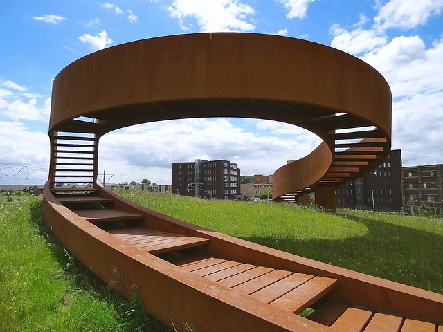
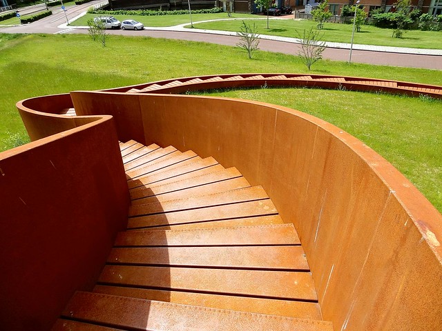
Here are some photos of The Elastic Perspective (2013) in Barendrecht, The Netherlands, by NEXT Architects, photographed by Ken Lee.

The Elastic Perspective, Barendrecht, The Netherlands

The Elastic Perspective, Barendrecht, The Netherlands

The Elastic Perspective, Barendrecht, The Netherlands

The Elastic Perspective, Barendrecht, The Netherlands

The Elastic Perspective, Barendrecht, The Netherlands5346801430_414295ea97_c.jpg" width="535" />

To contribute your Flickr images for consideration, just:
:: Join and add photos to the archidose pool
To contribute your Instagram images for consideration, just:
:: Tag your photos #archidose

Everything Old Is New Again

Clive Wilkinson's design for the Barbarian Group (completed 2014) in New York City, which features an "endless table":


[Barbarian Group | Photo: Michael Moran, from Clive Wilkinson Architects website]

reminds me of a project by Wilkinson from ten years earlier. Mother's, as I referred to the project when I posted about it in 2004, is also based around a looping table that serves 200 people:


[Mother London | Photo from Clive Wilkinson Architects website]

Yet, while Mother London's table is interrupted by columns and stairs, Wilkinson's latest rendition of this idea is more complex:


[Barbarian Group | Photo: Michael Moran, from Clive Wilkinson Architects website]

The Barbican Group table undulates like a long scarf, creating walkways, meeting rooms, libraries and other spaces underneath its high points, which I have to admit is pretty cool.


[Barbarian Group | Photo: Michael Moran, from Clive Wilkinson Architects website]

Today's archidose #786

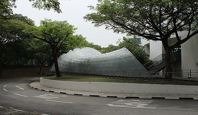
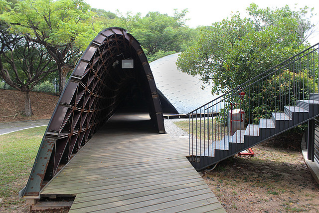
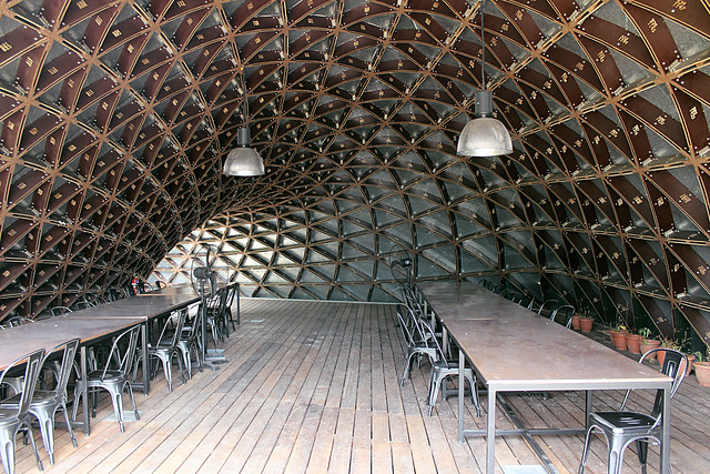
Here are some photos of the SUTD Library Pavilion (2013) in Singapore by City Form Lab, photographed by Trevor Patt.

IMG_7879

IMG_7854

IMG_7838

IMG_7842

IMG_7860

IMG_7858

IMG_7845

To contribute your Flickr images for consideration, just:
:: Join and add photos to the archidose pool
To contribute your Instagram images for consideration, just:
:: Tag your photos #archidose