Today's archidose #816

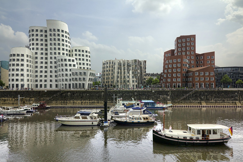
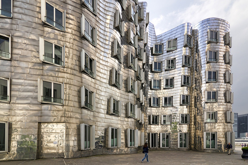
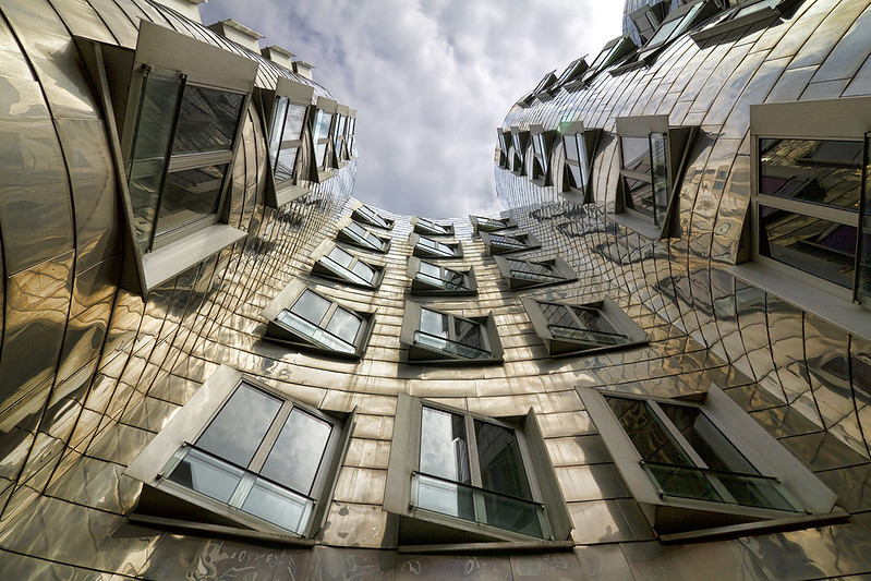
Here are some shots of Der Neue Zollhof (2005) in Düsseldorf, Germany, by Gehry Partners, photographed by Wojtek Gurak.

Neuer Zollhof

Neuer Zollhof

Neuer Zollhof

To contribute your Flickr images for consideration, just:
:: Join and add photos to the archidose pool
To contribute your Instagram images for consideration, just:
:: Tag your photos #archidose

Firm Faces #21: JGMA

Many of the recent "firm faces" I've featured have been fairly humorous, evidence that architects don't always take themselves so seriously. I think that can be safely applied to Chicago's JGMA, headed by Juan Moreno.

This screenshot shows the cartoon visages of Moreno and other executives and leadership in the firm:


Clicking on any of the cartoon faces brings one to a page with a b/w portrait and a bio...but a mouseover of the photo reveals a full-color cartoon. Here, I've stitched three in the top row together and animated them with their cartoon likenesses:


I must admit, one of my first questions is, "How do they draw with those 'hands'?"

Following 432

Although far from planned, yesterday I snapped three photos of the Manhattan skyline as seen from Queens, each one of them anchored by Rafael Viñoly's 432 Park Avenue nearing completion on 57th Street.

Here it is in the morning, seen from the Court Square 7 stop in Long Island City:


Here it is in the evening, seen from the Queensborough Plaza stop in Long Island City:


And here it is a few minutes later, seen from the Ditmars stop in Astoria (Time Warner is visible in the lower-right and One57 pops up near the center of the frame, below the cloud; ):


Many people are calling 432 Park Avenue a new compass for the middle of Manhattan, but it is also true for people, like me, who live in western Queens.

Notes day 3 IntraTeam Event Copenhagen 2015 #iec15

As I did yesterday, I'm sharing my (rough) notes with you all. Please find them below. Others are live-blogging the conference. Please follow them as well. I pointed to their blogs yesterday.

Dave Snowden, The organization as a loosely coupled network

About systems, cognition and the patterns of those.

Three functional types of systems:
  • Ordered: Order is cool, but after success we get seduced by it.
  • Chaotic: no boundaries or structure
  • Complex adaptive system (co-evolution): We’re moving away from content to linkages that are defined by people.
These systems work in very different ways. Illustrates this with the ‘7/8 year old children party’.

Refers to the Cynefin framework, a sense-making framework. Some remarks Dave made related to the framework:
  • If you’ve done two interviews you already have a hypothesis that is hard to give up.
  • Complexity requires more management than in the ordered domain, but the management is different. It’s about creating safe-to-fail experiments. It leads to a dramatic reduction in costs and managerial stress.
  • Failure is better for learning than success. If you copy best-practices you will never innovate.
The future is distributed. Dave says there will be no intranets in the future. We will work with something like a bundle of apps. This fits better with how organizations work.

Snowden wraps up his talk with insights about human language (‘meaning is not found in text’), patterns (from ambigious, positive questions) and the importance of stories (collect them regularly, in real-time).

Arthur Turkstra, Bring out the best with Iris

Didn't take a lot of notes on this talk. I just listened. But, in short, Arthur shared his experience with design and his design principles for intranets.

One interesting statement I did write down is: Design for all humans. Human behavior is predictable.

David Gurteen, Conversational Leadership

The purpose of the Knowledge Café is to bring a group of people together to have a conversation on a topic of mutual interest.

The aims include:
  • learning from each other
  • sharing ideas and insights
  • gaining a deeper understanding of the topic and the issues involved
  • and exploring possibilities
It also helps:
  • connect people
  • improve inter-personal relationships
  • breaks down organizational silo’s
The process of the Cafe:
  • speaker makes a short presentation
  • poses a question (what makes a good question?)
  • small group conversations at tables
  • 3 rounds of conversation
  • whole group conversation in a circle
  • approximately 2 hours in total
Conversations are the lifeblood of the organization. Some even say conversation is the organization.

There are many tools to facilitate conversation: dialogue, knowledge cafes, peer assist, De Bono’s six thinking hats, brainstorms, etc.

David thinks we should move towards conversational leadership. Conversational leaders can be described in the following way:
  • modify their behavior to take a conversational approach to the way that we work and interact with each other
  • help build a strong social fabric and a sense of community by connecting people and helping them build relationships with each other
  • practice conversational methods daily such as peer assists, after action reviews and knowledge cafe's
Look for Conversational Architects in your organizations. David thinks managers should start with this.

Luke Mepham, Considering SharePoint in the Cloud?

Product or service, cloud vs. non-cloud, software vs service? Understanding these differences is essential when want to choose between SharePoint on premise and Office 365.

Customization was not possible for Office365 in the past. It's now possible. But MS doesn't allow anything that breaks the service. And Aviva learned to see this as a good thing. However customization is only allowed on a different server and that costs money. And don't except all requests for customization. Sometimes an extra service is better than a customization.
Upgrades, they were happy that they would always be the latest version. However... the upgrade is done whether or not it has any benefits for the organization. You cannot choose.
Security-wise Office365 is amazingly secure. It complies to ISO 27001, SAS70 Type II and EU Safe Harbor. Aviva also uses two-factor authentication to make sure the employee-side of security is covered.

Luke is also sure 'SharePoint' will move to the cloud. Some of the services (like Yammer) are cloud-based and will always be.

Final talk is by Anders Quitzau about 'Demystifying cognitive computing and putting Watson at work'. I didn't take any notes during this talk. Just listened and tweeted. You can find all the tweets by searching for 'IEC15'.

Mark Your Calendars, Hamptonites

Parrish Art Museum just announced three years worth of exhibitions to be held at their Herzog & de Meuron-designed building in Water Mill, New York, from next month until 2017. A few of them are architecture-related and those are highlighted below.


Platform: Tara Donovan
July 4, 2015 to October 18, 2015

["Untitled (Mylar), 2011" by Tara Donovan, at Pace Gallery, 545 West 22nd Street | Photograph by John Hill]
Tara Donovan creates large-scale installations and sculptures made from everyday objects. Known for her commitment to process, she has earned acclaim for her ability to discover the inherent physical characteristics of an object and transform it into art. Tara Donovan, the Parrish Art Museum's 2015 Platform artist, will develop a new installation that relates to the space, context, and environmental conditions of the museum. Donovan poetically transforms accumulated materials such as drinking straws, index cards, slinky toys, and other surprising objects into formations that appear geological, biological, or otherwise naturally occurring.

Platform is an open-ended invitation to a single artist per year to present a project within the building and grounds of the Parrish Art Museum. Platform invites artists to consider the entire museum as a potential site for works that transcend disciplinary boundaries, encouraging new ways to experience art, architecture, and the landscape.

Andreas Gursky: Landscapes
August 2, 2015 to October 18, 2015

[Andreas Gursky, Engadin 1995 C-print 160 x 250 cm 63 x 98½" | Image via Saatchi Gallery]
German visual artist Andreas Gursky is renowned for his monumentally scaled photographs—grand urban and natural landscape vistas and large format architecture—created from a dispassionate, omniscient point of view. Highly detailed, Gursky's images are at once dead-pan observational and transcendent. He rigorously composes his expansive views to envelope viewers with dizzying scale, detail, and color—effects he often heightens through digital manipulation of the image. Gursky has been instrumental in defining contemporary German art in the 1990s. The exhibition focuses on some of his most enigmatic images of landscape, water, and architectural detail.

Image Building: How Photography Transforms Architecture
July 30 – October 15, 2017

[Iwan Baan, Torre David #2, 2011]
Image Building explores the complex and dynamic relationship among the spectator, photography, architecture, and time through the lens of architectural photography in America and Europe from the 1920s to the present. Organized by guest curator Therese Lichtenstein, Image Building will survey the ways in which historical and contemporary photographers explore the relationship between architecture and identity, featuring contemporary photographers Iwan Baan, Hiroshi Sugimoto, Andreas Gursky, Candida Höfer, Thomas Ruff, Stephen Shore, and Lewis Baltz, and earlier modernist architectural photographers like Julius Shulman, Ezra Stoller, Samuel Gottscho, and Berenice Abbott. The influential works of all these photographers transformed our vision and concept of architecture.

What 20th Century?

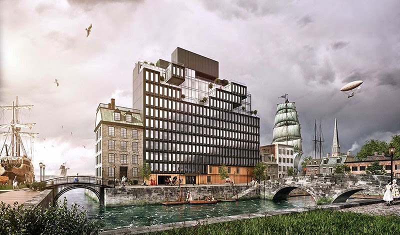
First, there was the steampunk reality of No. 15 Renwick, a residential project near SoHo by ODA Architecture:


And now, in this entry (1 of 86) from the Nine Elms to Pimlico Bridge Competition, there's even more of a sense that the 20th century never happened:


Perhaps, 19th-century entourage is just one way of softening the edges of modern architecture.

Notes from day 2 IntraTeam Event Copenhagen 2015 #iec15

I'm attending the 2015-edition of the IntraTeam Event in Copenhagen. It the 10th time it has been organized and it's my first time at the event. I'm writing along with the talks that I attended and will share my rough notes with you below. These are the notes from day 2 (- Day 1 was the workshop day. As I had to give a workshop I don't have any notes on Day 1. The slides for my/our workshop can be found here).

James Robertson, How design thinking is transforming

Intranets could do more with design. There are several tools to design intranets like:
  • Cardsorting
  • Tree testing (for instance by using Treejack)
  • Wireframing
  • Usability testing
James stresses that we should designing intranets that engage. Intranet should not only be useful (as he thought in the past), but also be beautiful. Employees look at it every day. It should delight employees. He shows several examples of intranets that do this:
  • Accolade
  • Calgary Board of Education (based on Sharepoint)
  • vxconnect, Virgin America's intranet
Also design should change the way of working. Coles – mycoles and Lakewood High School are shown as examples.

Theresa Regli, Evaluating mobile platforms for the enterprise
The main question Theresa will be addressing in her talk is: Should you go big or small when it comes to mobile technology? Big is go with Google, Microsoft, etc. But there are quite some best-of-breed smaller vendors.

What does enterprise mobile technology do?
  • it helps you with mobile app and mobile web experience development
  • services required by these mobile applications
Key players in the market are:
  • Infrastructure: e.g. IBM, Oracle, Salesforce, Adobe, SAP
  • Mobility specialists: e.g. Verivo, Appmobi, Xamarin
  • Niche offerings: e.g. Corana labs, July systems, Spring
The smaller vendors/specialist are much more focused on details and distributing to all types of mobile devices. The big guys focus on android and ios and that’s it.

What exactly are you trying to do?
  • simpler b2c (consumer apps)
  • b2e applications
  • location based
  • online and offline
  • mobile websites (make websites responsive, one-on-one conversion)
  • etc.
Theresa doesn’t think there’s a case for a complete native app for the intranet.
Hybrid apps: downloadable applications but the core uses standard web technologies.
Make sure you have a strategy and choose between a native app or responsive intranet and something in-between.

Closing thoughts
Select big infrastructure if:
  • already invested in them
  • need capabilities to mobilize other products with the suite
  • enterprise concerns more important than breadth of functionality
  • mostly suitable for b2e scenarios
  • usability focused on hybrid approach
In other situations go for a niche vendor.

Dana Leeson, Complicated business management systems made easy

Works for BSI, British Standards Institution (global company)

How do we support our employees?

Shows an (ugly) screenshot of BSi’s assurance business management system just before 2014. They knew they had to do something.

Four separate systems had to be integrated into one (experience), that would manage 3000+ documents:
  1. assurance
  2. product certification
  3. medical devices
  4. standards & publishing
They structured the documents into 4 content types and x document types and x document categories. And assigned an owner. They developed a form with 20 fields to upload and share a document.

BSi wanted to make the system purely focused on work, not on things like news that don’t have to do with news for auditors.

The entry point to the new systems gave a simple overview of updates and comments and links to useful pages.

The users like the system because it’s easy, gives a good overview of work and the documents can be found.

This system is used by auditors and is audited by auditors.

They thought this project would be done in 6 months, it took them 2 years. Know your internal limitations. External examples of speed don’t always work in your organization.

Perttu Tolvanen, Intranet systems beyond SharePoint – overview of the best alternative

You need to understand the philosophy behind systems you can use as an intranet platform.

Make sure you draw out how the (intranet) system relates to other systems. It can help you select the right intranet platform.

Perttu sees 2 trends:
  1. Social layer for the enterprise. Many of the older intranet system providers haven’t found the answer to the social layer.
  2. Microsoft and the cloud. SharePoint 2013 is a dying platform. All investment is in Office365.
And he distinguished between different types of intranets for which different platforms are right:
  1. Social publishing, e.g. Episerver, Confluence, Umbraco, Jive
  2. Complex social publishing (SharePoint doesn’t support this), e.g. Episerver, Drupal, Umbraco. These platforms also support mobile strategies as well.
  3. Management portal concept (hard to move to the cloud), e.g. Liferay, exo, ibm, SharePoint, Oracle
  4. Social publishing and teamwork, e.g. SharePoing, Confluence, Jive, Dropbox
  5. Social publishing and teamwork and document management, e.g. Dropbox, Alfresco, Liferay, IBM
Tomorrow we'll continue with notes from day 2 of the event.

Others are live-blogging the event, please refer to Sam Marshall and Wedge Black's blog.

Book Review: Workforce

Workforce: A Better Place to Work edited by Aurora Fernádez Per, Javier Mozas
a+t, 2014
Paperback, 160 pages


[All images courtesy of a+t]

Recently I picked up a couple used books that are all about work: Nikil Saval's Cubed: The Secret History of the Workplace, published last spring, and Studs Terkel's 1972 classic Working. These two books, combined with a+t's first installment in its Workforce Series, paint a picture of how work and the workplace itself has changed over the last century or so. Being that this is a blog about contemporary architecture, I'm therefore focusing on a+t's collection of recent workplace designs, but I think the book is a bit more meaningful in my mind thanks to reading parts of these other books simultaneously. Overlap can be found, for example, between Workforce and Cubed in the former's "A short history of the development of the office" by Caruso St. John Architects; in brief text and floor plans it parallels the social history that Saval delves into at length. Both books also bring us to a situation today that is much different than the one covered in Terkel's book, which is varied in trade and venue (from farmers and nuns to auditors and baseball players), but which echoes from a time when the white-collar workforce and workplace were narrower and more well defined. Now we work from home, co-work in shared spaces and work in other less traditional ways thanks to technology, increased freelancing and the rise of the creative class. This is the context that a+t tackles in Workforce.


Like other a+t books, the meat of the issue is the projects, in this case 25 office spaces designed by 18 firms. Most of the projects are in mainland Europe and the UK, but some are found in the United States (San Francisco and New York City, not surprisingly) and there is one each in Japan and Australia. But outside a fairly wide if Eurocentric geography, the projects share many traits in common. First, they are exclusively interiors projects, not buildings (perhaps a future installment in a+t's series will feature buildings). Second, many of the buildings/containers are old and formerly industrial, with the architects choosing to leave the "old bones" exposed. Third, there is a focus on the fun or casual, such that the workplaces often feel home-like and unlike traditional office environments of the 20th century (the cover photo is a clear indication of this shared trait); no wonder that the a+t editors call this section of the book "Workspaces: from fun to focus." And fourth, shared, or common spaces are more important than the individual workspaces and often the shared spaces are the locus for the fun and casual.


The shift to environments that are fun, casual and more home-like reflects the trends that are shaping work today, most of them coming about thanks to telecommunications. Laptops and smartphones enable work to take place anywhere, so instead of intense eight-hour days (four in the morning, four after lunch), the workday is longer, less intense and dispersed. As Javier Mozas explains in the critical history that introduces the issue, "The liquid nature of the workplace," companies are responding to the implications of technology by creating spaces that put people at ease and therefore keep them in the office longer. Companies, always aware of the bottom-line, are also devoting more space for common uses (leisure, dining, circulation) and thereby shrinking workers' own desks. Common space is seen nowadays as a space of interaction, which has been elevated to an almost absurdly high status, as it is seen as the place where innovation and creativity occurs. The design of schools, with more attention given to circulation than classrooms, echoes this approach, and one could see the design of public spaces in cities today, with pop-up spaces and the like, as an extension of this thinking. Where work was, in Terkel's day, a task segmented in time and space, it is increasingly one that is fluid, leaking through the borders that have become more and more porous over the years, such that work encompasses more and more of our waking lives. It's only appropriate that architects have responded in kind to create spaces that, if anything, don't remind us of this fact.


Vote for a Daily Dose

A Daily Dose of Architecture is one of ten blogs nominated in the Architecture category of the 6th Annual JDR Industry Blogger Awards. Given the list of great blogs in contention, I don't really stand a chance of winning, but if you like this little 'ol blog, head over to JDR's website and cast your vote, taking a look at the other contenders while you're at it.

banner-blogger-awards2015.jpg

Thanks to Jackson Design and Remodeling for this opportunity. Voting ends April 10 at 4pm PST.

Aftertaste: Inside Imagination

Parsons SCE's Interior Design Aftertaste symposium, Inside Imagination, takes place on Friday and Saturday at Parsons the New School for Design in New York. I was lucky enough to participate in last year's event, so I can't recommend it highly enough. Details on the two-day event are below.


AFTERTASTE 2015: Inside Imagination - SCE

February 27 + 28, 2015
Friday 6-8pm, Tishman Auditorium, University Center, 63 Fifth Avenue, New York City
Saturday 10-6pm, Kellen Auditorium, 66 Fifth Avenue, New York City

What does it take to imagine? We live in an era of environmental crisis and political unrest when complex systems and data analysis dictate projections of an uncertain future. Interiorists study existing places and are charged with imagining new worlds. In AfterTaste 2015, we draw inspiration from artists, educators, writers, and scientists who work to transcend what we know, to catapult culture into areas inspired and new.

Designers and thinkers who cultivate the imagination conjure futures, thinking beyond problem solving to that which has not existed before. What is the spark that creates new possibilities? How can we promote and develop imaginations that can envision and create interiors for an unknown future, rather than being beholden to the past? How can we cultivate the unknown in a culture increasingly defined by big data and digital devices of distraction?

On February 27 and 28, 2015, imagination alchemists, designers and experts gather to think and enact new possibilities and alternative paths through the interior of the imagination. The schedule of events will be as follows; please take special note of the location changes during Saturday’s events:

FRIDAY, FEBRUARY 27
6-8pm, Auditorium, University Center, 63 Fifth Avenue
Social Dynamics in Space: 3 Musical Explorations, presented by Michael Schober
Reception on Stage

SATURDAY, FEBRUARY 28
10am-1230pm, Kellen Auditorium, 66 Fifth Avenue  
Kyna Leski, John Warner, and Linnaea Tillett with David J Lewis, Interlocutor

130pm-230pm, Tishman Auditorium, University Center, 63 Fifth Avenue
Experiment in Performance presented by Jean Taylor, Eric Nightengale, Andres Petruscak

245pm-600pm, Kellen Auditorium, 66 Fifth Avenue, 2:45 – 6:00
Gael Towey, Gary Graham, and Joan Richards with Shannon Mattern, Interlocutor

Participants include: Kyna Leski, Professor, Department of Architecture RISD; John Warner, PhD, Co-Founder of Green Chemistry; Gary Graham, Designer of Fashion; Linnaea Tillett, Designer of Light; Jean Taylor, Actress, Teaching Artist; Mathias Kunzli, Drummer, Percussionist; Michael Schober, Professor, School of Social Research, The New School; Joan Richards, PhD,Professor, Department of History Brown University; Gael Towey, Storyteller, Creative Director; Daniel Carter, Muscian, Writer.

A Taste of PoohTown

Recent University College London graduate Nick Elias's PoohTown is the recipient of the Silver Medal in the 2014 RIBA President's Medals Student Awards. Below is a taste of the amazing project, in which, "1920s Slough is revisited to capitalize from the economy of 'happiness' as an alternative industry using Winnie the Pooh as a metaphorical protagonist for happiness." I recommend clicking over to his project to see the rest, or if you're in London, PoohTown and other "urban tales" will be on display at Carousel from the 6th of March to the 10th of April.


Today's archidose #815

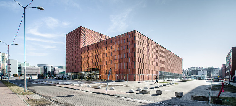
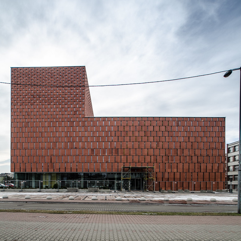
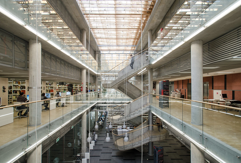
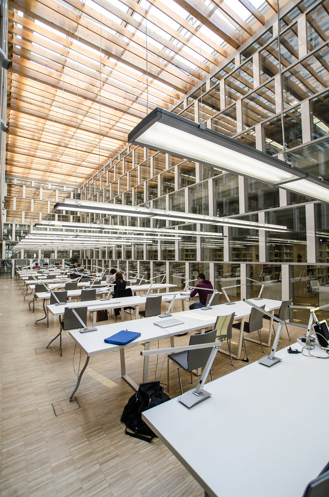
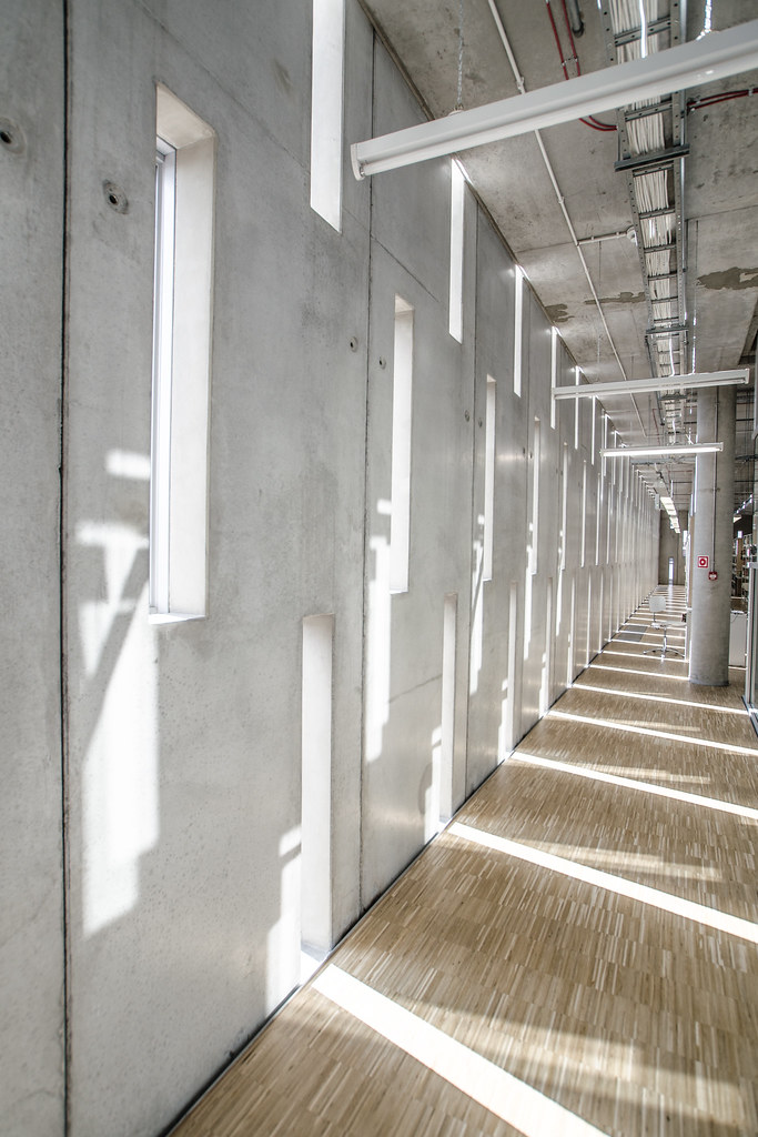
Here are some shots of the CINiBA/The Scientific Information Center and Academic Library (2011) in Katowice, Poland, by HS99, photographed by M Poplawski.

CINiBA

CINiBA

CINiBA

CINiBA

CINiBA

CINiBA

To contribute your Flickr images for consideration, just:
:: Join and add photos to the archidose pool
To contribute your Instagram images for consideration, just:
:: Tag your photos #archidose

Mark Your Calendars, Moneybags

As spotted at Artforum, and with my emphasis:
The Skystone Foundation has announced that James Turrell’s Roden Crater project near Flagstaff, Arizona will be opened from May 14 to May 17 with limited access reserved at five-thousand dollars per person.


Roden Crater, the unfinished magnum opus of Turrell, is closed to the public, so this is one of those rare opportunities for those with both taste and wealth. On top of the $5,000, tax-deductible "donation," the travel company overseeing the package is charging an addition $1,500 to "cover a portion of visitor's expenses while they're staying on site," again per the Artforum blurb. The donation money goes toward the Skystone Foundation, "the organization responsible for the fundraising, administration and realization of James Turrell’s Roden Crater project."

Shooting Construction

If you like tunnels, tall buildings and other large-scale constructions, head over to ENR to see the winners in their 2014 Annual Readers' Photo Contest (runners up can be found here). Here are a few standouts.


[Harry Tracy Water Treatment Plant, photographed by Robin Scheswohl]


[L: East Side Access Project, photographed by Rehema Trimiew; R: Legacy Way Tunnel Project, photographed by Steve Ryan]

Tschumi in PA

Next week Bernard Tschumi is giving a lecture in Pittsburgh, rescheduled from earlier this year when Snowmageddon was predicted but failed to materialize. Details are below.


[Acropolis Museum, Athens, 2001-2009]
SoArch Spring 2015 Lecture Series
BERNARD TSCHUMI
Bernard Tschumi Architects, New York, Paris
Professor, Columbia University
Concept and Notation
Friday 27 February at 5:30pm, Carnegie Lecture Hall
Alan H Rider Distinguished Lecture
Cosponsored by the Heinz Architectural Center at Carnegie Museum of Art

Bernard Tschumi is an architect based in New York and Paris. First known as a theorist, he exhibited and published The Manhattan Transcripts and wrote Architecture and Disjunction, a series of theoretical essays. Major built works include the Parc de la Villette, the New Acropolis Museum, Le Fresnoy Center for the Contemporary Arts, MuséoParc Alésia, and the Paris Zoo.  He was the Dean of the Graduate School of Architecture, Planning, and Preservation at Columbia University in New York from 1988 to 2003. His most recent book is Architecture Concepts: Red is Not a Color, a comprehensive collection of his conceptual and built projects.  His drawings and models are in the collections of several major museums, including MoMA in New York and the Centre Pompidou in Paris; in the spring of 2014, a major retrospective of his work was on view at the Pompidou, with an important bilingual catalogue entitled Bernard Tschumi, Concept and Notation.

Today's archidose #814

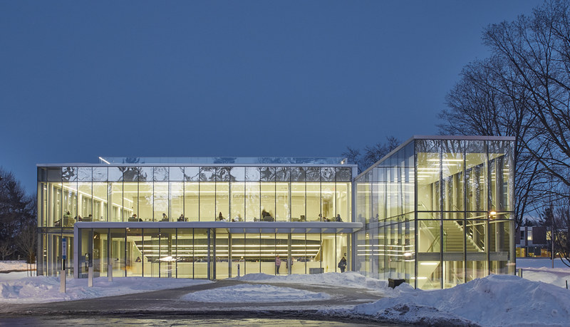
Here are a few wintry scenes for your Monday, President's Day here in the United States.

Centre of Excellence - York University, Glendon Campus by Daoust Lestage Architects, photographed by Riley Snelling:
CEG-32

Housing Complex Zollikerstrasse by Gigon/Guyer, photographed by Andras Kiss:
ANNETTE GIGON / MIKE GUYER ARCHITEKTEN: Wohnhäuser Zollikerstrasse, Zürich

Modern Wing of the Art Institute of Chicago by Renzo Piano Building Workshop, photographed by John Zacherle:
Snow Day at the Art Institute of Chicago #snow #modernwing #artinstituteofchicago #winter #VSCOcam

To contribute your Flickr images for consideration, just:
:: Join and add photos to the archidose pool
To contribute your Instagram images for consideration, just:
:: Tag your photos #archidose

Book Review: BIG. HOT TO COLD

BIG. HOT TO COLD. An Odyssey of Architectural Adaptation by Bjarke Ingels
Taschen, 2015
Paperback, 712 pages


[Wraparound cover – All images courtesy of Taschen]

If Bjarke Ingels' Yes Is More from 2009 didn't reinvent the monograph, it at least injected some new life into it. The BIG helmsman used a comic book format to explain the Danish firm's projects, particularly how those mountainous and curling forms came about. Much has happened in the six years since – BIG has expanded to New York and other offices; Ingels has become a common name and face, given appearances on CNN, TED and other venues with a wide audience; and the firm has produced lots of works, some of it built, some under construction, and some to never be. So 2015 is a fitting time for BIG to put out another monograph, one that accompanies their first U.S. exhibition, also called HOT TO COLD, now at the National Building Museum in Washington, DC.


[W57 "courtscraper" in Manhattan]

Those expecting Yes Is More v2 will be a bit disappointed, since Ingels ditches the "archicomic" format in favor of something more straightforward. But he does not abandon the idea behind the previous book entirely, as the spread from the W57 "courtscraper" project below illustrates. Although Ingels does not pop up on the page accompanied by a speech bubble, the white-on-black captions that overlap the images clearly explain what we are looking at. This quasi-comic approach (quasi in that the captions appear over the images rather than underneath or to the side) makes two things particularly important: the ordering of the images and the words in each caption. In the case of the former, the images – be they renderings, diagrams or floor plans – function much like the step-by-step diagrams that BIG is known for, moving from general to specific, diagrammatic to detailed. And in the case of the captions, they read like a story, a story that Ingels is telling the reader directly. The text is primarily free of archi-jargon, favoring metaphor to explain forms and honesty when explaining how a project came about, or in some cases how it fizzled.


[Spread from W57 project]

[Global hot-to-cold map of the ~60 projects in the book and exhibition]

As the HOT TO COLD name of the book and exhibition indicate, the projects are ordered in terms of climate, moving from the Middle East to the firm's native Copenhagen. At the National Building Museum, this movement happens on the second-story arcade that rings the huge atrium, but in the book it happens, appropriately, from cover to cover, with hot at the beginning and cold at the end. The strong colored border on each spread translates to a rainbow on the edges of the pages, making for a considered design from any angle. One difference between the exhibition and the book is the way the built projects are integrated into the hot-to-cold spectrum in the book, while they are (re)moved to a side gallery in the exhibition.


[Book sans dustjacket, which doubles as a map to the exhibition on the reverse side]

[The first "hot" project in the book]

If Yes Is More clarified Ingels' ambitions, adopting and reworking an expression ("less is more") attributed to one of the greatest architects of the 20th century (Mies van der Rohe) for the 21st century, then HOT TO COLD documents his attempts at turning that ambition into a global reality. Through a combination of striking form-making justified through diagrams, an omnipresence in various media, and a design approach that finds a unique twist in the given circumstances (climate, built context, economics, etc.), BIG's brand of architecture has taken off to just about every bit of land on the globe. Not that many firms could fit 60 projects into a global spectrum the way BIG has done; this is a testament to their appeal and their savvy, yet also their willingness to let the characteristics of a place take part in making attention-getting contemporary architecture.


[The last "cold" project in the book]

Happy Valentine's Day!

HeartBeat
[Stereotank's HeartBeat installation in Times Square, photographed on Friday the 13th]

Slideshow of BIG's W57

Yesterday I walked by BIG – Bjarke Ingels Group's W57, a "courtscraper" under construction on Manhattan's West Side. The slideshow has 20 photos from my short jaunt, moving in a clockwise motion from the southeast to the northeast. The building is scheduled to be completed before the end of the year.

Today's archidose #813

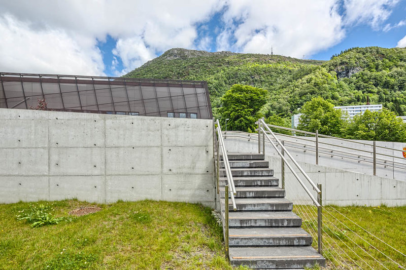
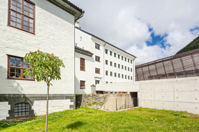
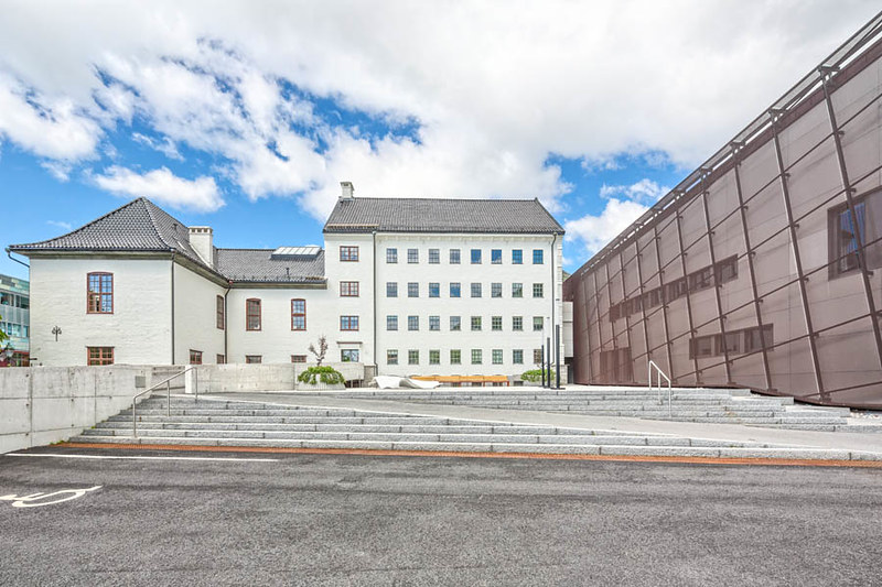
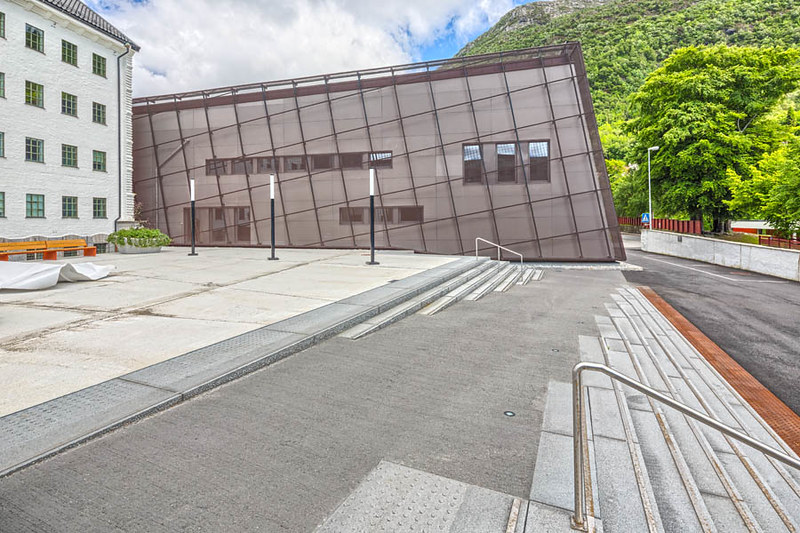
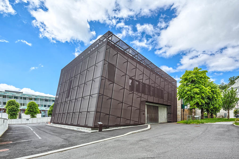
Here are a few photos of the addition to the Regional State Archives (addition 2012, original 1921) in Bergen, Norway, by NAV Architects with VY Arkitektur, photographed by Sindre Ellingsen.

Statsarkivet i Bergen

Statsarkivet i Bergen

Statsarkivet i Bergen

Statsarkivet i Bergen

Statsarkivet i Bergen

To contribute your Flickr images for consideration, just:
:: Join and add photos to the archidose pool
To contribute your Instagram images for consideration, just:
:: Tag your photos #archidose