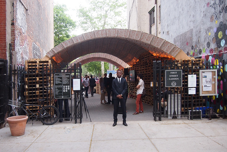
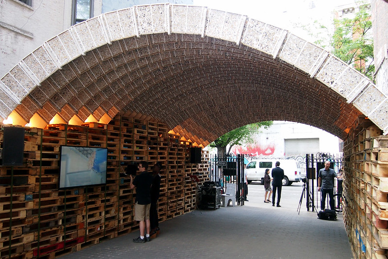
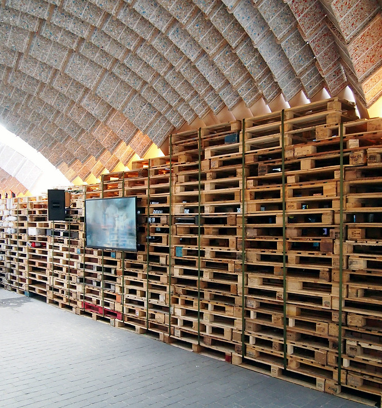
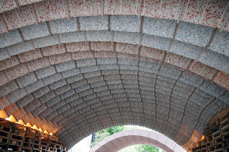
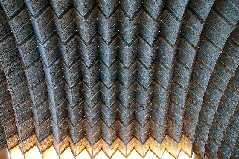
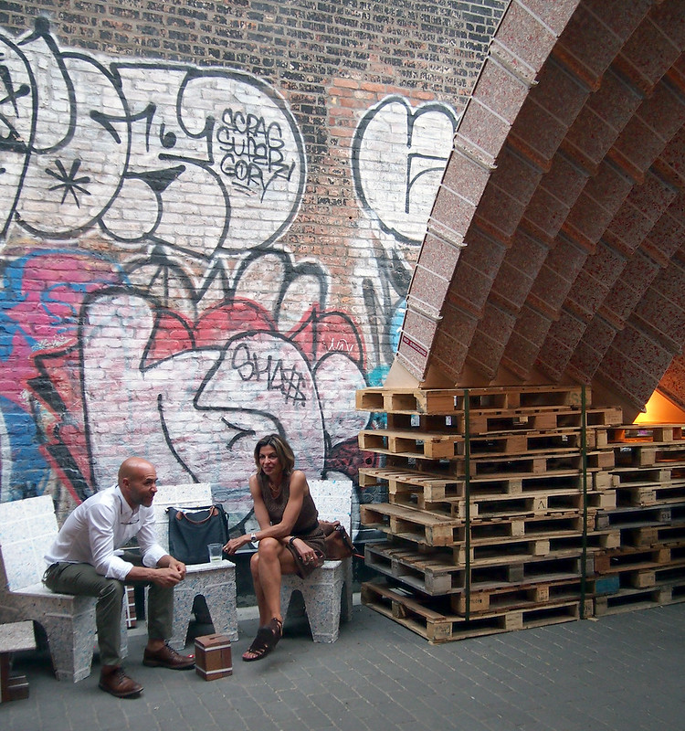
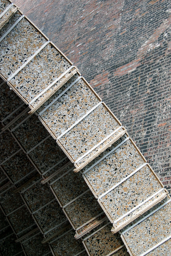
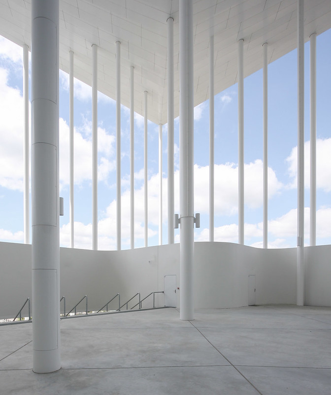
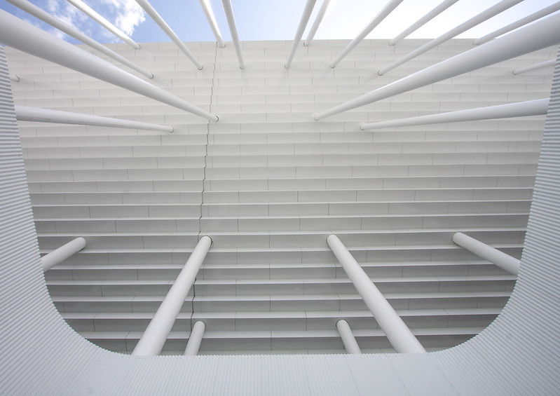
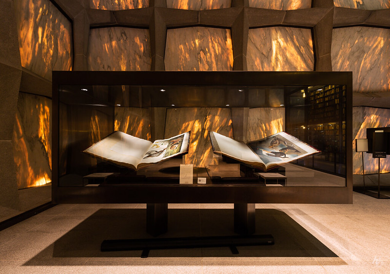
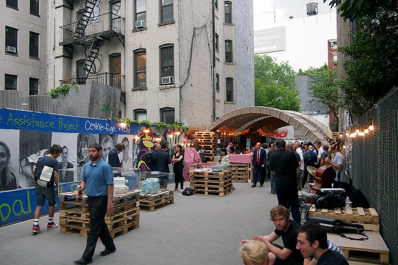
Below are some of my photos of the ETH Zurich Pavilion that is part of the IDEAS CITY Festival in New York City. To learn more about the pavilion, which is made from old beverage cartons, head over to World-Architects to see the piece I wrote.
Today's archidose #840
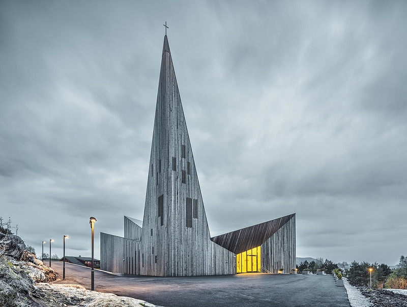
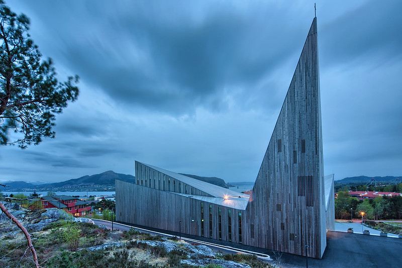
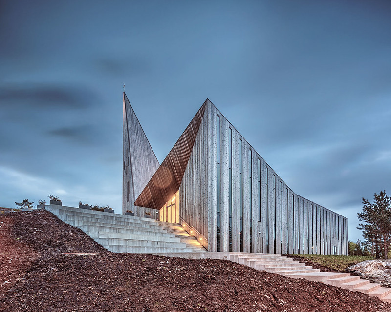
Here are some photos of the Community Church Knarvik (2014) in Hordaland, Norway, by Reiulf Ramstad Arkitekter, photographed by Sindre Ellingsen.
To contribute your Flickr images for consideration, just:
:: Join and add photos to the archidose poolTo contribute your Instagram images for consideration, just:
:: Tag your photos #archidose
Ross Barney Architects Studio Visit
Head on over to World-Architects to see a studio visit I made to Ross Barney Architects in Chicago. The firm opened a stretch of the Chicago Riverwalk over Memorial Day Weekend, one of the projects highlighted in the piece.
[Ross Barney Architects occupies the old office of Harry Weese | Photo by John Hill]
[Ross Barney Architects occupies the old office of Harry Weese | Photo by John Hill]
AE32: Climbing Nets
No less than three projects featuring nets – at least two for climbing – were featured in today's email from Arch Daily.
OB Kindergarten and Nursery by HIBINOSEKKEI + Youji no Shiro:
[Photo: Studio Bauhaus, Ryuji Inoue]
Garrison Treehouse by Sharon Davis Design:
[Photo: Elizabeth Felicella]
Saigon House by a21studio:
[Photo: Quang Tran]
Add to those projects a few more...
Brazil Pavilion at Expo Milano 2015 by Studio Arthur Casas + Atelier Marko Brajovic:
[Photo: Iñigo Bujedo Aguirre]
Net by Numen:
[Photo: Courtesy of Numen]
In Orbit by Tomás Saraceno:
[Photo: Studio Tomás Saraceno]
...And it looks like we have ourselves a new – or at least trendy – architectural element, with porous, malleable, playful surfaces bridging the realms of art and architecture.
Book Review: Architectural Styles
Architectural Styles: A Visual Guide by Owen Hopkins
Laurence King, 2014
Paperback, 240 pages
In the introduction to his visual guide to architectural styles, Owen Hopkins lets the reader know that architectural "style" is a 19th century creation, something that enabled architectural historians to chart developments in the appearances of buildings over time. But 220 pages later, in the book's postscript, he asks, "In the face of ever-increasing architectural variety...what possibilities are there for 'style'?" In both instances, Hopkins appears to be arguing against the validity of architectural style and the need for a book documenting one. Yet alas, he has written a book on such a topic, and with its focus on the visual, the book is a good introduction for students of architecture and laypeople with an interest in architecture, and a handy reference for architects who have forgotten what they learned in their history classes.
In the book's chronological format, there is an obvious move from simplicity to complexity, from "one" classical style to a plethora of styles, or, more accurately, a plurality of architects creating their own styles. The book starts with a chapter on the Classical and then moves on to eight more chapters: Early Christian, Gothic and Medieval, Renaissance and Mannerism, Baroque and Rococo, Neoclassicism, Eclecticism, Modernism, and After Modernism. The name of the last chapter reiterates the idea that style is historical; it is used to talk about what happened in the past, rather than what is happening now, or at least in the recent present. Charles Jencks may argue that just about everything post-Pruitt Igoe is Postmodernism, but Hopkins breaks down the last chapter to also include Regionalism, Deconstructivism, Eco-architecture, Expressive Rationalism, and Contextualism. He does the same for each chapter, elucidating the nuances within a style that arose from geography and time.
As can be seen in the spread above, within each chapter and "sub-style" Hopkins highlights key terms that accompany a photo of a building. This is the format used throughout, which certainly emphasizes the visual, but also brevity. This is architectural history for people who scan their content, be it by scrolling through web pages, flipping through magazines, or "reading" the environment around them. There isn't anything necessarily wrong with this approach, but at times I wish Hopkins went further in his visual approach, like he did in Reading Architecture, which includes numerous drawings, many with labels, and photographs labeled as a means of visual storytelling. Perhaps the difference is due to the page size, as Styles is smaller than Reading, making it a compact guide. Whatever the case, Architectural Styles will not replace more thorough histories of architecture, but it does a good job in making architectural history more accessible and understandable to a wider audience.
LEGOs coming to the High Line
Friends of the High Line has announced that Danish-Icelandic artist Olafur Eliasson will be presenting "The collectivity project, an installation of white LEGO bricks that features an imaginary cityscape conceived and designed by the public," from May 29 until September 30 on the High Line at West 30th Street. The collectivity project was previously installed in public squares in Tirana, Albania (2005, photo below), Oslo, Norway (2006), and Copenhagen, Denmark (2008).
[Olafur Eliasson, The collectivity project, 2005. Installation view at 3rd Tirana Biennale, Albania, 2005. Photo by Olafur Eliasson. Courtesy the artist; neugerriemschneider, Berlin; and Tanya Bonakdar Gallery, New York.]
In addition to the public – meaning kids like my six-year-old daughter – being able to play with the LEGOs,
"a selection of architectural firms involved in current or ongoing projects in the surrounding neighborhood – BIG–Bjarke Ingles Group, David M. Schwarz Architects, Diller Scofidio + Renfro, James Corner Field Operations, OMA New York, Renzo Piano Building Workshop, Robert A.M. Stern Architects, Selldorf Architects, SHoP, Steven Holl Architects – have been invited to collaborate by building one visionary structure or construction for the opening of the project. In the cooperative spirit of the project, these initial buildings will become part of the collective architecture that the public builds over the four months of the project’s installation."So starting Friday, you'll have the chance to modify a design by one of these firms, just another reason to head to the High Line this summer. Oh, and I'm giving a walking tour of the High Line on Saturday, May 30 – tickets available here.
Today's archidose #839
Here are some photos of the Northeastern Illinois University El Centro Campus (2014) in Chicago, Illinois, by JGMA, photographed by John Zacherle.
To contribute your Flickr images for consideration, just:
:: Join and add photos to the archidose poolTo contribute your Instagram images for consideration, just:
:: Tag your photos #archidose
Book Review: Local Architecture
Local Architecture: Building Place, Craft, and Community by Brian-MacKay-Lyons, edited by Robert McCarter
Princeton Architectural Press, 2015
Hardcover, 224 pages
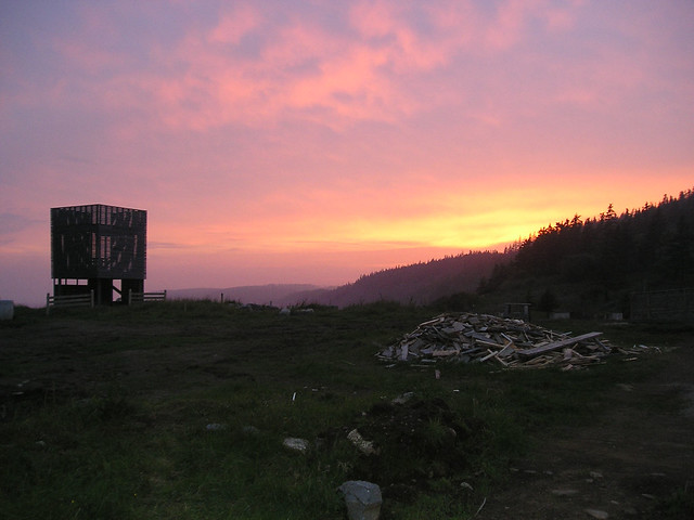
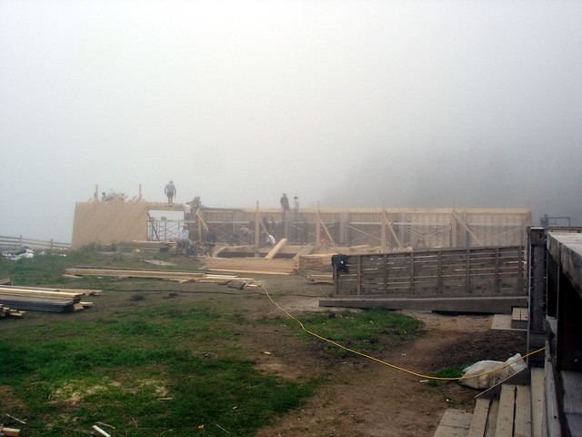
Ghost, a laboratory run by Canadian architect Brian MacKay-Lyons where architecture students would design and build small structures on land owned by the architect in Nova Scotia, started in 1994 with "a resurrection of a house silhouette in a cow field, an apparition, a ghost raised from earlier times." In 2011, twelve Ghosts later, it went on hiatus. To mark what might be seen as the completion of an experiment started by MacKay-Lyons, a principal at MacKay-Lyons Sweetapple Architects, Ghost 13 was a three-day symposium, themed "Ideas in Things," held on the same property in June 2011. This book documents the symposium and its who's-who list of architects respected for, as the title attests, creating architecture that responds to place, craft and community. Although the book does not summarize the twelve Ghost pavilions (a 2008 book documents the first nine), it does summarize the ideas behind the undertaking.
[Photo of Ghost 6 by archaalto]
The book has three parts. First are the three symposium keynotes by Kenneth Frampton, Juhani Pallasmaa, and Glenn Murcutt. Each one is valuable: Frampton for critically looking as his idea of critical regionalism; Pallasmaa for exploring a "call for a sustainable metaphor," or something that make sustainability more than just a functional notion; and Murcutt for honestly answering the questions from Pallasmaa about his background and approach to architecture (the questions were submitted by symposium participants and selected by MacKay-Lyons and Robert McCarter). Second are projects by symposium speakers: Marlon Blackwell, Wendell Burnette, Vincent James, Rick Joy, Tom Kundig, Patricia Patkau, Dan Rockhill, and Bridgitte Shim, to name just a few. This section takes up the most pages, adding plenty of eye candy to the otherwise word-heavy content. Third and last are essays by symposium critics Peter Buchanan and Robert McCarter (Tom Fisher supplies the book's introduction), as well as Ingerid Helsing Almaas, Christine Macy and Essy Baniassad.
[Building Ghost 8 | Photo by archaalto]
The ideas prevalent in Ghost 13 are not just the givens of place, craft and community; they are education (what MacKay-Lyons calls "the elephant in the room" during the symposium) and making. The "Ideas in Things" theme implies that a thing must be made for the idea to be expressed, experienced, tested, learned from, etc. It's no wonder then that the projects that make up the middle portion of the book are all built – no speculative renderings, just photographs and architectural drawings. None of this is too shocking or groundbreaking; MacKay-Lyons even says in his afterword that the symposium might be seen as "preaching to the choir." But what I wish came across more in the book was the experience of the symposium, which sounds like an amazing time for those presenting as well as those attending. Much of that must have come from the place itself, the property of the Ghosts that so eloquently expresses in built form what the symposium, and this book, was trying to say in words and images.
"I'm OK. The world's all wrong."
The quote of this title's post comes from the notebook of Harry Weese, which is featured in a 2010 episode of Chicago Tonight. The 13-minute piece gives a good overview of a late Chicago architect who, like Bertrand Goldberg, has been overshadowed by Mies, SOM, and other architects in the city, even though he produced some of the city's best architecture. It's worth watching if you don't know his story.
(Click here to watch the video if you don't see the embedded video above.)
Book Review: Fuksas Building Update
Fuksas Building Update by Massimiliano & Doriana Fuksas
Actar, 2015
Hardcover, 250 pages
First off, I should admit that I don't have nor haven't seen the first Fuksas Building, published by Actar in 2011, which this book updates. So I can't really comment on how well this book extends the content of that monograph, nor if it is worth having in addition to that book. Second, I should admit that I have a love-hate relationship with Fuksas's work, which I have seen little of in person (the Armani Fifth Avenue springs to mind), but which, like other architects these days, has some interesting qualities at a small scale that don't necessarily work when blown up larger. The glass roof funnels of the New Milan Trade Fair, for example, are appealing (if a repeated element for Fuksas), but not at what looks to be a half-mile length of the concourse. The buildings of Massimiliano and Doriana Fuksas are increasingly larger (heck, they just finished an airport in China), but I'm not sure their architecture responds accordingly. Nevertheless, I like the brevity of the spread before the first chapter, Buildings, which is found in lieu of a traditional, multi-page introduction:
This statement made me wonder if in fact they don't have a style. At first I agreed, since the three projects mentioned and linked above are a pretty diverse bunch. Regardless, they are recognizable as Fuksas projects, along the lines of Renzo Piano's buildings being recognizable as his own even though he doesn't have a signature style in the vein of, say, Richard Meier, to cite the most obvious example. Like Piano, Fuksas's buildings have a "style" at the level of detail, element and surface: undulating glass roofs, blobs with perforated surfaces, and cantilevered glass boxes, to name a few. Also, the husband-wife duo really like to juxtapose hard-edge boxes with soft forms and surfaces, such as inside the Armani Fifth Avenue and in the New Rome-Eur Convention Centre and Hotel, which is highlighted in the Construction chapter:
The other chapters in the book, in addition to Construction, which only has the one project, are: Building, with eight buildings, most of them completed in 2012 and 2013, and documented through photographs and brief text; Project, which has five projects briefly explained through renderings; and Drawing and Detail, which has construction documents (plans, sections, details, etc.) for nine projects, seven of them from the Building chapter. Drawing and Detail is easily the most valuable part of the book for architects, since it includes the types of drawings and information that are otherwise overlooked in monographs. It's great to see, for example, sections through the "blob" inside the boxy EUR project, even if the individual sections are at a small scale (below). Since the drawings reference the built work at the front of the book, other architects can grasp how the projects moved from drawing to building, one thing that makes this book an appealing one, especially for fans of Fuksas's style-free architecture.
What's that ↑ up there?
Unless you're reading this post on a mobile device or in your email browser, you're seeing a new widget with three images tucked between the title atop the blog and this post below it. This widget features three recent posts from the World-Architects Daily News, where I am Editor in Chief. Given that a good deal of my time during the day is spent adding posts to the Daily News, I felt it would be good to highlight some of them and this widget seems like a good way to do it.
So click on the images to see the Headlines, Films, Products, Insights, and other features over at the World-Architects Daily News.
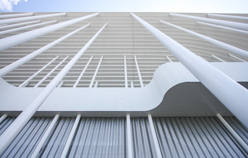
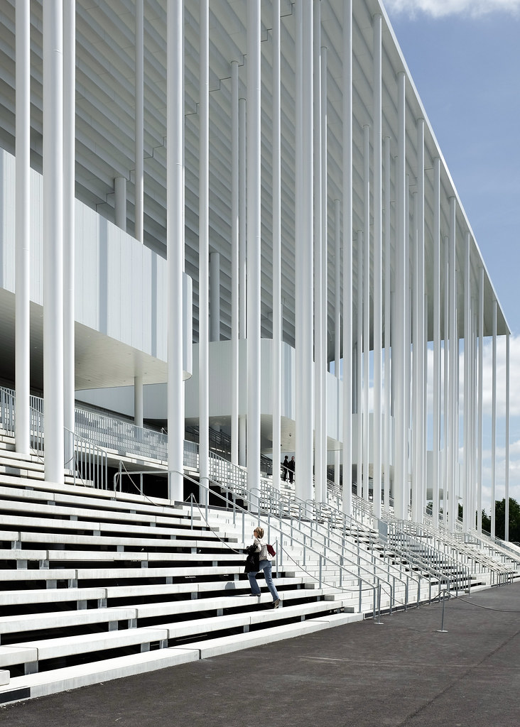
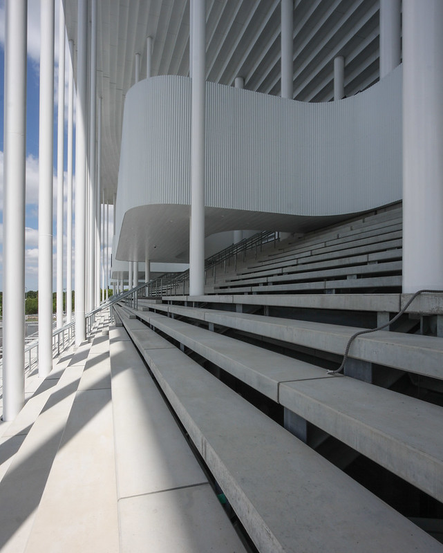
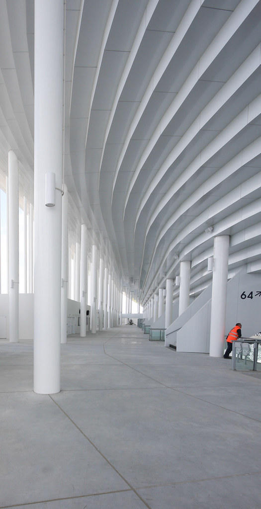
Today's archidose #838
Here are some photos of the Nouveau Stade de Bordeaux (2015) in Bordeaux, France, by Herzog & de Meuron, photographed by JP2H.
To contribute your Flickr images for consideration, just:
:: Join and add photos to the archidose poolTo contribute your Instagram images for consideration, just:
:: Tag your photos #archidose
Book Review: The Japanese House Reinvented
The Japanese House Reinvented by Philip Jodidio
Monacelli Press, 2015
Hardcover, 288 pages
In the introduction to Philip Jodidio's new book highlighting fifty recent Japanese houses, the author mentions that Japan and the United States share a preference for single-family houses over apartments. While not a surprising statement, the similarities end there, since each country's geography, culture, economics and other factors have created widely divergent contemporary designs. Japan, in particular, is full of houses that scream "Japan," most of them found in the tight confines of Tokyo, like the project gracing the cover (Atelier Tekuoto's "Monoclinic"). But, as Jodidio's selection of houses shows, there is more to single-family residential architecture in Japan that idiosyncratic vertical houses in tight confines, even as some of those are found in these pages.
One of the numerous US-Japan differences in single-family houses is size, with those in the United States averaging around 2,600 square feet, exactly double Japan's average of 1,300 square feet. It's not surprising to find numerous houses in this book that are under that average, many with three digits rather than four. But there are a surprising number of large houses, from a 2,000-square-foot house in Osaka designed by Tadao Ando to a 13,475-square-foot (nope, that's not a typo) house in Tokyo designed by ARTechnic Architecture. Before you start thinking that I'm gung-ho for Japanese houses being as big as American ones (I'm not), it is interesting to see how large houses in Japans are designed.
[Shigeru Ban: Villa in Sengokuhara]
One house that can serve as an example is Shigeru Ban's 4,875-square-foot Villa in Sengokuhara, which is like a letter P in plan with squared-off, metal-clad walls on the exterior and rounded glass walls facing the interior courtyard. It's definitely not a house that could be pulled off in expensive Tokyo, much less Kyoto or Osaka; the rural setting in Hakone, Kanagawa Prefecture, is ideal for the extra-large house. Even though the house is large on square footage (the site area is nearly 20,000 square feet, or almost half an acre), the "rooms" that ring the courtyard are well-scaled, thanks to the narrow width of the plan. Instead of Great Rooms, as many bloated US houses like to incorporate, the grandness of the design comes from the openness of the rooms through sliding glass walls to the courtyard at its center. (As a point of contrast, Jodidio includes Ban's Yakushima Takatsuka Lodge, a small lodge of only 355 square feet.)
Two other large houses in the book suit my fancy, but for what they do with their size, not simply for being large. TNA Architects' Gate Villa, like Ban's Villa in Sengokuhara, is large (4,080 square feet), but its outdoor space is about three times as large. The house is based on a 23-foot-square grid – 4 modules by 5 modules – but only 7 of the 20 modules in the grid are used for enclosed space; the other 13 are open spaces that range from one module to six contiguous modules. The other house is Mount Fuji Architects Studio's Shore House, smaller at 3,210 square feet, which has a roof terrace for outdoor space but makes a double-height space lined with open shelves the main feature. Perhaps it's just the bookworm in me salivating, but that house is just one of the many marvelous designs found in this book, all thoroughly Japanese but more varied that what we've come to expect from the plethora of books on the island's contemporary houses.
Monacelli Press, 2015
Hardcover, 288 pages
In the introduction to Philip Jodidio's new book highlighting fifty recent Japanese houses, the author mentions that Japan and the United States share a preference for single-family houses over apartments. While not a surprising statement, the similarities end there, since each country's geography, culture, economics and other factors have created widely divergent contemporary designs. Japan, in particular, is full of houses that scream "Japan," most of them found in the tight confines of Tokyo, like the project gracing the cover (Atelier Tekuoto's "Monoclinic"). But, as Jodidio's selection of houses shows, there is more to single-family residential architecture in Japan that idiosyncratic vertical houses in tight confines, even as some of those are found in these pages.
One of the numerous US-Japan differences in single-family houses is size, with those in the United States averaging around 2,600 square feet, exactly double Japan's average of 1,300 square feet. It's not surprising to find numerous houses in this book that are under that average, many with three digits rather than four. But there are a surprising number of large houses, from a 2,000-square-foot house in Osaka designed by Tadao Ando to a 13,475-square-foot (nope, that's not a typo) house in Tokyo designed by ARTechnic Architecture. Before you start thinking that I'm gung-ho for Japanese houses being as big as American ones (I'm not), it is interesting to see how large houses in Japans are designed.
[Shigeru Ban: Villa in Sengokuhara]
One house that can serve as an example is Shigeru Ban's 4,875-square-foot Villa in Sengokuhara, which is like a letter P in plan with squared-off, metal-clad walls on the exterior and rounded glass walls facing the interior courtyard. It's definitely not a house that could be pulled off in expensive Tokyo, much less Kyoto or Osaka; the rural setting in Hakone, Kanagawa Prefecture, is ideal for the extra-large house. Even though the house is large on square footage (the site area is nearly 20,000 square feet, or almost half an acre), the "rooms" that ring the courtyard are well-scaled, thanks to the narrow width of the plan. Instead of Great Rooms, as many bloated US houses like to incorporate, the grandness of the design comes from the openness of the rooms through sliding glass walls to the courtyard at its center. (As a point of contrast, Jodidio includes Ban's Yakushima Takatsuka Lodge, a small lodge of only 355 square feet.)
Two other large houses in the book suit my fancy, but for what they do with their size, not simply for being large. TNA Architects' Gate Villa, like Ban's Villa in Sengokuhara, is large (4,080 square feet), but its outdoor space is about three times as large. The house is based on a 23-foot-square grid – 4 modules by 5 modules – but only 7 of the 20 modules in the grid are used for enclosed space; the other 13 are open spaces that range from one module to six contiguous modules. The other house is Mount Fuji Architects Studio's Shore House, smaller at 3,210 square feet, which has a roof terrace for outdoor space but makes a double-height space lined with open shelves the main feature. Perhaps it's just the bookworm in me salivating, but that house is just one of the many marvelous designs found in this book, all thoroughly Japanese but more varied that what we've come to expect from the plethora of books on the island's contemporary houses.
Today's archidose #837
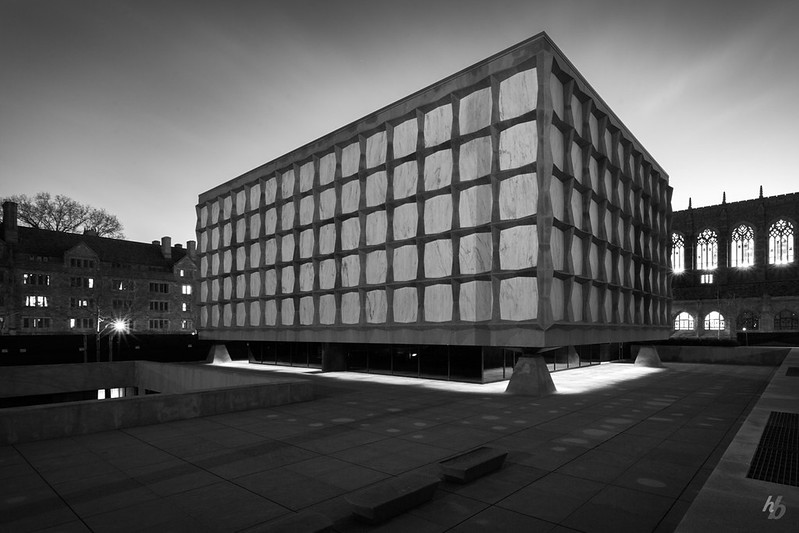
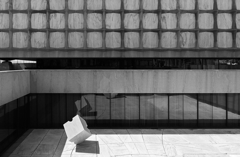
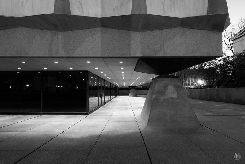
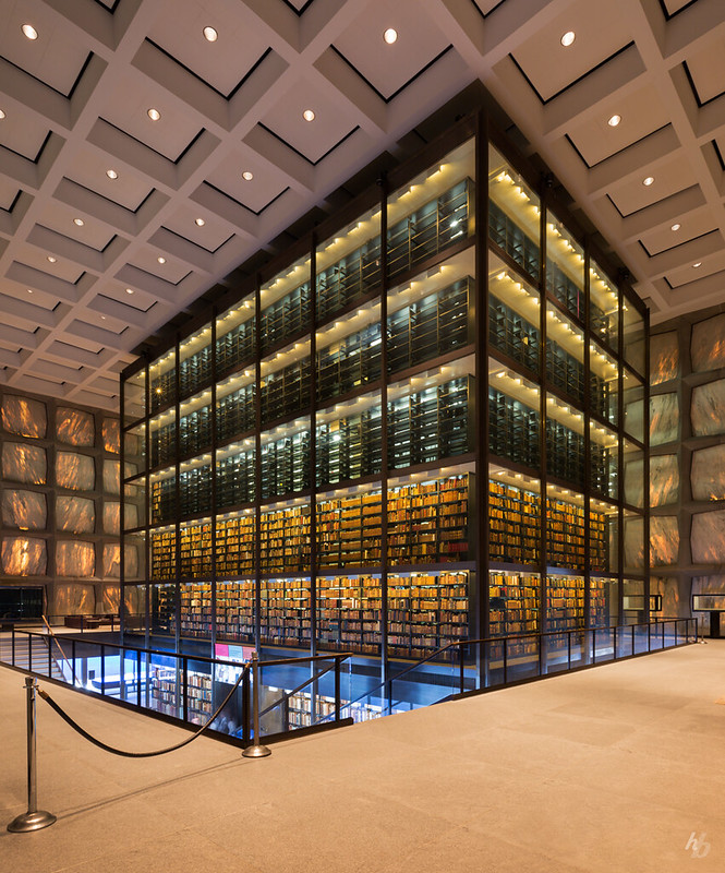
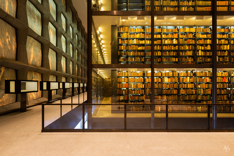
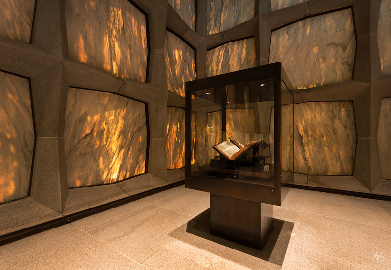
Here are some photos of the Beinecke Rare Book & Manuscript Library (1963) at Yale University in New Haven, Connecticut, by Skidmore, Owings & Merrill, photographed by Hassan Bagheri.
To contribute your Flickr images for consideration, just:
:: Join and add photos to the archidose poolTo contribute your Instagram images for consideration, just:
:: Tag your photos #archidose
Subscribe to:
Posts (Atom)