Today's archidose #785

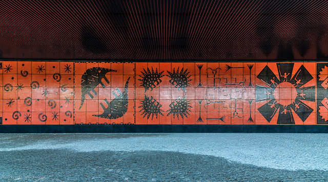
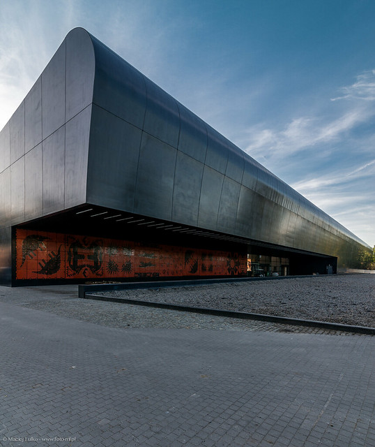
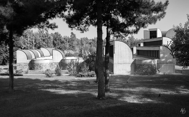
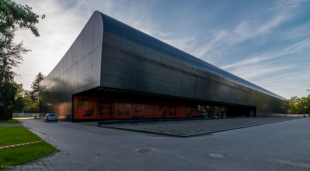
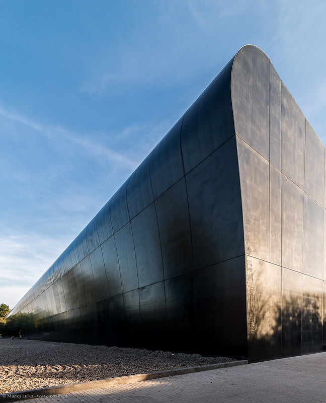
Here are some photos of the Afrykarium - Oceanarium, ZOO Wrocław (2014, under construction) in Wrocław, Poland, by ArC2 Fabryka Projektowa, photographed by Maciek Lulko.

Afrykarium

Afrykarium

Afrykarium

Afrykarium

To contribute your Flickr images for consideration, just:
:: Join and add photos to the archidose pool
To contribute your Instagram images for consideration, just:
:: Tag your photos #archidose

High Line at the Rail Yards

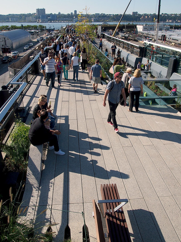
Like my time-lapse walk of the High Line posted last week, here is a north-to-south tour of the third section of the High Line, which opened to the public on September 21. About 2/3 of this section is a solid-surface walkway that parallels plantings kept in their found, as-is state with wildflowers and other vegetation. After that, the park changes to its more familiar palette of precast concrete pavers, benches, reused rails, and so forth; as will be seen, these elements are used in a slightly different way than the first two sections.

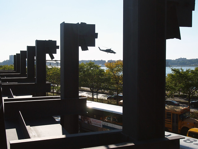
Some steel pylons overlooking the Hudson River and West Street:
High Line Section 3

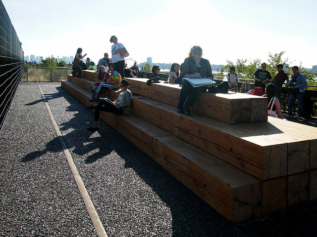
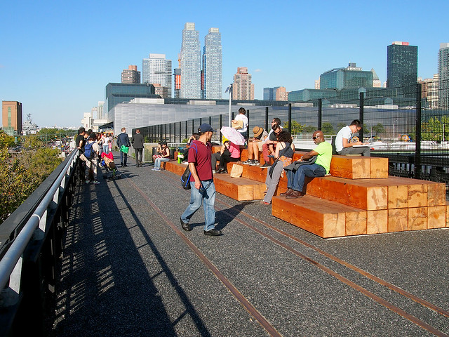
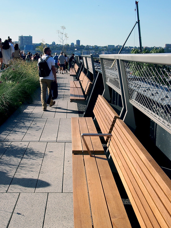
About halfway along the straightaway paralleling the Hudson River are these large pieces of timber stacked into seating overlooking the Hudson on the right and the Hudson Yards on the left:
High Line Section 3

Another view of the benches, this time looking north to Javits:
High Line Section 3

Separating the walkway from the wildflowers is chain link fencing that the wildflowers poke through:
High Line Section 3

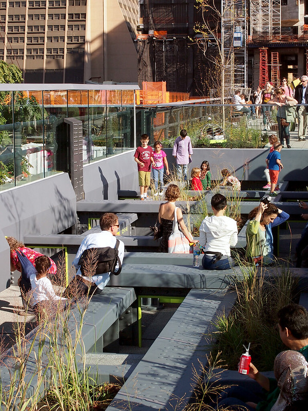
A large seating area can be found at the bend where the High Line turns east (the vista will be full of Hudson Yard towers in five years):
High Line Section 3

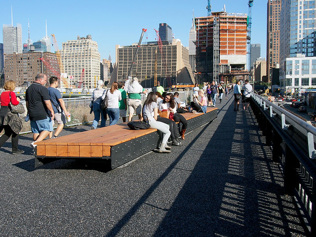
Another look at the bench made from steel and wood:
High Line Section 3

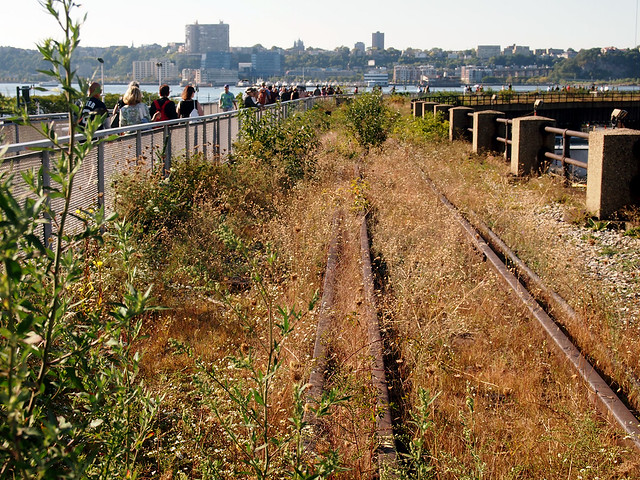
A view of the wildflowers looking west:
High Line Section 3

Section 3 has the High Line's only playground, where kids can squirrel their way through the steel beams (this is where this section transitions from "wild" to "tame":
High Line Section 3

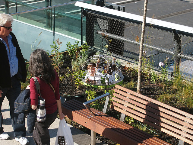
At the end of the playground is a tube where kids can pop their heads up in a planting bed:
High Line Section 3

A stair at 11th Avenue gives an elevated view of the park, here looking west:
High Line Section 3

Seating over 11th Avenue incorporates tall backs for safety:
High Line Section 3

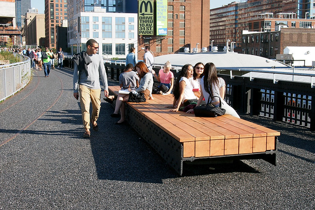
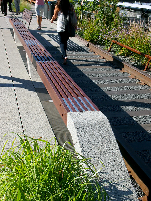
Some of the peel-up benches in section 3 combine to make really long benches:
High Line Section 3

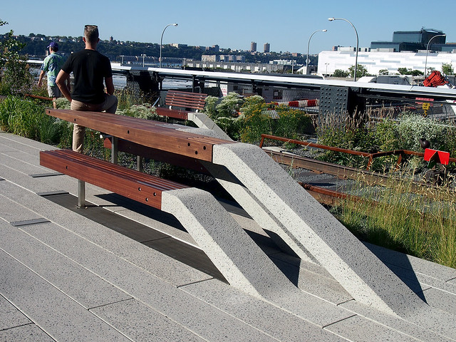
Another slightly different detail is the creation of tables similar to the benches:
High Line Section 3

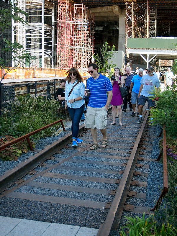
Also new is being able to walk between the rails and atop the railroad ties:
High Line Section 3

Long-Awaited DVD of the Moment

Finally! Thom Andersen's brilliant, nearly three-hour documentary Los Angeles Plays Itself is being released on DVD and Blu-Ray on October 14, eleven years after it was completed.


At its most basic, the video essay (as it's been called) is an analysis of Los Angeles through movies. On a deeper level, film critic Jonathan Rosenbaum calls it, in addition to "a masterpiece," "an essay that qualifies as social history, as film theory, as personal reverie, as architectural history and criticism, as a bittersweet meditation on automotive transport, as a critical history of mass transit in southern California, as a wisecracking compilation of local folklore, as “a city symphony in reverse,” and as a song of nostalgia for lost neighborhoods such as Bunker Hill and unchronicled lifestyles such as locals who walk or take buses." (my emphasis) Rosenbaum's description of the film as part architectural history and criticism is spot on, just one aspect that makes it a stimulating and enjoyable experience for every one of its 169 minutes.


So, you may be asking, why has it taken eleven years for a DVD release? The main reason is that the film was made without studio backing and distribution, and since it's completely made up of clips from other films (with Andersen's highly opinionated narration on top), the rights to use the hundreds of clips was too much for the filmmaker or any distributor wishing to take on the task.


Enter The Cinema Guild, which announced in July that it would be releasing Los Angeles Plays Itself and three more Andersen titles: Red Hollywood, Eadweard Muybridge, Zoopraxographer, and Reconversão. As other documentaries have invoked "fair use" protections in recent years, such as This Film Is Not Yet Rated, so is Andersen. As he said last year last year on the film's 10th anniversary: "I was, am, and will be able to use [the clips] under fair use. No copyright owners were harmed in the making of this film."

For a taste of the joys of Andersen's film, here is a 6:40 clip on the use of modern houses in films:


Available at Buy from Amazon.com (but cheaper to buy direct from Cinema Guild on DVD and Blu-Ray.)

White Sails Hospital & Spa

File this thing under "money does not buy taste": Millionaire architect Vasily Klyukin's proposal for a 4-tower hospital and spa to be built in Tunisia Economic City.


(via The Verge)

Today's archidose #784

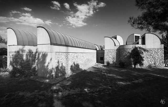
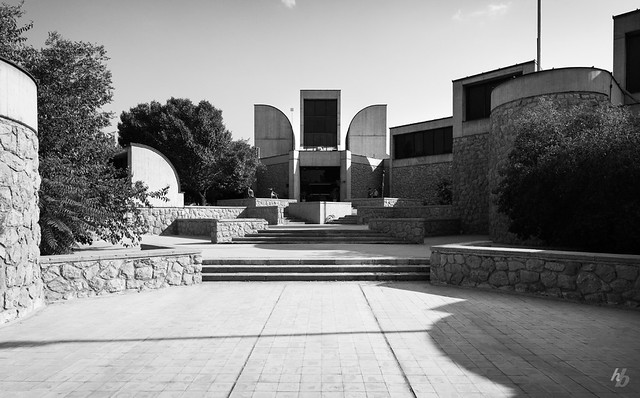
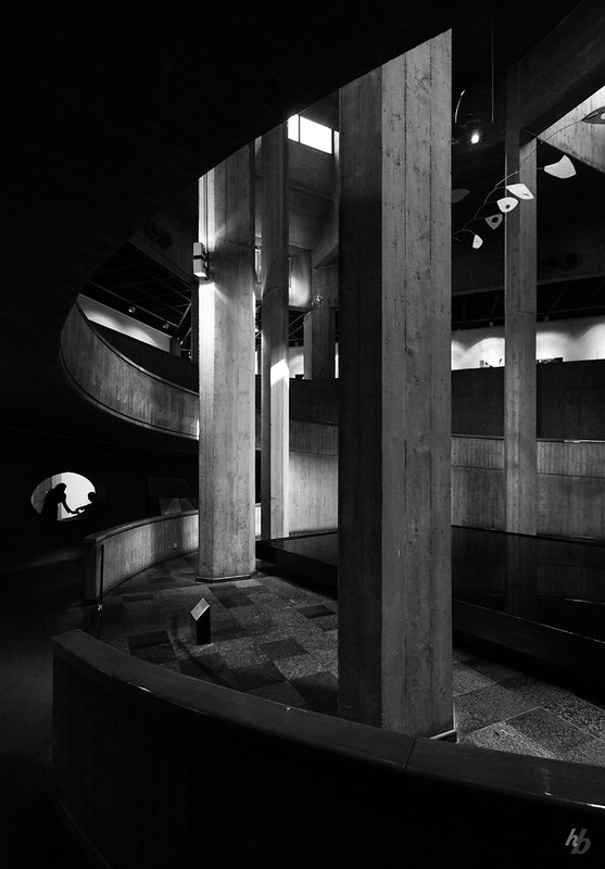
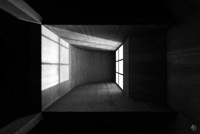
Here are some photos of the Tehran Museum of Contemporary Art (1977) in Tehran, Iran, by Kamran Diba, photographed by Hassan Bagheri.

Tehran Museum of Contemporary Art

Tehran Museum of Contemporary Art

Tehran Museum of Contemporary Art

Tehran Museum of Contemporary Art

Tehran Museum of Contemporary Art

To contribute your Flickr images for consideration, just:
:: Join and add photos to the archidose pool
To contribute your Instagram images for consideration, just:
:: Tag your photos #archidose

Rome Prize 2015

It's autumn, which means it's time to apply for a Rome Prize at the American Academy.


Deadline is November 1.

Book Review: Two Books about Writing

The Architect's Guide to Writing: For Design and Construction Professionals by Bill Schmalz, illustrations by Bob Gill
Images Publishing, 2014
Paperback, 160 pages

Writing Architecture: A Practical Guide to Clear Communication about the Built Environment by Carter Wiseman
Trinity University Press, 2014
Paperback, 230 pages


I am an architect first and a writer second. Educated as an architect and urban planner, I find myself devoting most of my time to writing, be it for this blog, online publications or printed matter. While my situation is different than most architects who run or practice in firms, I share an educational background where studio comes first and writing comes much later – certainly not second but maybe fourth or fifth. This condition makes sense, given the need to express ourselves through drawings and models, the need to understand structures and materials, and a general reliance of the visual over the written word in explaining ideas to others. This condition also means that the writing of architects who came out of the system could be much improved. I like to think my writing has improved over the years, considering I do a lot of it every day, but for practicing architects it's helpful to have aids when it comes to the task of writing. These two books, although they sound similar, are very different from each other; in concert they offer broad and detailed advice for the many architects in need of help in expressing themselves through writing.

The broad strokes come from Carter Wiseman in his book Writing Architecture. Wiseman, a former architecture critic for New York Magazine, teaches classes at Yale, one of them on architectural writing. Much of that class lays the foundation for this book, and occasionally the author uses examples culled from the class. If writing is directed at addressing certain questions (who, what, when, where, how, why), Wiseman's book deals with the what, the how, and the why. What is defined in the chapters that take different types of writing as their subject: criticism, scholarship, literature, presentation, professional communication. How comes in the form of positive examples that Wiseman quotes and discusses within the chapters; most often these are architects and writers, but sometimes they come from his students, and sometimes the examples are how not to write. Why is basically the whole book, which argues that clear communication is integral for successful architecture, since words have an important part in expressing ideas, and because any architect will admit they write much more than they ever would have anticipated.

With Wiseman broadly addressing who, how, and why, Bill Schmalz, a principal at Perkins + Will's L.A. office, hones in on the how, but not in the same way that Wiseman does. In The Architect's Guide Writing, Schmalz examines vocabulary, grammar, punctuation, style, spelling, and other highly detailed ways of writing the English language. Given the many pages devoted to clearing up errors that shouldn't happen with educated people (its versus it's, for example), it's clear that the author believes architects are poor writers, or perhaps good writers struggling through bad habits. Therefore the book functions like a crash course in getting reacquainted with written English in order to write more clearly, free of jargon, and primarily free of errors (it's hard to be completely free of them). More seasoned architect/writers, myself included, may find the advice to be basic, but I was amazed at how many questionable things appear in my own writing (such as "in order to" in the previous sentence, which could just as effectively be shortened to "to").

So even though two books on writing for architects were released within weeks of each other, their different approaches to the topic mean they do not step on each other's toes, and they actually work together quite well. Traits that both share include the goal of better writing for architects and conveying that goal through clear writing; their books are their best examples, in other words. Wiseman's book relies on other voices to a large degree, reminiscent of Alexandra Lange's Writing About Architecture, and this helps to infuse the book with variety and some references to actual architecture. Schmalz, on the other hand, uses humor (in his writing, but also in Bob Gill's illustrations) as a way to make what are at times remedial lessons go down easier and become memorable. Another commendable trait they share is that they are both quick reads, and for architects out there who would rather spend their time on anything but reading and writing, that should make their lessons go down that much easier.
Walking the High Line

The third and last phase of the High Line opened to the public yesterday, so today I walked the full length of it, from 34th Street on the north to Gansevoort Street on the south. On my visit I decided to try out a timelapse app on my smartphone, and while the results are very amateurish (particularly the 5-degree tilt from horizontal that predominates, not to mention the occasional blurry shots and a close-up of my fingers at one point) the 2:46 clip does give a good idea of the changing character of the park and its context.


Want a soundtrack for the walk? I'd recommend a 3-minute chunk of Yo La Tengo's Autumn Sweater, as remixed by Kevin Shields. The song is embedded below and set to play the recommended part. Just press play on the song right after you press play on the timelapse and enjoy.


Any other songs or pieces of music ideal for a walking the High Line? Please comment with suggestions.

Some insights from the Digital Workplace Survey 2014 - 3

In my previous post about Jane’s report about the Digital Workplace I focused on what the report said about adoption, challenges and business scenario’s. In this post I’m zeroing in on the survey results about mobile intranet, search, and the scorecard.

Mobile intranet
I hear quite some organizations talk about mobile intranet. The report shows only 10% actually have a mobile intranet. And 30-40% have plans to develop one in 2014. To me this is somewhat disappointing, although it does relate to my consultancy work. Mobile intranet is still far away for most companies. Many are (still) working hard to get the 'basics' right.

Search
Quite some attention is paid to ‘search’ in the report. Clearly search is not done well in most intranets. I do find it surprising hardly any companies get search right. My experience is this usually has more to do with governance and content design than with technology…

Scorecard
Together with an Advisory Board a Digital Workplace Scorecard was defined with which organizations can assess themselves at their readiness for or current state of the digital workplace. The Scorecard is not easy to understand and fill in, I find. But I actually like that. Developing an intranet or a digital workplace is not easy either. The Scorecard clearly communicates that. There are many things to take into account when developing and maintaining a digital workplace.
In conclusion
First and foremost I’d like to congratulate Jane with another great report. Clearly a huge amount of work must go into the report. I find reading the report inspiring and insightful. And the way the survey results are presented get better every year. I really appreciate the way Jane continuously is thinking about how to present and communicate the results in a better way.
I’ve read quite a bit of posts about the report. It’s great to hear what others think of the results. I’m curious to hear what you think of my findings from the report. And how you use Jane's great report in practice. Please leave a comment if you have any.

Oh, and finally, it’s good to see some Dutch organizations – I counted 7 - participating in the survey. But we can do better, dear Dutchies! :-)

Today's archidose #783

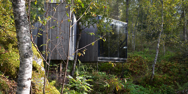
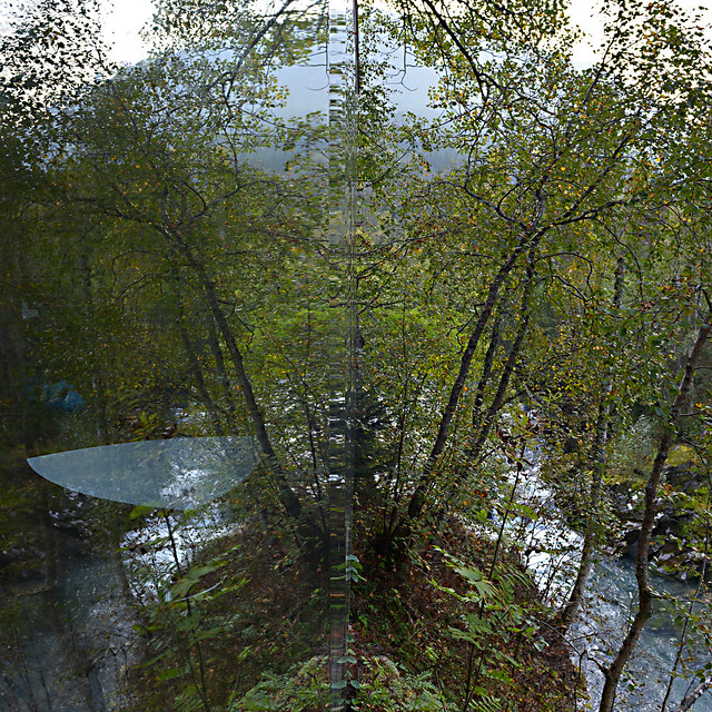
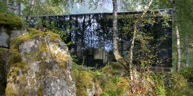
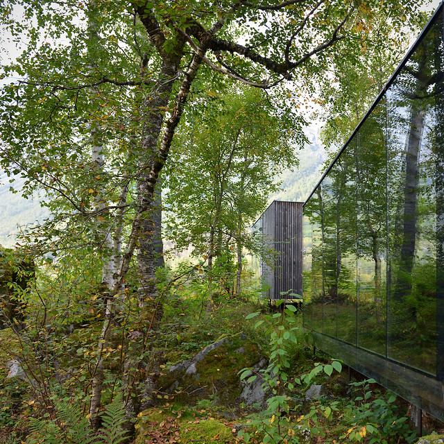
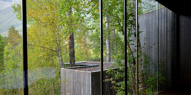
Here are some photos of the Juvet Landscape Hotel (2009, with 2013 addition) in Norddal, Norway, by Jensen & Skodvin, photographed by Flemming Ibsen.

juvet landscape hotel

juvet landscape hotel

juvet landscape hotel

juvet landscape hotel

juvet landscape hotel

juvet landscape hotel

To contribute your Flickr images for consideration, just:
:: Join and add photos to the archidose pool
To contribute your Instagram images for consideration, just:
:: Tag your photos #archidose

Archtober (ärk’tōbər)

Archtober – AIANY's moniker for Architecture and Design Month in October – is nearly upon us. To help in determining where to go and what to see, I've waded through 31 days of lectures/conferences, exhibitions, special events, and buildings of the day to offer my top three recommendations in each area. Even between the printed schedule, below, and the online schedule, there were considerable changes, so it's recommended the you check the Archtober calendar and/or the respective websites for confirmed day/times, and in some cases to register or buy tickets. Happy Archtober!


[Archtober calendar | Photo by John Hill]


SPECIAL EVENTS

Dwell on Design
Archtober 9-11
82 Mercer Street

One of the highlights of Dwell magazine's first East Coast show are the 20 installations created by local designers paired up with manufacturers.


OHNY Weekend
Archtober 11 and 12
Various locations throughout NYC

The full list of sites will be released on September 30, with reservations for certain sites and tours available at ohny.eventbrite.com starting at 11am on October 1.


Architecture and Design Film Festival
Archtober 15-19
Tribeca Cinemas

Highlights in ADFF's sixth season include Wim Wenders's Cathedral of Culture series (3d documentary films by Wenders and other directors) and the world premier of Gray Matters (pictured), a film about Eileen Gray.


EXHIBITIONS

Sagrada Família - Gaudí's Unfinished Masterpiece: Geometry, Construction and Site
Throughout Archtober
Bernard and Anne Spitzer School of Architecture at The City College of New York

City College will also be hosting seven lectures throughout Archtober and November on Gaudí's masterpiece; see the school's website for dates and more information. 


New York New Design
Opening Archtober 9
West 4th Street Subway Station

What better place to see the recent work of AIANY architects than in a crowded subway concourse?


Weltstadt – Who Creates the City?
Archtober 1-19
Goethe-Institut Wyoming Building

"The Weltstadt exhibition explores urban participation and the future of cities in light of challenges such as climate change, migration, and social polarization and presents recent initiatives from Bangalore, Belgrade, Curitiba, Dakar, Johannesburg, Lisbon, Madrid, New York, Porto Alegre, Riga, Salvador, São Paulo, Seoul, Toulouse, Turin, and Ulan Bator."


LECTURES/CONFERENCES

Guggenheim Helsinki Competition: Designing a Museum of the Future
Wednesday, Archtober 15 at 6pm
(Location details and link with further information on the panel discussion are still to come.)

Michael Kimmelman and Annabelle Selldorf in Conversation
Thursday, Archtober 16 at 6:30 PM
Higgins Hall Auditorium, Pratt Institute

2014 MAS Summit for New York City
Archtober 23 and 24
TimesCenter


BUILDINGS OF THE DAY
(Visit the Archtober website for registration/tickets.)

Kickstarter, Ole Sondresen
Archtober 7
58 Kent Street, Brooklyn


Glen Oaks Branch Library, Marble Fairbanks
Archtober 11
256-04 Union Turnpike, Queens


Wieden+Kennedy, WORKac
Archtober 14
150 Varick Street


NOT PART OF ARCHTOBER BUT WORTH A MENTION

Critical Halloween: On I-Relevance
October 31
Organized by Storefront for Art and Architecture
Location TBD