Book Review: Trilogy: SCI-Arc Pavilions

Trilogy: SCI-Arc Pavilions by Oyler Wu Collaborative
SCI-Arc Press, 2014
Paperback, 144 pages


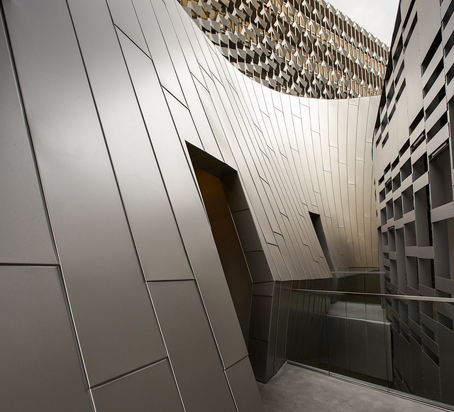
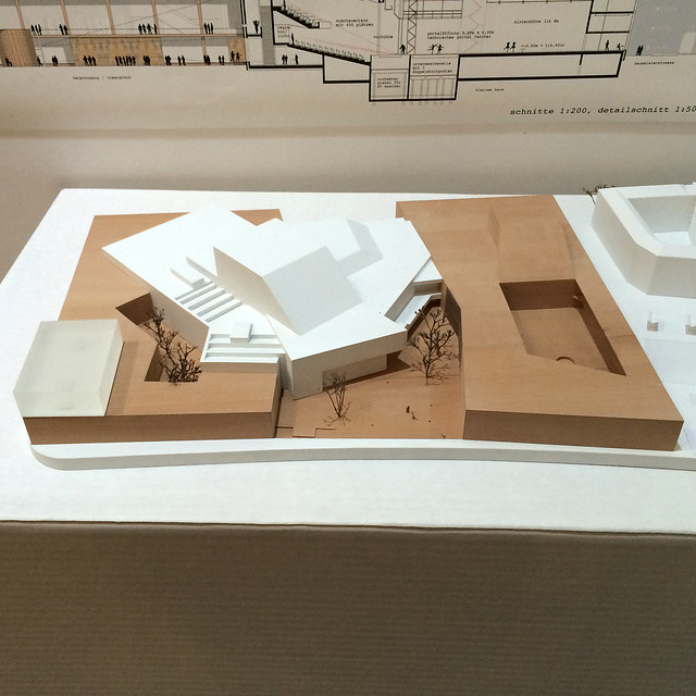
This book presents three pavilions designed by Oyler Wu Collaborative for SCI-Arc, where husband-and-wife partners Dwayne Oyler and Jenny Wu teach. This situation is certainly a unique one, since the school has acted as client for the duo's design proposals not once, but on three consecutive occasions, from 2011 to 2013. They were asked each year to create a shelter for about 900 people for the graduation ceremonies taking place in the school's parking lot each September. The first pavilion was dubbed Netscape, an appropriate name given the 45,000 linear feet of knitted rope strung between the tube-steel trusses. Netscape survived into the following year, so Oyler Wu were given the opportunity to add a stage structure, in effect improving the experience of the ceremony while exploring more means of design and construction in the smaller project. Stormcloud, the 2013 pavilion celebrating SCI-Arc's 40th anniversary, reused the Netscape structure, but for various reasons the architects opted for fabric rather than rope, giving the pavilion a much different character than the previous iteration.


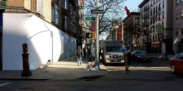
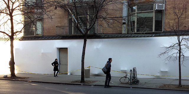
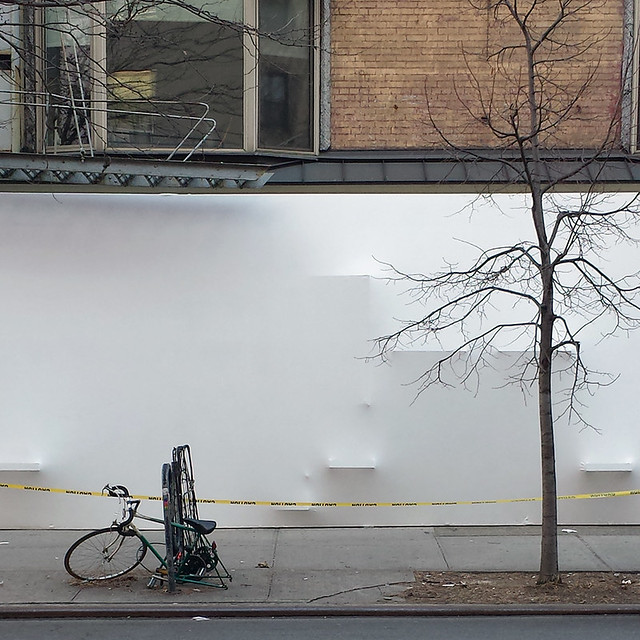
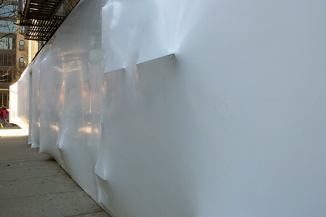
[SCI-Arc Graduation Pavilion by Oyler Wu Collaborative, 2011]

Yet even as the book does an excellent job of documenting these three SCI-Arc pavilions through drawings, models, construction photos and the words of Oyler and Wu, the reader does not confront them until page 70, at the halfway point of the book. Preceding the "trilogy" are comments from fellow SCI-Arc faculty: Dora Epstein Jones puts down some dense theoretical prose to situate the duo's work in a historical context; soon-to-be Director Hernan Diaz Alonso sees Oyler Wu's work in relation to his own primarily unbuilt designs; and John Enright grasps the learning process embedded in the prototype designs of the three pavilions. Following those introductory remarks is a transcribed lecture of Oyler and Wu speaking at SCI-Arc in January 2013. The lecture is similar to one I attended in 2012 in which the couple explained clearly how lessons learned from one project – be it in design and/or realization, the latter often by themselves – were carried over into another, much as they were in the three SCI-Arc pavilions.


[Sketch by Dwayne Oyler]

"Lineworks" is the name of the January 2013 lecture, and it is an appropriate title, given that lines define much of what they have designed and built to date. They can be found in pieces as early as Oyler's undergraduate projects, which I was privy to as a classmate in undergraduae architecture school, but it's his ongoing sketchbooks full of pages of layered and knotted lines that are most extraordinary. A carryover from Oyler's experience working with Lebbeus Woods (check out Woods's sketchbook pages to see the similarity), the 15 years worth of drawings display an increasing complexity and sureness of hand in creating what he refers to as "spatial fields." The spaces depicted are thick, dense with lines that interact with each other to create even thicker lines and nodes of hierarchy. Even as these spatial fields defy realization, it's pretty easy to see the relationship between these drawings and projects like Screenplay and The Cube.


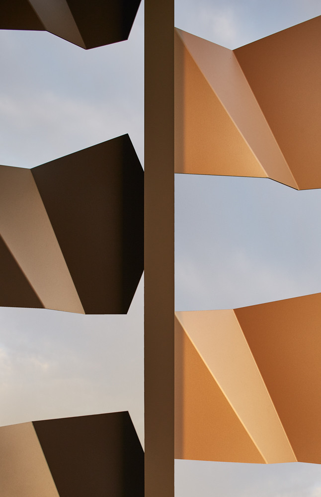
[Stormcloud installation at SCI-Arc, 2013]

Publication of this little book (about the same size but a bit longer than their previous book, Pendulum Plane) coincides not only with the completion of the three SCI-Arc pavilions, but also with some new directions for the collaborative. Most notably, their design for a 16-story residential building in Taipei is now under construction (on the site of the Sales Center they built for it), their Screenplay installation created for Dwell on Design in 2012 was recently added to the SFMOMA permanent collection, and Jenny Wu launched LACE, a line of 3D printed jewelry, mainly rings and necklaces. Even as Oyler and Wu are venturing into larger and more diverse realms and being recognized for their work, their root explorations remain. Just look at LACE, which utilizes 3D printing technology and therefore could be just about anything, could take any form. But the duo's "linework" remains, evidently serving as a means of making decisions about form and creating things that are downright appealing.


[LACE by Jenny Wu, Catena Necklace]

Vote for 2014 Building of the Year

The work I do with World-Architects includes the Building of the Week feature on the American-Architects platform. For 2014 there were 49 such buildings, and voting is open to determine the Building of the Year. The screenshot below gives a peek of the buildings in the running, but head over to American-Architects to vote. One vote is allowed per person, and the deadline is January 31, 2015.

Book Review: Sand and Golf

Sand and Golf: How Terrain Shapes the Game by George Waters
Goff Books, 2013
Hardcover, 140 pages


Just like architecture and landscape architecture have reoriented their practices in part toward sustainable ends – designing buildings and landscapes that use less energy and respond to their local contexts – so has golf course architecture. What can be seen as a subset of landscape architecture, golf course architecture has often been held in less regard, since many courses, especially in the United States, are not open to the public and they have a heavy need for irrigation and pesticides, branding courses as resource hogs that do more damage than good. But recent years have seen the creation of golf courses that resemble their natural origins in the British Isles more than the modern courses that litter the U.S. and other parts of the world. Courses like those on the cover of George Waters' book Sand and Golf (Pacific Grove Municipal in California) point toward a way of designing according to a site's characteristics rather than importing a particular type of course to any location.


[The 16th Green at North Berwick | Photo: George Waters]

According to Waters, a golf course architect who has worked with Tom Doak, Bill Coore, Ben Crenshaw, and other designers that share an appreciation of links courses, the key to designing a course that is "green" and follows the game's origins is sand; not sand in the sense of bunkers (just about all courses have them, regardless of where the courses are located and how they're designed), but sand as the base material that the course sits upon. It's no wonder that golf blossomed in places like Scotland and Ireland, where dunes evolved over time to create suitable landscapes for animal grazing as well as for a social game that involved hitting a ball with a club. But in the 20th century golf bloomed and courses were built on all types of soils, not all appropriate for the game as it was traditionally played or for the best grasses to play upon and maintain. And as golf's popularity grew so did technology, not only for moving earth but for the making of clubs and balls, meaning that golfers could hit farther and higher, which influenced the design of courses from a game played as much "on the ground" as "in the air," to one where the latter predominated. While to this day technology's influence has not subsided, the need to be more environmentally responsible has increased, accompanied by an appreciation of links courses by a number of designers and their desire to create courses for all abilities, not just scratch golfers.


[Pacific Grove Municipal | Photo: George Waters]

Waters' book is a strong argument for finding the right sandy sites for building golf courses, both inland and coastal, and then designing with the land rather than imposing one's will upon it. Sandy sites offer the greatest opportunities for moving the least amount of earth during construction and for using the least amount of energy in maintaining the courses over time. Yet in addition to these benefits, and the fact that links courses with their distinctive contours offer as much pleasure to high handicappers as low handicappers, Waters' words on the evolution of sites are particularly interesting. There is a tendency to see courses as static designs rather than dynamic pieces of dynamic landscapes; a hole is seen to have a certain form that needs to be maintained over time. But since a course is part of a landscape, it influences its surroundings, which in turn affect the course. This reciprocity can negatively impact certain holes, but it can also offer the opportunity for creative responses to change, be it in redesigned holes or completely new ones. Whatever the case, it stems from a thinking that acknowledges the naturalness of courses and the idiosyncratic characteristics that arise from being located in a particular part of the world.


[The 10th at Swinley Forest | Photo: George Waters]

Today's archidose #809

Here are some of my photos of the Storefront for Art and Architecture, wrapped by curators Sebastiaan Bremer and Florian Idenburg & Jing Liu of SO–IL for their BLUEPRINT exhibition.

BLUEPRINT

BLUEPRINT

BLUEPRINT

BLUEPRINT

BLUEPRINT

To contribute your Flickr images for consideration, just:
:: Join and add photos to the archidose pool
To contribute your Instagram images for consideration, just:
:: Tag your photos #archidose

Today's archidose #808

Here is a sampling of some panoramic photos recently added to the archidose pool.

Maison des Associations - Fécamp by G2 architectes, photographed by David Cousin-Marsy:
Maison des Associations - Fécamp

Computer model of a Mies van der Rohe-designed golf clubhouse, by Heiner Engbrocks:
1:1 modell of a golfclubhouse, Mies van der Rohe

Kurkowa 14 estate - Apartamenty Kurkowa 14 by Maćków Pracownia Projektowa, photographed by Maciek Lulko:
Kurkowa 14

Visitor center at nature reserve Oostvaardersplassen by BKVV, photographed by Frank Stahl:
Buitencentrum Oostvaardersplassen

To contribute your Flickr images for consideration, just:
:: Join and add photos to the archidose pool
To contribute your Instagram images for consideration, just:
:: Tag your photos #archidose

Sorkin Builds


[All photographs courtesy of Michael Sorkin Studio]

If I had a nickel for every time I've read somebody comment in response to one of Michael Sorkin's opinion pieces something like, "What does he know? He hasn't built anything," I'd probably have, well, a dollar and some change. To me that point does not hold relevance for criticism and for being influential in the world of architecture; ideas take precedent over experience, or at least over a particular type of experience, since it comes in all shapes and sizes, not just from realizing a building from beginning to end. Nevertheless, these comments spring to mind as I look at construction photographs of Michael Sorkin Studio's Xi'an Office Building going up near the Xi'an Xianyang International Airport in China. Sorkin's detractors probably won't be satiated by this revelation, but I don't care; I'm just glad to see a creation of his come to life, even if it's halfway around the world from his New York City home.


[Project aerial rendering]


[Context view | Aerial from Google Maps]

The office building is made up of two pieces – a round building and a rectangular bar – and is intended to mark the entry to a new district just north and west of the airport. Construction of the project is visible in the Google Maps aerial, but not much else has accompanied it. So what kind of "new city" context the building will fit into remains to be seen, especially since, like most renderings of projects in China, it is depicted above in a generic landscape of roads, grass and trees. Like many buildings in China designed by architects from overseas, the project creates the landscape, rather than the other way around. In the case of the Xi'an Office Building, it's the round building that makes the strongest statement.


[Close-up of site | Aerial from Google Maps]


[General view from rectangular bar toward round building]

Although the cladding that is still to come will greatly influence the final building's appearance, the rendering above indicates that the arching structure will be left exposed. So these recent construction photos give a good sense of what is to come. Particularly striking is the way the the concrete arches span from the exterior to the courtyard, eschewing vertical exterior walls and giving the impression of a vortex in the middle of the building.


[A closer view from the rectangular building]


[Looking south from the courtyard]

The form harks back to traditional Chinese Tulou dwellings while also recalling contemporary buildings like Herzog & de Meuron's "Bird's Nest" stadium for the 2008 Olympics in Beijing. The sloping section of the building, evident in the photo at top, means that more sunlight reaches the courtyard and the spaces that overlook it. It also means the building looks best from the south, where it reveals the central courtyard for those approaching from the airport via car, and for those walking on the central axis from the rectangular building.


[Courtyard detail]


[Michael Sorkin on the job site]

Sorkin Studio's website shows another project in Xi'an, a mixed-use complex that would sit directly west of the office building, just across the busy north-south road. It's not clear if work has proceeded on this project with exhibition and convention hall, offices, a hotel, and a large shopping mall, but here's hoping Sorkin has some momentum in Xi'an and will get to keep building.

Today's archidose #807

Here are some photos of the Rowing Pavilion (2010) in Alange, Spain, by José María Sánchez García, photographed by José Carlos Melo Dias.

Alange, Centro de Remo y Piragüismo | 2009. José María Sánchez García

Alange, Centro de Remo y Piragüismo | 2009. José María Sánchez García

Alange, Centro de Remo y Piragüismo | 2009. José María Sánchez García

Alange, Centro de Remo y Piragüismo | 2009. José María Sánchez García

Alange, Centro de Remo y Piragüismo | 2009. José María Sánchez García

To contribute your Flickr images for consideration, just:
:: Join and add photos to the archidose pool
To contribute your Instagram images for consideration, just:
:: Tag your photos #archidose

Book Review: Performative Skyscraper

Performative Skyscraper: Tall Building Design Now by Scott Johnson
Balcony Press, 2014
Paperback, 164 pages


When in Chicago last fall I stopped by the office of Adrian Smith + Gordon Gill Architecture (AS+GG) to do a studio visit for World-Architects. If any firm is known for tall buildings, it is AS+GG. Sure, there are bigger firms like SOM, KPF, and Gensler that are designing and building this century’s skyscrapers, but they lack the sharp environmental focus of AS+GG. Known primarily for the supertall Kingdom Come Tower, what will be, barring any surprises, the tallest building in the world when completed in a few years, the most striking project I saw on my visit was FKI Tower in Seoul. Its serrated exterior is not just a formal flourish; it is a means of integrating solar PVs into the façade to optimize the generation of solar power. AS+GG is not alone in using form, material and technology together to create more sustainable high-rise buildings, but the FKI Tower is illustrative of an approach where building form/expression and environmental performance become one.

Other AS+GG projects make similarly overt gestures and many of those are included in architect Scott Johnson’s book on what he calls the “performative skyscraper.” Just saying a skyscraper is “green” or “sustainable” is not enough these days; those words have been watered down by overuse and they don’t speak to particular approaches. “Performative,” on the other hands, clearly points to making tall buildings perform better, be it in generating energy, decreasing how much energy is used, or some other means of gauging a building’s positive contribution. The term also points to measurement as an integral part of the design process.


[AS+GG's FKI Tower | Photo: Namgoong Sun, via American-Architects]

Johnson’s book, which gathers many recent built, in-progress and unbuilt projects but doesn’t read like a collection of typological precedents, is organized into five chapters that build in scale and ambition, moving from internal environments to urban contexts: Performative Ecologies, Performative Skins, Performative Parametrics, Performative Neighborhoods, and Performative Cities. If my assertion that the middle section of a book says more about it than the rest, then the chapter on parametrics is key to Johnson’s argument for building better-performing skyscrapers. The first two chapters deal with a building’s skin and its internal environment, while the latter two chapters move beyond a tower’s enclosure and footprint. This leaves the middle chapter to focus on form and the process of realizing it.

Parametric modeling is often seen as a means of creating ever-more complex forms – blobs – that turn cities into playgrounds of odd forms vying for our attention. But this antagonistic view of the implementation of software for architects ignores the benefits of performance that are also a part of them. Sure, parametric modeling enables architects to create malleable forms in the computer, but they can also have measurable data tied to them. Architects can then, for example, analyze a form’s wind resistance or gauge how much daylight is transmitted over the course of a day, month, or year. This process does not have to result in curving towers that look out of place in some contexts, as should be apparent in AS+GG’s FKI Tower, which is basically a modern box with ridged edges.


[Detail of AS+GG's FKI Tower | Photo: Namgoong Sun, via American-Architects]

Even with parametricism at the book’s core, the last two chapters made me most optimistic about Johnson’s approach, since he looks at a larger canvas. He examines how tall buildings, in and of themselves or in concert with other buildings in a single project, can contain whole neighborhoods. This is not new (think of Chicago’s John Hancock Center or Marina City – the name says it all!), but it is happening at an increasing clip, so it is important to focus on the social life of tall buildings. He also examines how tall buildings work in urban assemblages, creating districts and even whole cities that perform better in various ways. Again, this is not new (New York likes to take credit for being traditionally “green” thanks to its density and prevalent public transportation), but if any century is the “century of the city” it’s the 21st, so considerations of urban performance should be part of the decision-making process.

That said, it pained me to discover in Joseph Giovannini’s preface that Johnson’s firm, Los Angeles's Johnson Fain, is responsible for Museum Tower, the controversial residential building in Dallas. The building was in the news in 2012 and 2013 for deflecting the sun’s rays into the north-facing skylights of the Nasher, the low-slung and much-celebrated museum designed by Renzo Piano. Like the “Walkie Talkie” building Rafael Viñoly designed for London, whose concave glass façade melted plastic on cars blocks away, considerations of context did not extend far enough when Johnson designed Museum Tower. This blemish contradicts the general idea of thinking of a skyscraper’s performance beyond its internal environment and its exterior curtain wall. In this case the curtain wall most likely benefits those living inside, but at the expense of a prized institution across the street. Regardless, this instance does not directly detract from the arguments that Johnson lays out ever so persuasively, but it does make me wish he would practice what he preaches.

Sculpting the Architectural Mind

This sounds like a conference worth attending, taking place at Pratt Institute in early March:


Sculpting the Architectural Mind
Neuroscience and the Education of an Architect

In recent years, architects have been mining new research in neuroscience, cognitive psychology, object-oriented philosophy, and experimental biology for design concepts and for accounts of the new conditions of materiality. Architects borrow from these discourses to formulate and justify a wide range of design processes, especially digitally-driven ones. But we have failed to discuss how neuro-scientific knowledge can impact architectural pedagogy. This conference considers the roles that applied neuroscience has played and might play in the education of architects.

The symposium is structured around invited presentations and panel discussions with neuro-scientists, architectural theorists, historians, philosophers, and artists. Hosted by Pratt Institute’s School of Architecture in collaboration with the Academy of Neuroscience for Architecture. It is free and open to the public.

The conference is co-organized by Dan Bucsescu (Pratt), Michael A.Arbib (ANFA Liaison) and Ralph S. Steenblik.

Speakers will include:
Michael A.Arbib
Philip Beesley
Lawrence Blough
Dan Bucsescu
Edward Eigen
Michael Eng
Thomas Hanrahan
Deborah Hauptmann
Duks Koschitz
Sanford Kwinter
Eduardo Macagno
Harry Francis Mallgrave
Ralph Steenblik
Meredith TenHoor

Conference Schedule

Friday, March 6th

Opening Session 9:30AM -12:30PM
What the Hand Tells the Architect’s Brain

12:30- 1:30 PM Lunch

Afternoon Session 1:30 - 5:30 PM
Experiencing the Built Environment

5:30-6:30 Exhibition /Opening Reception

Saturday, March 7th

Morning session 9:30 AM - 12:00 PM
The neuroscience of the design process for architecture

Lunch 12:00 -1:00 PM

Afternoon session 1:00 - 4:15 PM
Neuroscience of architectural experience

Closing Keynote 4:15-4:45
Closing Panel Discussion 5:00 - 6:00 PM

Going Underground in DC

It seems appropriate that the drive to transform a unused underground trolley station into a venue "for presenting, producing, and promoting cutting-edge arts, architecture, design, and creative endeavors" should take place in Washington, DC. The city, after all, is home to Harry Weese's beloved METRO stations, which won last year's 25-Year Award from the AIA. And let's not forget that DC was home to one of the most important underground music scenes of the late 1970s and early 1980s, with bands like Bad Brains and Minor Threat and a DIY attitude that extended to the latter's Ian MacKaye's Dischord label. Dupont Underground, inadvertently perhaps, respectively embodies the desire to have something beautiful under the street level and a bottom-up means of accomplishing it.


[All images courtesy of Dupont Underground]

The non-profit Arts Coalition for the Dupont Underground describes their mission as "working to transform the unused Dupont Circle trolley station into an institution highlighting the District’s rightful place on the cultural map." The choice to focus on a piece of unused (since the 1960s) piece of urban infrastructure puts it in line with projects like the High Line, which is primarily a park, but which also serves as a canvas for artworks and performances, stemming appropriately from its location cutting through Chelsea's gallery district. Of course, unlike the High Line that threads its way over streets and between buildings, the old trolley line sits below and around Dupont Circle, the park and traffic feature that gives the historic district its name. Further, unlike the Low Line, which proposes to transform the micro-climate and experience of an old underground trolley station in New York's Lower East Side via innovative light scoops, the DU players treat their station with reverence, like a found beauty. The preliminary, informational renderings show minimal changes to the underground spaces.


The non-profit's efforts have resulted in signing a 5.5-year lease on the 75,000-square-foot space with DC's Office of the Deputy Mayor for Planning and Economic Development. Although this is admittedly a step in securing a long-term lease, the widespread support of the project is visible in DU's surpassing of its $50,000 crowdfunding goal – with 56 days left; even this early, earning the long-terms lease looks promising. Their initial transformation of the station will focus on the eastern platform, which makes up about a third of the total square footage. Once the space is brought up to code, the "blank canvas" will serve as a host for exhibitions, installations, performances, all sorts of events as a means of exploring what works underground. If those events parallel what DU has envisioned remains to be seen, but organizations in DC needing a unique venue won't be at a loss for where to look.


One area where I see potential is architectural lighting. The renderings clearly show how the ambiance of the spaces will depend upon the lighting – the type, location, intensity, etc. Why not invite lighting designers and artists into the space to explore how to illuminate the underground spaces, both to exploit the qualities of the old station and take it in unexpected directions? Then the usual exhibitions, pop-up shops and the like can follow. However it plays out, it's clear the Dupont Underground offers lots of potential for creativity on the DC scene.

Today's archidose #806

Here are some photos of Emerson College in Los Angeles, California, by Morphosis Architects, photographed by Riley Snelling; see more photos on the photographer's website.

EC-21

EC-15

EC-18

EC-11

To contribute your Flickr images for consideration, just:
:: Join and add photos to the archidose pool
To contribute your Instagram images for consideration, just:
:: Tag your photos #archidose

2015 Driehaus Prize Winner

David M. Schwarz is the 2015 recipient of the Richard H. Driehaus Prize. But, if the website of his firm, David M. Schwarz Architects (DMSAS), is any indication, the $200,000 prize is just a step below gracing the cover of a phone book. Which begs the question, "Are Yellow Pages and other phone books still being printed?"


[Screenshot from DMSAS Awards page]

In case you can't read the lower-left corner of the screenshot above, it says:
If a community is defined by its significant buildings, then there is no greater testament to the status of any one building than to make the cover of the phone book. The book is to architecture, what Rolling Stone is to rock n' roll – a testament to a building's stature, its symbolism, its place within the community.

The buildings of DMSAS have been so honored numerous times. We consider it our highest accolade.

2015 Mumford Lecture: Rebecca Solnit

Mark your calendars: Thursday, April 2 is the 2015 Lewis Mumford Lecture on Urbanism, to be given by writer, historian and activist Rebecca Solnit. The 11th annual lecture is presented by the Graduate Program in Urban Design, Bernard and Anne Spitzer School of Architecture at City College of New York (CCNY), and will be held in the Great Hall of Shepard Hall at CCNY, Convent Hall at 138th Street. It's free, open to the public, and no reservations are necessary.


Previous Lewis Mumford Lectures:
2014 - Theaster Gates: "Place Over Time"
2013 - Marshall Berman: "Emerging from the Ruins"
2012 - Janette Sadik-Khan: "It's Not Impossible To Change a City" (audio podcast available)
2011 - Richard Sennett: "The Edge: Borders and Boundaries in the City" (video archive available)
2010 - No lecture
2009 - Paul Auster: "City of Words"
2008 - David Harvey: "The Right to the City" (audio podcast available)
2007 - Amartya Sen: "The Urbanity of Calcutta" (audio podcast available)
2006 - Enrique Peñalosa: "A New Urban Paradigm: Building a Just and Sustainable Metropolis"
2005 - Mike Davis: "Planet of Slums"
2004 - Jane Jacobs

Slat Happy

Earlier today I did two microblogging things:
1. I deleted my "archidose" Tumblr page/account, and
2. I set up a new "Slat Happy" page on Tumblr
"Huh?" you ask, "You had a Tumblr?" Yes I did, and I'll admit it wasn't anything special, something I set up as an outlet for very short, image-based posts, featuring whatever struck my fancy. But over time – and I think I had the page for two years, tops – it got neglected, unlike the Unpacking My Library blog, which I started in July and is more focused and more interesting for me to do on a regular basis.

Yet I still like the idea of microblogging, so I decided to go the route that most good/successful Tumblr blogs go, which is finding a very specific niche and maintaining that focus over time. (Just think about all of the "F*!k Yeah" and "____ porn" – stair porn, bookcase porn, etc. – sites to see what I mean.) And although I'm not aiming for the levels of apparent excitement and overload in those sites, I like the idea of having a microblog focused on something I really like, and the first that came to mind was wood slats, a topic I wrote about for Houzz a few years ago.

So I set up Slat Happy*, loading it up with a handful of projects that put a smile on my face. The first one is one of my favorites, the Herman Miller/Holdrege Avenue Building by Lynch/Eisinger/Design.


(What's not to love? Photo: Amy Barkow)

 So visit, bookmark, follow Slat Happy. I'll be updating it as long as doing it makes me, well, happy.

*No, I did not see this Dwell article before deciding on that name. It just came to me and seemed to work well, and only later did I Google the phrase to see where "slat happy" has been used.

Today's archidose #805

Here are some photos of models from the architectural competition for an overall refurbishment and extension of the “Badisches Staatstheater” theatre in Karlsruhe, Germany, photographed by Frank Dinger. The two first prize winners will develop their designs for the competition's second stage.

Delugan Meissl, Vienna, Wenzel + Wenzel, Karlsruhe, first prize:
Theatre Karlsruhe Extension Competition 2014

Dietrich | Untertrifaller, Bregenz, first prize:
Theatre Karlsruhe Extension Competition 2014

GMP Architekten, Berlin/Hamburg:
Theatre Karlsruhe Extension Competition 2014

ALA architects, Helsinki:
Theatre Karlsruhe Extension Competition 2014

Benthem Crouwel, Aachen:
Theatre Karlsruhe Extension Competition 2014

Wulf Architekten, Stuttgart:
Theatre Karlsruhe Extension Competition 2014

Dominique Perrault, Paris:
Theatre Karlsruhe Extension Competition 2014

Vasconi architectes, Paris:
Theatre Karlsruhe Extension Competition 2014

BHBVT Architekten, Berlin:
Theatre Karlsruhe Extension Competition 2014

Rudy Ricciotti, Bandol:
Theatre Karlsruhe Extension Competition 2014

LRO - Lederer Ragnarsdottir Oei, Stuttgart:
Theatre Karlsruhe Extension Competition 2014

To contribute your Flickr images for consideration, just:
:: Join and add photos to the archidose pool
To contribute your Instagram images for consideration, just:
:: Tag your photos #archidose