Book Briefs #21: 7 Issues of 5 Journals

"Book Briefs" are an ongoing series of posts with short, first-hand descriptions of some of the numerous books that make their way into my library. These briefs are not full-blown reviews, but they are a way to share more books worthy of attention than can find their way into reviews on my blog. This installment focuses on a few recently published journals, some academic and some independent.


1: New Geographies 06: Grounding Metabolism edited by Daniel Ibanez, Nikos Katsikis | Harvard GSD | 2014 | Amazon
In architecture, the word "metabolism" typically brings to mind the short-lived Japanese Metabolist movement that has seen a resurgence in recent years through a book and exhibition. But the term – both as a natural/scientific process and a metaphorical trope – has more wide-ranging applications, and it's clear from the sixth issue of Harvard GSD's New Geographies that students and faculty in academia are trying to decipher metabolism relative to designing buildings, landscapes and cities. While the editors conducted an interview with Ken Tadashi Ishima that focuses on the Japanese Metabolists, the other contributions depart from this default idea of the term toward investigations of urban systems, the reshaping of geographies by humans, post-petroleum landscapes, temporary cities, and projective design practices, among many other approaches to tackling the issue's theme. Some of the contributions, it should be noted, emanated from a 2014 GSD symposium, "Projective Views on Urban Metabolism," which the editors helped to organize. The essays and interviews are dense, and each deserves the utmost attention and patience to yield the greatest insight into what is clearly a complex topic.


2: Lobby No. 2: Clairvoyance edited by Regner Ramos, et. al. | The Bartlett School of Architecture | Spring 2015 | Amazon
Having worked on a journal in architecture school eons ago, I know first-hand that it can be difficult to get contributors to address, much less stick to a theme. With just about every architecture journal, academic or otherwise, defining a theme for their issues all these years later, the hard part is more likely defining a theme rather than getting content to fit it. With that, I really like the choice of Regner Ramos and company from Bartlett with "Clairvoyance," a theme that is pretty broad but a logical fit for architecture; after all, what architects do consists of a good deal of predictions, whether acknowledged or not. Beyond the big names (Daniel Libeskind, Mecanoo) needed to anchor any publication these days, the issue has numerous obvious and unexpected responses to the theme: Disney's EPCOT, architectural competitions, rioting, rising waters, the "Preppers" of New York City (who knew?), and projects that are widely diverse in scope and form yet seem to share, appropriately, a sense of optimism. Most unique is the "The Seminar Room," one of eight sections in the book, which consists of two texts on architecture and the city (one old, one recent), five short essays on the same subject, and a brief discussion on the texts; it reads like a seminar, one that the editors note, "You're not being marked on."

3: Soiled No. 5: Cloudscrapers edited by Joseph Altshuler, et. al. | CARTOGRAM Architecture | 2014
Soiled calls itself "a periodical of architectural stories that makes a mess of the built environment and the politics of space." Adopting -scraper themes (Windowscrapers, Deathscrapers, etc.) for each issue, the journal invites the unconventional, the fantastical. Cloudscrapers asked contributors to "let go" and float upward into the clouds "as a site for activated atmospheres, a privileged perch, and otherworldly occupation." Unlike the other journals featured here, Soiled presents a small number of contributions, eight in the case of Cloudscrapers. Each one is a project, echoing the journal Fairy Tales, and the highlights include Clark Thenhaus's reappropriation of silos in the American Midwest as sites for stargazing; Jenny Odell's poetic glances and extractions on seeing the earth from satellites; and Luis Callejas's strategy of floating doppelgangers of buildings to protest Heathrow traffic patterns. It's hard not to look up, even higher than the AIA would have us gaze, when absorbing the projects in these pages.


4: MAS Context Issue 22: Surveillance edited by Iker Gil | MAS Context | Summer 2014
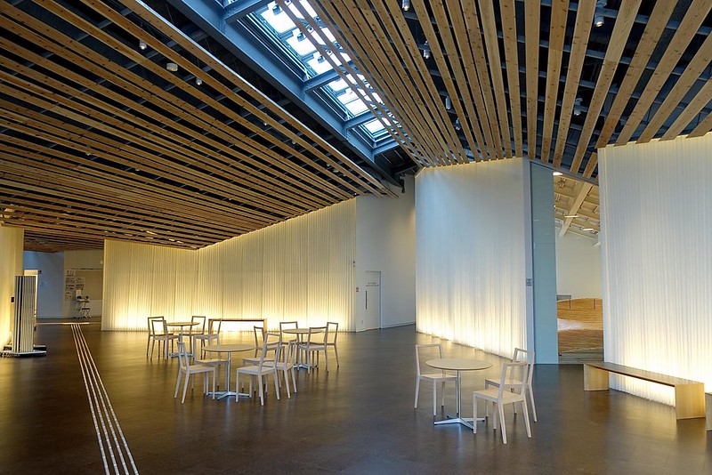
5: MAS Context Issue 23: Ordinary edited by Iker Gil | MAS Context | Fall 2014
MAS Context's one-word themes veer from broad, almost anything-goes topics (living, amusement, information, visibility, narrative) to those that are timely and demand a strong position (network, conflict, energy). I'd say that of these two issues, Ordinary falls neatly into the former and Surveillance the latter. For Surveillance, editor Iker Gil starts by discussing the police surveillance of Cabrini Green, the notorious public housing project in Chicago that has been dismantled slowly over the last couple of decades into almost nothing. His editorial statement sets the tone for an issue that delves into security cameras in cities, networked urbanisms, drones of all sort, the history of recording devices, digital fingerprints, and so forth. Those expecting architectural responses to the theme will be disappointed (it should be pointed out that MAS Context "addresses issues that affect the built environment," so it is far from just an architecture journal), but those who want content that makes them think will be quite happy.

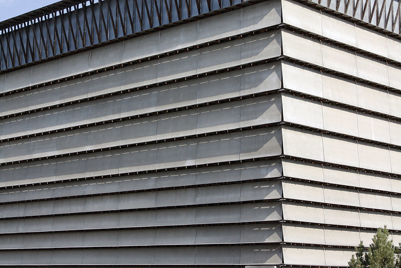
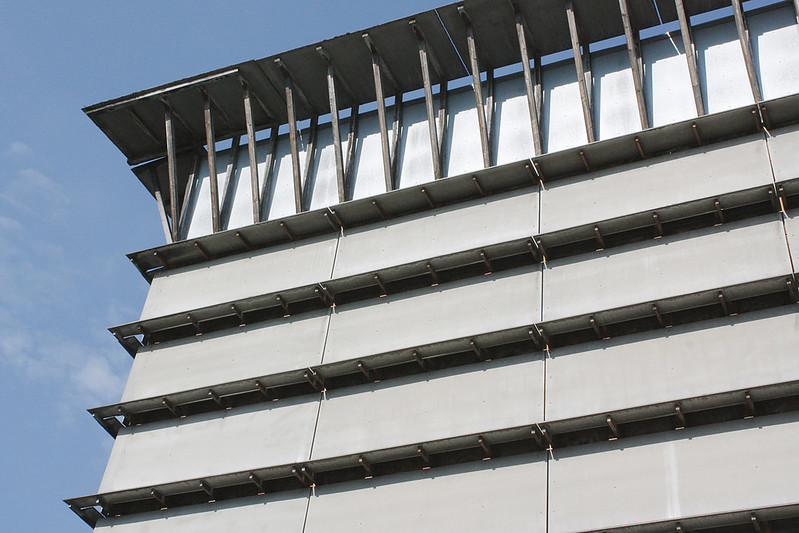
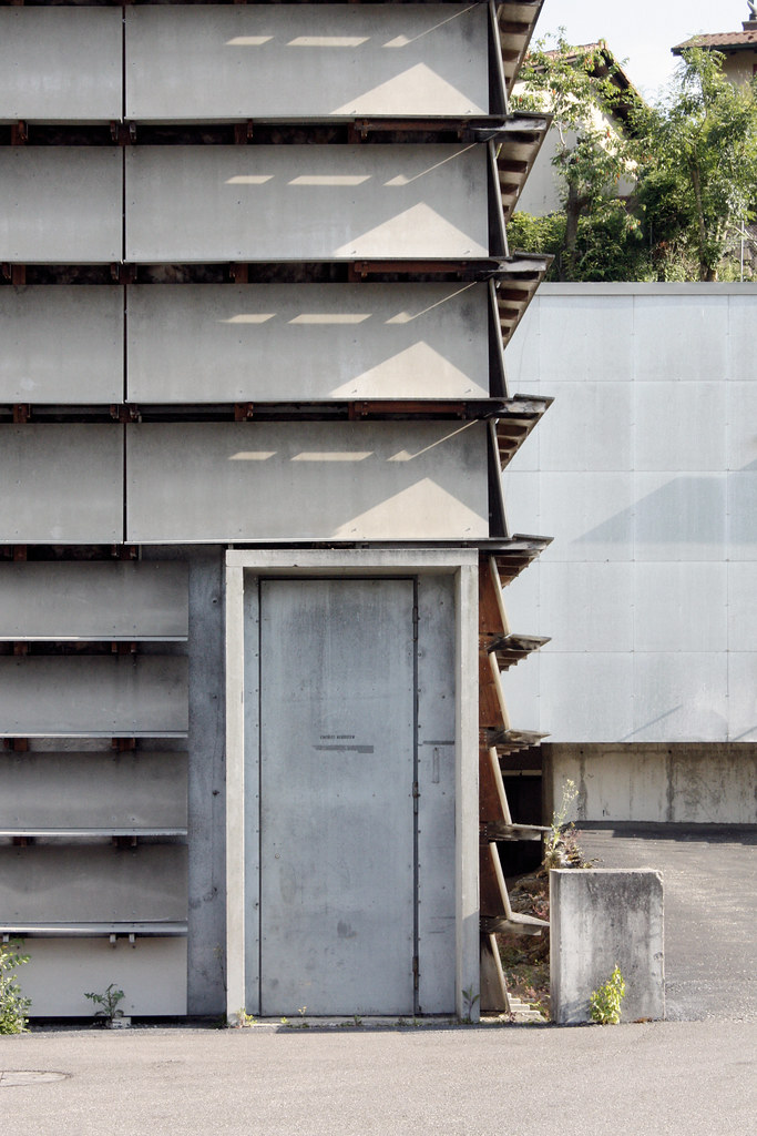
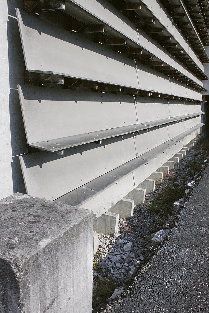
There's a bit more architecture in Ordinary, but here the focus is on the commonplace, be it in the vein of Robert Venturi and Denise Scott Brown, or even in how right angles tend to predominate over angles and curves. There are photos of ordinary architecture under gray skies and photos of gray, concrete models of generic housing slabs, stairs and other commonplace architectural elements. The city depends on the ordinary, that part of the built environment that our brain can ignore as it focuses on other things. But that doesn't mean it can't be celebrated now and then, as in these pages or in the city, as one is wont to do after flipping through this issue.


6: Boundaries 10: Architecture for Emergencies II edited by Luco Sampo | Boundaries International Architecture Magazine | October-December 2013 | Amazon
7: Boundaries 11: A Focus on Humanitarian Architecture edited by Luco Sampo | Boundaries International Architecture Magazine | January-March 2014 | Amazon
Boundaries is a quarterly architecture magazine that presents the buildings and projects that other magazines aren't always willing to include in their pages. Sure, the occasional project in Africa makes its way into Architectural Record or Architect, but those projects (many designed by US firms for the continent) only scratch the surface on what architects are doing in places without the resources of North America or Europe. Luco Sampo's insatiable appetite for almost single-handedly presenting architecture that is socially responsible, but also beautiful, continues with these recent issues on "Architecture for Emergencies II" (the first installment on that theme is the second issue of Boundaries) and "Humanitarian Architecture." The former presents designs for refugee camps, disaster housing, mobile health clinics, schools, collective housing, and playgrounds. Like other Boundaries issues, the projects are balanced by research, positions, interviews, and books on the topic.

Given the consistent format of the magazine, the same can be said for the latter issue on humanitarian architecture, which could surely encompass architecture for emergencies, but focuses on projects run with NGOs and other organizations and often realized by volunteers. Most of the projects are schools, clinics and community centers, pointing to the importance of these institutions and the need to create places for the people who cannot build at this scale for themselves. Right before writing about these two issues, the newest Boundaries landed in my mailbox, a good sign that Sampo isn't letting up with his ambitious goal to present some of the most commendable architecture being produced today.

Today's archidose #834

A classic: Here are some photos of the Nova Office Building (2014) in Jaworzno, Poland, by Pracownia 111, photographed by Sebastian Deptula.

Nova

Nova

Nova

Nova

Nova

Nova

To contribute your Flickr images for consideration, just:
:: Join and add photos to the archidose pool
To contribute your Instagram images for consideration, just:
:: Tag your photos #archidose

The New Whitney

The New Whitney
[Looking west at the Whitney from Gansevoort Street | All photographs by John Hill]

The Whitney Museum of American Art opens on Friday, May 1, nine years after the institution announced it would be moving to the Meatpacking District adjacent to the southern end of the High Line. That same year, 2006, construction started on turning the disused railway into an elevated park (phase 1 opened in 2009), which accelerated the area's transformation from its industrial namesake to a popular area for retail, fashion houses, restaurants and offices. The Whitney will surely have a substantial effect on the area's continued evolution, but one sign of the changes hit me on the way to the museum last week for a press preview.


[The Gansevoort Market]

There, in an unassuming storefront on Gansevoort Street, one block east of the Whitney and High Line, is a new food hall with pastries, a Greek yogurt bar, a taco bus, and an outpost of Sushi Dojo. Open since October 2014, the Gansevoort Market (named for the city's official moniker of the landmark district - PDF link) is yet another element in the displacement of industry toward high-end goods, services and apartments catering to residents and tourists with plenty of money to spend. Ironically, a sign of the area's former self can be seen from the quasi-industrial stairs linking the Whitney's three tiered terraces.


[Weichsel Beef as seen from a terrace of the Whitney]

Just north of the museum is Weischel Beef, which almost certainly will become the site of a Whitney expansion in two decades time. (According to Architectural Record, "the city owns a two-story wholesale meat center [to the north of the museum] and has given the Whitney the right of first offer when that building's lease comes up in 15 years.") For now, the meatpacker is just one of many sites to be glanced at from the terraces, which also includes the High Line, the Standard Hotel and the skyline of Midtown.

The New Whitney
[Looking south at the Whitney from the High Line]

Yet before even entering the new Whitney, designed by Renzo Piano Building Workshop in collaboration with Cooper Robertson, many conclusions are being drawn from glimpsing the building from the north, from the High Line, a side that will be covered up at some point in the future, be it by the Whitney or a developer. From here, the building is a jumble: windows of varying sizes, exhaust piping rising up the side, large rooftop chillers, a stepped concrete wall topped by exposed stairs. It's hard to like the building from this side, but it's not worth writing off the building solely based on how it looks on the exterior.

The New Whitney
[The Whitney as seen from the west]

The west side of the building does not offer much more hope, but from here we can start to see why the building looks the way it does. While the north side reveals the stepped profile that allows for both sculpture terraces for the museum and more natural light for the elevated park, the west side reveals the concrete core rising eight stories into the air and a couple large expanses of glass facing the Hudson. The core – what Piano calls "the spine" – holds the stairs, elevator and services, but it is also the main structural element for the building, enabling the glassy first floor with lobby, cafe and bookstore. The spine also splits the building into two halves, with galleries on the south (right) and offices, labs and other non-public areas on the north.

The New Whitney
[Detail view of west elevation]

The large windows, on the other hand, arise from the fact the museum is a vertical one, such that all of the galleries can't be flooded with light from above as in other Piano buildings (only the Whitney's 8th floor is given that). So light must be brought in from the sides, and Piano did it at the east and west to allow the windows to frame views of the city on the east and the Hudson on the west, while also giving passersby views into the museum's galleries. The offices and other non-public spaces are found behind the rectangular windows with rounded corners cut into the light-blue steel panels.

The New Whitney
[View of the glassy first floor from Gansevoort Street]

That the Whitney is more than just a clunky exterior starts to become apparent when walking toward the entrance on Gansevoort Street. All glass and slender columns, the first floor is a beckoning space glazed on three sides, its walls ascending toward the High Line in an effort to lure people from the free park to the museum charging a $22 admission fee. Even though the admission tops MoMA's $20 mark, I should point out the ground floor, which consists of one small gallery on is north side, is a publicly accessible, freely open space, something that surely came from Piano's Italian sensibility. To the east of the glass walls is a small outdoor space that further links the museum with the High Line's southern entrance.

The New Whitney
[Looking toward the High Line from the lobby]

The reason for the rising prow of the floors cantilevered above the lobby and Danny Meyer's "Untitled" cafe is obvious when seen from the inside – the glass perfectly frames the High Line. But it works both ways, so strollers on the High Line can look into the lobby and be enticed by the crowds in the cafe and lobby.

The New Whitney
[Open stairs seen from the lobby]

Those plonking down the admission fee have two options on ascending to the 5th floor gallery: take one of the four elevators or take the stairs. The elevators are given the most real estate of the concrete spine facing the lobby, but the open stair beckons with a light installation streaming down its whole length, form the 5th floor to the basement (oddly, those wanting to walk up higher than the 5th floor have to transfer to the exterior stairs at the terraces or an interior fire stair on the west side of the spine). Comparisons have been made between this stair and the one in the Whitney's 1966 Marcel Breuer building on the Upper East Side, which the Whitney has leased to the Metropolitan Museum of Art for eight years, namely that these stairs do not have as much character as the Breuer stairs, meaning visitors may be less likely to use them in lieu of the elevators. I'll agree they lack the character of Breuer's intimate stairs, but the combination of stair and light installation makes the new stair the most Instagram-ready site in the building.

The New WhitneyThe New Whitney
[The stair terminating at the 5th floor, and the artwork in front of the stair and elevators]

Arriving at the 5th floor means stepping into the largest gallery space in New York City, at 18,000 square feet. This gallery is the driving case for the new museum, since it allows for the display of extremely large artworks, and it notches the Whitney above the galleries in Chelsea that have been offering the same thing. I can see the "largest gallery" race continuing as galleries attempt to grab that designation back, but for now the Whitney has it, though it is hardly exploiting the potential in such a large floor plate. For its inaugural exhibition, America Is Hard to See, which culls around 600 works from its permanent collection and puts them on display in all of the galleries throughout the museum, the 5th floor is surgically cut up with walls rising to the ceiling grid outfitted with built-in tracks for supporting walls and lights. Only an enfilade running east-west across the gallery gives an indication of the floor's enormous scale.

The New Whitney
[The 5th floor gallery]

The New Whitney
[The space behind the window at the western end of the 5th floor gallery]

But the Whitney – a hulk on the outside and galleries boasting of size on the inside – is not all "bigger is better." At the ends of the 5th floor galleries, for example, are smaller spaces outfitted with couches that invite museumgoers to sit down, take a break and look out at the city for a little while. Those who want to go outside to get a more immediate interaction with the city can walk out to the large terrace adjacent to the 5th floor, which sits atop the High Line maintenance building (also designed by Piano, with Beyer Blinder Belle) or head up to the 6th floor, the first of three tiered terraces with sculptures overlooking the High Line.

The New Whitney
[Terrace and cityscape seen from one of the gallery floors]

The New Whitney
[A sculpture terrace overlooking the city]

Like the lobby and the galleries, the terraces are something that work when you are on them, even though they appear ill-considered from a distance. The stairs, positioned atop the building's dividing spine, effectively link the terraces, while even incorporating Titanic-like lookouts. It's clear that the curators do not know yet how to use these spaces, as right now the sculptures are randomly strewn across them, not taking advantage of their unique location overlooking the High Line and the city. Over time this will surely change, but for now the potential of these spaces is evident if not exploited.

The New WhitneyThe New Whitney
[The stairs linking the terraces, and the 8th floor terrace with the north-facing skylights poking above the railing]

The New Whitney
[The 8th floor gallery space]

But where to end a tour of the museum? And how to sum up the building, when so much has been written about it before the Whitney has opened its doors to the public? In addition to another Danny Meyer-run cafe, the 8th floor is where we find Piano's signature skylights. Yet instead of something elegant and sculptural, like the Menil or just about any other North American museum he's done since then, they are straightforward, north-facing clerestories that are hidden above the ubiquitous grid that makes the flexibility of moving walls and lights the most important facet of the galleries. I'm more inclined to end this tour/review with two views of the museum, one inside and one outside.

The New Whitney
[The Works on Paper Study Center, open to the public by appointment]

Many critiques of the new Whitney have compared Piano's design with the Breuer building that the Whitney left last year. I find the need to compare the two buildings understandable but unfair. Should an architect be under any obligation to carry over certain qualities from an institution's old home to a new one? Or should they break from the old with a fresh start? The comment on the stair earlier is just one indication that it is hard to completely break from the old, which in this case just happens to be a building that was unloved at first but gained a larger appreciation in the ensuing decades, where I seen Piano's building going as well. If comparisons must be made, then they should acknowledge all of the new spaces the museum now has at its disposal, beyond the expanded gallery space. In addition to a 170-seat theater, there are classrooms and a study center that are all firsts for the Whitney. The study center, as one example, is more straightforward than the galleries and other public spaces in terms of design, but it is a functional space that melds storage needs and those of education. After seeing the lobby, art galleries and terraces on the press preview, the study center and adjacent conservation labs were a welcome respite that revealed where some of the real work of an arts institution happens, and where architecture is still important, if understated.

The New Whitney
[The Whitney seen from the east at Gansevoort and Hudson Streets]

The last view of the building is this distant one from the east, from two blocks away where Gansevoort Street intersects Hudson Street. From here the new Whitney partially reveals itself, hidden behind an old brick building and peeking above lower buildings. The building has a strong presence from this perspective, a presence that tells me it fits right in by being a jumble of different volumes and surfaces – angled walls, large projecting windows, tiered terraces, exposed stairs, exhaust pipes, and a concrete core rising above all. The new $422 million Whitney embraces the cacophony of Manhattan as it continues to transform itself from a place of industry to one where culture and technology take precedence. Perhaps people who don't like the building from the outside don't like what the building is saying about the city – that it is big, messy, constantly changing, and expensive.

The State of the Art in (Chicago) Architecture

Over at World-Architects, I put together a list of 15 buildings built in Chicago in the last 15 years. The piece was spurred by the Chicago Architecture Biennial and its theme of The State of the Art in Architecture, as well as a book I'm writing on contemporary architecture in Chicago (more on that at a later date). So head over to World-Architects to see the buildings that sum up The State of the Art in (Chicago) Architecture.


[Northeastern Illinois University (NEIU) - El Centro, JGMA]

Today's archidose #833

A classic: Here are some photos of the Ricola Storage Building (1987) in Laufen, Switzerland, by Herzog & de Meuron, photographed by Trevor Patt.

_MG_4457

_MG_4480

_MG_4464

_MG_4441

_MG_4466

_MG_4468

To contribute your Flickr images for consideration, just:
:: Join and add photos to the archidose pool
To contribute your Instagram images for consideration, just:
:: Tag your photos #archidose

What's About to Happen in Architecture and Design Book Publishing

Although I'm not sure if the title is a statement or a question, here's a heads up on an event taking place on May 14 at Cooper Union. Details on the free event are below and at Eventbrite.


WHAT’S ABOUT TO HAPPEN IN ARCHITECTURE AND DESIGN BOOK PUBLISHING
Thursday, May 14, 2015 from 5:00 PM to 9:00 PM (EDT)
Herb Lubalin Study Center
41 Cooper Square
New York, NY

There are many important changes and challenges rippling through the world of architecture and design book publishing. This program will consist of a panel of top editors and executives from leading publishing companies talking about the changes they see coming (or would like to see coming) in how architecture and design books are conceived, created, designed, and sold.

Panelists include:
Will Balliett, President and Publisher of Thames & Hudson Inc.
John Donatich, Director of Yale University Press
Pamela Horn, Head of Cross-Platform Publishing at the Cooper Hewitt, Smithsonian National Design Museum
Kyle May, Editor in Chief, CLOG

The evening begins at 5:00 pm with a Pop-up architecture and design book fair.
The panel discussion goes from 7:00 pm until 8:30 pm.
A reception and the continuation of the Pop-up book fair follows from 8:30 pm until 10:00 pm.

Event Sponsors: Designers & Books and The Herb Lubalin Study Center of Design and Typography at the Cooper Union.

The New Whitney in 99 Photos

My write-up of the new Whitney Museum of American Art, opening May 1 in the Meatpacking District, is still to come. For now, here is a slideshow of the building with photos I took during yesterday's press preview. (If you don't see the slideshow below, click here to see it on Flickr.)

Renzo Piano on the Whitney

Today was the press preview for the Whitney Museum of American Art, opening on May 1 in its new location at the southern end of the High Line. I'll have photos and words on the building before the opening, but for now I'd recommend watching a short video from Architectural Record with Renzo Piano explaining how the building works. It's worth it, if anything, for the last few seconds, where Piano is either jubilant because the interview is over or because the building is finally finished.

Today's archidose #832

Here are some photos of the Towada City Plaza (2015) in Aomori, Japan, by Kengo Kuma and Associates, photographed by Ken Lee.

十和田市市民交流プラザ, Civic center plaza, Towada City, Japan

十和田市市民交流プラザ, Civic center plaza, Towada City, Japan

十和田市市民交流プラザ, Civic center plaza, Towada City, Japan

十和田市市民交流プラザ, Civic center plaza, Towada City, Japan

To contribute your Flickr images for consideration, just:
:: Join and add photos to the archidose pool
To contribute your Instagram images for consideration, just:
:: Tag your photos #archidose

Book Review: Lighting Design & Process

Lighting Design & Process by Office for Visual Interaction
Jovis, 2014
Hardcover, 216 pages


I'll admit that when it comes to light, I veer toward books that focus on natural light, such as titles like Henry Plummer's Nordic Light and Mary Ann Steane's The Architecture of Light. As an architect I understand the important of artificial lighting for interiors and exteriors, even though I believe the best buildings exploit natural light's qualities to their fullest. People cannot exist today without artificial lighting, and therefore it should be an integral part of the design process. One problem for me is that books on lighting design, rather than those on natural light, tend to be overly technical, with an emphasis on general conditions rather that specific applications. This is the case with a book by ERCO I featured five years ago, but a book by Herve Descottes of L'Observatoire International, which I briefly reviewed three years ago, points in the other direction, toward accessible case studies that explain how general principles of light are applied to specific projects. Light Design & Process by Jean M. Sundin and Enrique Peiniger's Office for Visual Interaction (OVI) falls into the latter camp, and they do an excellent job of showing how lighting designers work to create solutions that can be dramatic, subtle or even invisible.


[Scottish Parliament - Cafeteria ceiling]

The book starts with an introduction by Dietrich Neumann, editor of the book The Structure of Light: Richard Kelly and the Illumination of Modern Architecture. It then launches into the most in-depth project, the Scottish Parliament designed by Enric Miralles Benedetta Tagliabue with RMJM. Nearly 50 pages are devoted to the project's many spaces and lighting applications – exterior walls and walkways, public areas, lighting cast into concrete, the debating chamber and lighting for television broadcasts, to name a few, though my favorite is the exposed conduit lighting in the cafeteria. Just as the building is composed of numerous buildings, each unique yet exhibiting the hand of its designer, the lighting is diverse, working with the architecture to elevate it accordingly.


[Book spread on New York Times Building]

Most of the projects – many of them are notable buildings with notable architects – are given anywhere from 2 to 12 pages, but another project given a good amount of real estate (nearly 30 pages) is the New York Times Building designed by Renzo Piano. Like the Scottish Parliament, the Times Square high rise has many different applications of lighting, from illuminating the building's exterior, its public spaces and offices, to the theatrical lighting of the TimesCenter auditorium. In this project as in others, the reader is treated to numerous photos of the finished building, but also photos that document the process, and many sketches and other drawings that do the same. It's one thing to write that the uplights are yellow as a reference to the city's ubiquitous taxicabs; it's another to tell that story visually through photos of cabs and a local taxi shop painting a sample luminaire, plans, elevations and detail drawings, and photos revealing how the lamps were aimed so as to not throw light past the building's top; the last is important given that uplighting is an obvious source of light pollution in cities. Therefore the book tells the stories of the projects as much, if not more, through images as through text.


[Book spread with OVI's sketch for Zaha Hadid's Rosenthal Center for Contemporary Art]

Other projects in OVI's monograph consist of completed buildings but also historic preservation and a number of in-progress projects. All together, they act as an argument for integrating the lighting designer into the process at an early stage, so the lighting strategy plays as much a role as form-making, and in some instances influences the form of the building. In all my years of experience in practice, I can think of only one or two projects where this happened, one in which lighting was an integral part of the building's nighttime identity and one with a building type that required a lot of specialized lighting. But all too often the lighting designer is brought in well after most of the decisions are done, then just asked to figure out the spacing of lights and provide a spec list. Sure, not all buildings are the Times Building or the Scottish Parliament, but architects should certainly strive for results as extraordinary – and illuminating.

Book Review: Three Mies Books

Last Is More: Mies, IBM, and the Transformation of Chicago by Robert Sharoff, photographs by William Zbaren
Images Publishing, 2014
Hardcover, 160 pages

Mies by Detlef Mertins
Phaidon, 2014
Hardcover, 560 pages

Mies van der Rohe: A Critical Biography, New and Revised Edition by Franz Schulze and Edward Windhorst
University of Chicago Press, 2013
Hardcover, 512 pages


Ludwig Mies van der Rohe (1886-1969) is one of the triumvirate of 20th century architects (the other being Le Corbusier and Frank Lloyd Wright) who continue to be the subject of books long after their passing. They are the most influential architects of the modern age, with each afforded the occasional reassessment due to exhibitions, preservation battles and other contemporary happenings (Le Corbusier's recent labeling as a "militant fascist" is an example on the negative spectrum of this). Even with so many books devoted to them, each architect has been misunderstood over time, but none more than Mies, who is often blamed for every mediocre glass box that litters cities in the United States and beyond. Such blame is unfair, so it's good to have books, like these three, that effectively argue for the lasting qualities of his (then) unique approach to architecture.

Unique approaches can be found in these books: Sharoff and Zbaren (authors of the "American City" series that includes St. Louis Architecture) have created a case-study of the IBM Building, considered Mies's last commission, and his work in Chicago, while doubling as a coffee table book with its large format and generously sized photographs; Detlef Mertins, whose book was published three years after his 2011 death, has crafted a thorough historical monograph that is given the Phaidon touch, meaning it was made big and illustrated profusely; Franz Schulze has updated his equally thorough biography with Chicago architect Edward Windhorst to address new information and positions on the architect since its initial 1985 publication (the two MoMA/Whitney shows, Mies in Berlin/Mies in America, in particular), and to incorporate newly released information, such as transcripts from the trial with Edith Farnsworth.

That Mies is a continuously appealing subject for writers and architects is due not just to the buildings he created. It also arises from his personal life, a two-act, made-for-TV story (not as dramatic as Wright, but close) that started in Germany and saw him leave his family and war-torn Europe for the United States, where he changed the course of modern architecture. This appeal arises from the influence he had and continues to have on architecture, not just in terms of mundane glass boxes, but through the school he set up (Armour Institute of Technology, now Illinois Institute of Technology or IIT) and in the beautiful modern buildings created by architects who embraced his artistic approach to architecture and attention to details. The three books – Mies van der Rohe, Mies, Last Is More – break down respectively along these three subject lines: Mies's life, his buildings, and his influence.

Of the three books, I'd recommend Schulze and Windhorst's Mies van der Rohe to those with little familiarity of Mies and those who know his buildings but not his story. It has the greatest proportion of depth to readability. It is a smooth narrative that occasionally veers off course when discussing Mies's buildings – the "critical" approach is laudable, but many of the buildings get bogged down in dry descriptions that could be aided by more illustrations on more than one occasion. But when the authors tell the story of Mies's life, which of course encompasses his architecture, not just the personal parts outside of it (the relationships, the health problems, and so forth), and discuss the details of Mies's buildings (many carefully illustrated) the book is excellent, explaining not only the what but also the how and why of his buildings.

Schulze and Windhorst delve into detail on the most important Mies buildings (ignoring or just briefly mentioning ones carried out primarily by his associates, such as 2400 Lakeview), which is a trait that is shared by Detlef Mertins in his historical monograph. He also tells the story of Mies's buildings chronologically, going into depth on nearly 20 projects, both built and unbuilt, but when he discusses them his historical skills shine, aided by numerous photographs and drawings. Given the length and size of the book, it's not one to be read from front to back like Mies van der Rohe (it can be, but it's not for the faint of heart); instead one can delve into any of the five sections or the chapter project histories as desired. With Mertins' depth of scholarship and dense but readable style of writing, each chapter functions like a case study in its own right. Beyond the particulars of the significant projects, though, Mertins does an excellent job of elucidating the ideas behind Mies's buildings, the philosophical positions that led to his architecture of order and clarity.

Just as Mertins' book is separated into five sections, so is Last Is More by journalist Robert Sharoff and photographer William Zbaren. But the similarities end pretty much there, as the duo presents Mies in a much easier to digest manner, starting with a quick history of the architect in twenty pages. The IBM Building – now home partly to the Langham Hotel, which prompted the creation of this book – is the subject of the second chapter. The first chapter and the subsequent ones – on buildings in Chicago inspired by Mies, on early Chicago landmarks, and on the Langham itself – serve to situate the IBM Building in a larger, albeit still local, context. It's a unique approach that benefits greatly from Zbaren's great photos, which give the book a visual consistency, even when it is presenting Wright or Sullivan, rather than Mies. While the quick history and compact chapters might leave some wanting more information on the larger-than-life Mies, they need look no further than the other two books reviewed here.