Today's archidose #730

Here are some photos of the Two Houses Colegiales (2012) in Buenos Aires, Argentina, by Hitzig Militello Arquitectos, photographed by Federico Kulekdjian.

Dos Casas Conde

Dos Casas Conde

Dos Casas Conde

Dos Casas Conde

Dos Casas Conde

Dos Casas Conde

Dos Casas Conde

Dos Casas Conde

Dos Casas Conde

Dos Casas Conde

To contribute your Flickr images for consideration, just:
:: Join and add photos to the archidose pool, and/or
:: Tag your photos archidose

An Olfactory Archive

Those attending or reading about last night's MoMA Conversation should understand why I'm posting these photos from last year's An Olfactory Archive exhibition at California College of the Arts last year.

IMG_8760_NORRENA
[All photos via CCA Snapshots Flickr set]

IMG_8242_NORRENA

IMG_8872_NORRENA

IMG_8754_NORRENA

IMG_8767_NORRENA

A Conversation on MoMA's Plan for Expansion

I'm at the New York Society for Ethical Culture for the ArchLeague/MAS/AIANY event on MoMA's controversial expansion plan by Diller Scofidio + Renfro (DS+R). I'll update with photos (pardon the low-res, cameraphone shots) as the evening progresses, adding some commentary tomorrow.

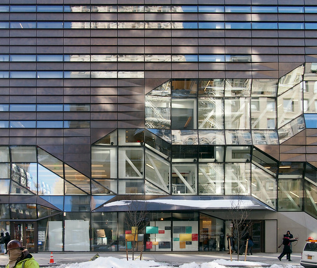
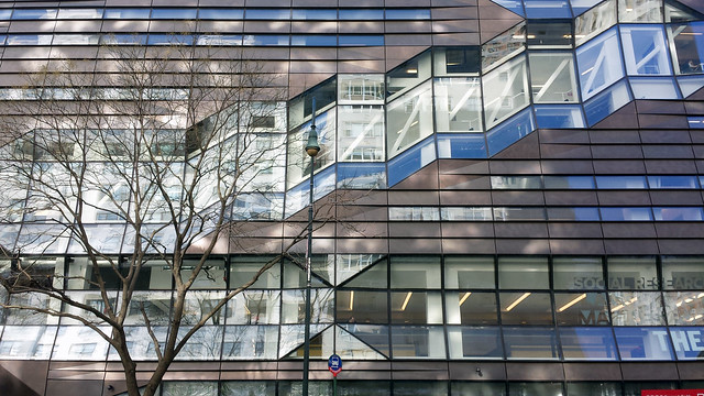
For background on the controversy, which involves the destruction of Tod Williams Billie Tsien Architects' 2001 American Folk Art Museum (AFAM), which MoMA purchased in 2011, see my previous post on DS+R's plan unveiled three weeks ago.

A crowd packs the New York Society for Ethical Culture on the Upper West Side:


MoMA's Glenn Lowry (director) and Ann Temkin (curator) begin the proceedings by outlining their main objectives with the expansion, namely that they have a responsibility as an important cultural institution, and therefore they need more space to show more art. Temkin uses the Frank Lloyd Wright archives that MoMA jointly acquired in 2012 as an example of something they'd be able to show with more galleries, clearly to appease to the crowd of mainly architects. She also mentions that while MoMA traditionally show the art of the past and the art of the present, a "new generation of curators" is working in across multiple histories in a "non-linear, networked" fashion. Here Lowry presents before Temkin speaks:


Liz Diller of DS+R starts her presentation by stating the two reasons why they accepted the MoMA commission:
1) They believed they could save AFAM;
2) They believed in MoMA's "forward mission" of expanded and diverse programming that results to some extent from the new generation of curators that Temkin mentions.


Diller then explains the goals of their six-month study, based on the notion that there is a "good MoMA" (represented by the view of an art-filled gallery above) and a "bad MoMA," which is the crowds of people in the lobby and elsewhere:


Starting with a plan showing the current extents of MoMA in yellow, AFAM in pink, and the Jean Nouvel/Hines Tower in Green (which includes gallery space for MoMA on the lower floors), Diller explains the "closed loop" of the chronologically ordered galleries in MoMA's Taniguchi building (loop not show in this photo, but imagine a clockwise route moving from the atrium in the middle of the yellow spaces moving to the left and then back to the atrium):


Diller then shows that the closed loop becomes a dead end that requires a back track, when the AFAM is not touched and the galleries extend only into the Nouvel/Hines tower:


So naturally AFAM is seen as a way to close the loop again, by bridging across it in one or two places:


The best location of a bridge is at the front of the building, which would necessitate the "white glove" removal of the facade and it being mounted on a new armature incorporating the bridges:


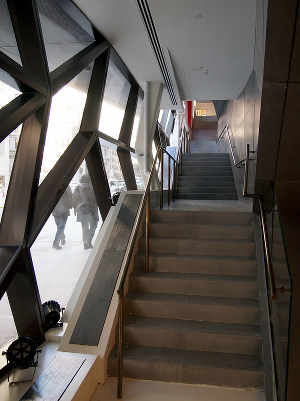
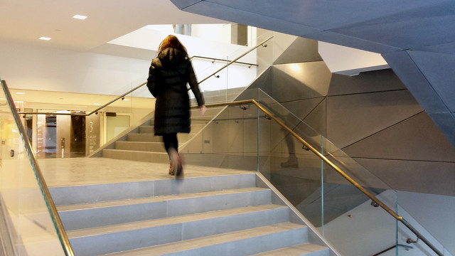
DS+R's analysis of AFAM finds four aspects of the Williams Tsien design that give the building its character:
1) Its facade;
2) The sculptural stairs;
3) The vertical openings through the building;
4) The skylights at the rear yard and top of the building. 
The overriding concerns on the part of MoMA and DS+R are threefold:
1) Close the loop;
2) Find a place for the necessary new core;
3) Find a place for the required mechanical rooms.
This slide shows what happens when the loop is closed, the core is inserted into AFAM's rear yard, and the mechanical space is plopped atop the building:


DS+R did convince MoMA to let them explore alternative programming within AFAM:


Even looking at ways that the existing building would be revealed through the bridge that closes the loop (note the way the floors do not align, one "misfit" that would necessitate removing most if not all of the floors in AFAM):


Diller tells the crowd that they really tried to reuse the 12-year-old building, but "the building is so obdurate," a term she uses at least three times during the evening.

One of the last images showed a newly considered East 53rd Street elevation, from the reconfigured entrance to the Taniguchi building and the clear glass inserted above the gift shop, to the "Art Bay" in place of the old AFAM, and the Nouvel/Hines tower. A band of clear glass unites all three:


Another view of the packed auditorium:


After Diller's presentation the panel convened. Moderated by Reed Kroloff (Cranbrook), the panel consists of Cathleen McGuigan (Architectural Record), Jorge Otero-Pailos (Columbia GSAPP), Nicolai Ouroussoff (former New York Times critic), Stephen Rustow (Museoplan), and Karen Stein (independent architectural advisor):


Some paraphrased highlights from a few of their comments:

Rustow: Given that DS+R's scheme is a feasibility study, and it is only as good as the questions asked, what they were given would have to result in AFAM coming down. Any change in that fact would entail posing the original questions in different ways. One way to do that is to treat AFAM like the original MoMA building, which has been altered considerably over the years, even when inadequate, because it has always been considered an integral part of the museum's evolution.

We should look to Carlo Scarpa for ways of being creative with preservation. For him, the materials on site were fair game, something he created a dialogue with. Additionally, by calling the preservation of just the AFAM facade "facadism" – with all the negative connotations of the term – something that could be creatively reused is being thrown out.
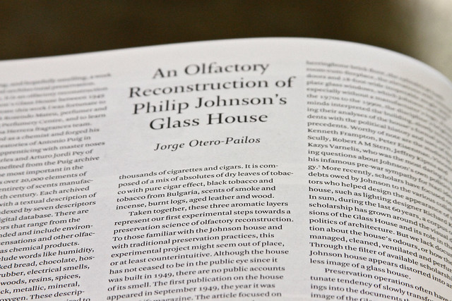


Otero-Pailos: 
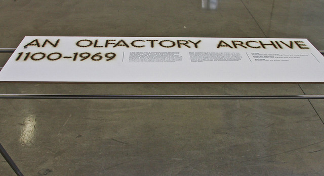
Rethinking preservation is important. For example, what about preserving the smell of AFAM, which has a distinctive olfactory sense emanating from the way the building has been crafted. On the other hand MoMA has an "airport smell." And as advice to the MoMA board members, think ahead 15-20+ years, when the museum decides to relocate due to running out of space in Midtown; what will they have left to the city and its people? And what could they have left them?


Stein: DS+R's process unfolds like a "mathematical theorem," such that one thing logically follows from the previous. But the continuous loop that it is founded upon is problematic. (I'd agree, since the closed loop is based on an art historical view of things, and the new generation of curators that Temkin speaks about work in other ways, meaning the loop is no longer a valid way to organize the museum.)

At the end of the night it is clear that most people in the audience and on the panel want to preserve AFAM in some way. This is particularly obvious when applause follows each of the above comments from the panel.

Lowry, Temkin and Diller join the panel on stage to field questions from the audience, written on cards given out at the beginning of the event. L-R: Kroloff, McGuigan, Otero-Pailos, Diller, Ouroussoff, Rustow, Stein, Lowry, Temkin:


A couple questions are directed at Lowry, who nonchalantly says: "Our decision has been made," and: "We don't collect buildings." Any hope for further discussion is dashed in the course of one sentence, be it an expected one.

As the event comes to a close and Kroloff thanks MoMA and the panelists, the largest applause goes to Liz Diller for "her bravery" in presenting. Of course missing from the crowd are Williams and Tsien, but they probably know that coming to the "conversation" with the hopes of a different outcome is unrealistic, something most people in the crowd are sad to realize over the course of the 2-hour event.

Book Review: OASE 91

OASE #91: Building Atmosphere edited by Klaske Havik, Hans Teerds, Gus Tielens
nai010 Publishers, 2013
Paperback, 128 pages


Quality in architecture...is to me when a building manages to move me. What on earth is it that moves me? How can I get it into my own work?...How do people design things with such a beautiful, natural presence, things that move me every single time. One word for it is Atmosphere.
This quote from Swiss architect Peter Zumthor's 2006 book Atmospheres: Architectural Environments - Surrounding Objects comes at the beginning of the editorial introduction to OASE #91. It is hardly the first utterance of the word "atmosphere" relative to architecture (the editors mention a Mark Wigley essay from a 1998 issue of Diadolos, but it probably goes back farther than that), but it is one that has shaped how architects and critics have started to use the word in the years since. More common or not, it is a term that has not been explored much in architecture, to the point that a definition of atmosphere is non-existent; perhaps it is a highly personal thing, as Zumthor's quote alludes. The editors paraphrase Jorge Louis Borges in this regard, such that, like poetry, atmosphere is something that can be recognized but not defined; it can only be known when we can't define it.

My definition of atmosphere is spatial and environmental. In other words, the quality of atmosphere comes about through enclosure (therefore the inside of a building rather than the outside, though in-between spaces, like those of Japanese architecture, could be included) and the way a space is "formed" by the materials of architecture and their interaction with the surroundings. This sounds pretty vague, but it seems that staking out this position is nevertheless a start, eliminating exteriors and focusing on, for example, the way sunlight touches a wall or the way a view is framed by a window or the way breezes move through a screen. Linking the spatial and environmental is our presence and the way we sense and experience these qualities.

Nanzen-ji Temple
[Nanzen-ji Temple. Photo by John Hill]

Not surprisingly, Zumthor's buildings spring to mind, specifically the way atmosphere saturates the spaces within the Therme Vals – light from the slots in the ceiling hitting the stone and concrete; sounds echoing off the hard surfaces; the humidity of the air; and of course the water on one's body when in the various pools. It's also not surprising that Zumthor makes up a good chunk of this issue of OASE. The editors paid a visit to his office to speak with the architect and see how he works, how he gets atmosphere into his own work. The studio visit is worth the price of admission, with some keen insights on the part of the editors and some candid quotes of Zumthor speaking with his employees.

Much of the rest of the issue is comprised of an interview with Juhani Pallasmaa, a Finnish architect known more for his essays and books. Like Zumthor, Pallasmaa talks a good deal about atmosphere, but for the Finn it is a long held notion in his writing, but one that has only recently gone by that term. His infatuation with filmmaker Andrei Tarkovsky is but one indication of how much he values space as something dripping with both emotional and physical feeling. In addition to the interview that lets us know more about Pallasmaa the man than his own writings convey, he contributes an essay on Frank Lloyd Wright's Taliesin West, where he recently stayed for a period of five months.

Therme Vals
[Therme Vals. Photo by John Hill]

Tying together the primary pieces of Pallasmaa and Zumthor that make up this issue are a couple essays by German philosopher Gernot Böhme. One is an English translation of chapter from his 2006 book Architektur and Atmosphare, and the other is an essay on "the concept of atmosphere in the work of Juhani Pallasmaa and Peter Zumthor." The first goes a long way toward defining atmosphere relative to architecture ("being mindfully present in space"), while the second is interesting for giving an outsider's perspective on two figures often read and critiqued primarily by architects. The issue is rounded out with projects, photographs, and a specially commissioned film, making it a highly recommended book for fans of Pallasmaa, Zumthor and architecture in general.

Vol Walker Hall

American-Architects Building of the Week:

Vol Walker Hall & the Steven L Anderson Design Center in Fayetteville, Arkansas, by Marlon Blackwell Architect:
this week's Building of the Week

How students use social media

The last 3 years I've had the honor to give a guest lecture to a group of around 30 students. They are in their 2nd year of college. The class they are taking is about ‘consultancy’ and I was asked to share my consultancy experiences in the intranet and enterprise 2.0 field. I really enjoy lecturing for and discussing with them. They hardly have any feeling for working in mid-sized or larger organizations. They really keep you grounded by their straight-forward approach to projects and problems. This year I used a case from one of my clients, described the case and asked them to ‘solve’ it. How would they address the client’s assignment? I thought it was a lot of fun and we had a lively discussion about it.

Trends in social media use
But what I wanted to share with you is which social media they use and how they use it. The previous years I also shared these numbers with you. I think it gives an interesting insight into social media usage patterns. The group is quite small so we can’t jump to conclusions. (More research on this topic can be found here and here.) But it does give a small indication of where things are heading.

The numbers
First let me give you the numbers. I basically asked them which social media they are using, if they use just have an account, only consume info or post & consume info. Here’s the list:
  • Twitter: 18 have an account, 14 use it to consume tweets, 2 actively use it for interaction (read and post)
  • Facebook: 24 have an account, all use it for interaction
  • Hyves (Dutch social network): 16 have (had) an account, nobody uses it
  • Google+: 2 have an account, 2 use it for reading, nobody for posting
  • Snapchat: 9 have an account, 7 use it for posting and reading
  • Whatsapp: 24 have an account, all use it actively
  • LinkedIn: 14 have an account, only 2 use it actively
  • Instagram: 14 have an account, they use it every now and then
  • Pinterest: 2 have an account, they use it every now and then
  • Foursquare: 1 has an account and uses it actively
  • Youtube: of course almost consume video, only a few post video's every now and then
  • Blog: 5 have blog, 5 read other blogs and 2 blog actively
What students say about social
I also wrote down the remarks they made about the platforms:
  • Google+: don’t see added value
  • Snapchat: fun to use and not pervasive (vluchtig)
  • LinkedIn: only for resume, not used for groups
  • Pinterest: hardly any users, only girls, for inspiration
  • Instagram: like the fact that it’s mobile only
  • Blog: had to blog for a class, so actually everybody has a blog. Only 5 blog regularly. One used it to share insights related to the company that he owns and for linkbuilding. Another used it to share his passion about his hobby (music).
Patterns in the numbers
I’m fascinated by these numbers. I like the practical way they talk about using and choosing the platforms. It also shows that some of the platforms are clearly not for students but for employees. LinkedIn is hardly used, but I’m sure they’ll use it much more to find a job and when they have a job. Another think that strikes me is how Twitter is used to consume not publish information. They follow people they look up to and Twitter keeps them up to date on their lives.

Comparing these results with last year's I see the following:
  • More students actively use Twitter compared to last year.
  • Instagram is more popular than last year, but not very popular. The same goes for Pinterest.
  • Google+ is hardly used
  • Whatsapp wasn't mentioned last year and now use by all students.
  • Facebook remains a core social tool for youngsters.
  • LinkedIn and Foursquare show the same level of engagement among teens.
Your ideas
I’m curious what you learn from this list. And if you interact with youngsters and student, do you see the same or different patterns?

Today's archidose #729

Here are some photos of the REHAB, Centre for Spinal Cord and Brain Injuries (2002) in Basel, Switzerland, by Herzog & de Meuron, photographed by Fernando Herrera.

REHAB, Centre for Spinal Cord and Brain Injuries

REHAB, Centre for Spinal Cord and Brain Injuries

REHAB, Centre for Spinal Cord and Brain Injuries

To contribute your Flickr images for consideration, just:
:: Join and add photos to the archidose pool, and/or
:: Tag your photos archidose

New School University Center

Here are some of my photos and commentary on SOM's New School University Center from yesterday's inauguration.

The building is located on the southeast corner of 14th Street and Fifth Avenue. The sizable building (what SOM's Roger Duffy called a "vertical campus" during the inauguration) includes 200,000 square feet of academic space on the first seven floors and 150,000 square feet for a 600-bed dormitory on the levels above. The setback marks the transition between the two major components, where the two-story library can also be found. This view is looking south down Fifth Avenue:
New School University Center

Regular bands of glass and Muntz metal ("a sort of brass containing about 60 percent copper and 40 percent zinc" per The Architect's Newspaper) are broken by larger glazed sections that follow the stairs snaking down the building. This view is the Fifth Avenue facade near 14th Street (the worker just visible in the bottom-left corner, by the way, is part of the crew fixing the water main break that hit last week; Fifth Avenue was closed completely from 14th to 13th Street):
New School University Center

Around the corner, here is a close-up of the elevation on 14th Street:
New School University Center

Looking up at the Fifth Avenue facade, the scalar profile of the Muntz panels is particularly pronounced:
New School University Center

There is an entrance at the corner of Fifth Avenue and 13th Street, where one of the open, communicating stairs lands:
New School University Center

A few steps beyond the now-standard security turnstiles is a sunken, tiered space that is open to the lobby:
New School University Center

Inside, the building is all about the stairs. There are so many stairs doing so many different things (winding, straight runs, bends, angles, bridges) that it was hard for me to remember where each of my photos were taken. In the case of this photo, the number on the wall helps:
New School University Center

To convey the complexity – and hopefully some understanding – of the stairs, here's a diagram of them (via archpaper):


SOM must have had some fun getting the fire department on board with this design. An indication of the measured needed for what is basically an irregular atrium can be seen in the fire shutters, whose hidden presence is known through the gaps in the ceiling and tracks on the wall (just right of the signage on the wall):
New School University Center

Some of the most interesting parts of the building can be found where stairs "infiltrate" other spaces, such that circulation is not always separate from program:
New School University Center

The snaking stairs and adjacent spaces are in various shades of gray, but some color can be glimpsed in the elevator lobbies:
New School University Center

Corridors saturated with color give direct access to the studios and other classrooms, as well as being the location for students' lockers:
New School University Center

Many of these corridors are bare bones, such that without the colors they would feel like basement or service spaces (it's not surprising, given the expense of the stairs and exterior):
New School University Center

A straight-run stair ascends from the 3rd or 4th floor (I can't remember which) toward the mid-level library where the inauguration took place:
New School University Center

This is the same stair as in the previous photo, looking down from near the top. Note the two types of windows – the narrow horizontal bands and the larger panes following the stair:
New School University Center

The larger glass is also found in the fire stairs, which are located immediately below the open, communicating stairs (think of the stairs as double-deckers, with open stairs above enclosed, fire stairs):
New School University Center

The straight run stair comes to a landing that winds up again to the top floor of the library:
New School University Center

This view is looking down toward roughly where the previous photo was taken. Note the setback and snow-covered roof outside the expansive glass:
New School University Center

Here's a view that is a little bit to the right from the previous photo. The full-height glazing on this floor wraps from the south (left) to the west:
New School University Center

These windows offer some really interesting views of the buildings around the University Center. They are clearly from another time when seen through windows that are snaking rather than punched:
New School University Center

For those of you expecting to see photos of the inauguration festivities, which included an appearance from Sarah Jessica Parker, sorry, that's not my thing. You'll have to look elsewhere for that.