Lettering Large: Art and Design of Monumental Typography by Steven Heller and Mirko Ilić
The Monacelli Press, 2013
Hardcover, 224 pages
What happens to letters, words and phrases when they are blown up from their usual place on the pages of a book to occupying space within the public realm? The most obvious answer is that they become advertising, gracing the sides of buildings or billboards to entice consumers toward a certain product or brand. But as co-author Steven Heller asserts in a piece at Designers & Books, Lettering Large "is not about advertising—it’s about how the language of advertising is applied to architecture and art and identity."
Most of the examples of monumental typography collected in the book are fairly recent, but Heller and Ilić do acknowledge the history of large letters on buildings and in space, be it inscriptions on the buildings of ancient Rome or early modern attempts to synthesize architecture and graphic design. If one thing comes across while imbibing the many examples in the book's 240 pages, it is the blurring of the boundaries between art, architecture, typography, graphic design, and even landscape in many contemporary settings.
The authors compiled what seems like hundreds of examples of monumental typography into four chapters: Monumental Outdoor Type, Typo-Hypnotic Messages, Big and Better: Type as Object, A-R-T in T-Y-P-E. Generally, the venues for the first and last chapters are landscapes, while building facades and spaces are the canvases for the examples in the middle chapters, though this is hardly a rule. The book starts with the most monumental letters of all, those that are ideally read from above, via airplanes and even satellites. The North Carolina Museum of Art, with "PICTURE THIS" set into the landscape by Barbara Kruger, is actually one of the smaller such examples. For this and other large-scale messages to stay intact, the landscape will need to be maintained, but some of the more appealing examples are temporary formations of people (echoing the way Coca-Cola used birdseed in Piazza San Marco to entice pigeons to unknowingly spell out the company's name over 50 years ago) that are used for a variety of purposes, be it political, civic pride, or humor.
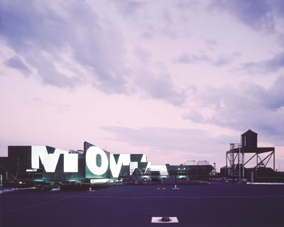
Not surprisingly, most of my favorites fall in the middle two chapters, where architecture takes on a more prominent role than in the chapters bookending them. The "typo-hypnotic messages" in the second chapter adorn building facades and line their insides, often conveying a message. Simplicity of the message is penultimate, even though in cases like the temporary MOMA QNS it took some effort, or being in the right place at the right time, to understand it. When used as an object in the following chapter, type becomes a pattern or just another texture or surface decoration. Words and phrases overlap and collide, symptomatic of our time when there is too much information to convey meaning adequately.
Heller and Ilić's helpful but basically uncritical text clearly places the emphasis on the great number of examples of monumental typography that exist, particularly from the last 10-15 years, and the even greater variety of applications. There is the feeling that letters, words, and phrases blown up to life-size and larger are a really good thing, even if the results are questionable at times – Mitsutomo Matsunami's Number House comes to mind. And it's easy to get swept along with them, taking in the ping-ponging fun, serious, and often colorful projects all over the world. Each page brings to mind a building or landscape with letters or words, making me see if the authors included it in the book; these searches make it clear the book really should have an index. But that is a small fault in an enjoyable book that is also a great reference of how type surrounds us even more than we could have imagined.
The Monacelli Press, 2013
Hardcover, 224 pages
What happens to letters, words and phrases when they are blown up from their usual place on the pages of a book to occupying space within the public realm? The most obvious answer is that they become advertising, gracing the sides of buildings or billboards to entice consumers toward a certain product or brand. But as co-author Steven Heller asserts in a piece at Designers & Books, Lettering Large "is not about advertising—it’s about how the language of advertising is applied to architecture and art and identity."
Most of the examples of monumental typography collected in the book are fairly recent, but Heller and Ilić do acknowledge the history of large letters on buildings and in space, be it inscriptions on the buildings of ancient Rome or early modern attempts to synthesize architecture and graphic design. If one thing comes across while imbibing the many examples in the book's 240 pages, it is the blurring of the boundaries between art, architecture, typography, graphic design, and even landscape in many contemporary settings.
The authors compiled what seems like hundreds of examples of monumental typography into four chapters: Monumental Outdoor Type, Typo-Hypnotic Messages, Big and Better: Type as Object, A-R-T in T-Y-P-E. Generally, the venues for the first and last chapters are landscapes, while building facades and spaces are the canvases for the examples in the middle chapters, though this is hardly a rule. The book starts with the most monumental letters of all, those that are ideally read from above, via airplanes and even satellites. The North Carolina Museum of Art, with "PICTURE THIS" set into the landscape by Barbara Kruger, is actually one of the smaller such examples. For this and other large-scale messages to stay intact, the landscape will need to be maintained, but some of the more appealing examples are temporary formations of people (echoing the way Coca-Cola used birdseed in Piazza San Marco to entice pigeons to unknowingly spell out the company's name over 50 years ago) that are used for a variety of purposes, be it political, civic pride, or humor.
Not surprisingly, most of my favorites fall in the middle two chapters, where architecture takes on a more prominent role than in the chapters bookending them. The "typo-hypnotic messages" in the second chapter adorn building facades and line their insides, often conveying a message. Simplicity of the message is penultimate, even though in cases like the temporary MOMA QNS it took some effort, or being in the right place at the right time, to understand it. When used as an object in the following chapter, type becomes a pattern or just another texture or surface decoration. Words and phrases overlap and collide, symptomatic of our time when there is too much information to convey meaning adequately.
Heller and Ilić's helpful but basically uncritical text clearly places the emphasis on the great number of examples of monumental typography that exist, particularly from the last 10-15 years, and the even greater variety of applications. There is the feeling that letters, words, and phrases blown up to life-size and larger are a really good thing, even if the results are questionable at times – Mitsutomo Matsunami's Number House comes to mind. And it's easy to get swept along with them, taking in the ping-ponging fun, serious, and often colorful projects all over the world. Each page brings to mind a building or landscape with letters or words, making me see if the authors included it in the book; these searches make it clear the book really should have an index. But that is a small fault in an enjoyable book that is also a great reference of how type surrounds us even more than we could have imagined.
No comments:
Post a Comment